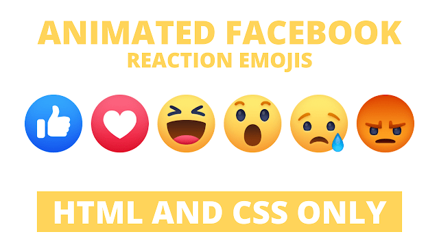
Hello readers, Today in this blog you’ll learn how to create Facebook Wow Reaction Button using only HTML & CSS. Earlier I have shared a Text Glitch Effect in HTML & CSS, now it’s time to create a Facebook Wow Reaction Button.
As you know, Facebook reaction buttons mean instead of just having the option of ‘Liking’ a post, users can now interact with a status update, article, or photo using one of seven emotional reactions: Like, Love, Care, Haha, Wow, Sad, and Angry.
You already know about these reaction buttons and have seen them on Facebook. There are seven reaction buttons. But today you’ll learn to create one of the reaction buttons called Wow. I used only HTML & CSS to create this reaction button. You can call this is a pure CSS program.
If you’re feeling difficult to understand what I am saying. You can watch a full video tutorial on this program (Facebook Wow Reaction Emoji).
Video Tutorial of Facebook Wow Reaction Emoji
I created this button just for fun and learning purposes. If you are a beginner and have some basic knowledge about HTML & CSS. Then definitely you can also create this type of reaction button or other Facebook reaction button (Like, Love, Care).
If you like this Wow reaction Button and want to get codes of this. You can easily get the source codes of this program. To get the source codes you just need to scroll down.
Facebook Wow Reaction Emoji [Source Codes]
To create this program (Facebook Wow Reaction Emoji). First, you need to create two Files one HTML File and another one is CSS File. After creating these files just paste the following codes in your file.
First, create an HTML file with the name of index.html and paste the given codes in your HTML file. Remember, you’ve to create a file with .html extension.
<!DOCTYPE html>
<!-- Created By CodingNepal -->
<html lang="en" dir="ltr">
   <head>
      <meta charset="utf-8">
      <title>Wow Facebook Reaction</title>
      <link rel="stylesheet" href="style.css">
   </head>
   <body>
      <div class="center">
         <div class="emoji">
            <div class="emoji_face">
               <div class="emoji_brow"></div>
               <div class="emoji_eye"></div>
               <div class="emoji_mouth"></div>
            </div>
         </div>
      </div>
   </body>
</html>
Second, create a CSS file with the name of style.css and paste the given codes in your CSS file. Remember, you’ve to create a file with .css extension.
body{
  margin: 0;
  padding: 0;
  background: #d4e9f7;
}
.center{
  position: absolute;
  top: 50%;
  left: 50%;
  transform: translate(-50%, -50%);
}
.emoji{
  position: relative;
  display: inline-block;
  height: 120px;
  width: 120px;
  border-radius: 50%;
  box-shadow: inset 0 0 10px 2px #eead2b;
  background: linear-gradient(#FFED65,#EEAD2F);
}
.emoji_face,.emoji_brow,
.emoji_eye,.emoji_mouth{
  position: absolute;
}
.emoji_face{
  height: 120px;
  width: 120px;
  animation: face 3s linear infinite;
}
@keyframes face {
  15%, 25%{
    transform: rotate(20deg) translateX(-20px);
  }
  45%, 65%{
    transform: rotate(-20deg) translateX(20px);
  }
  75%, 100%{
    transform: rotate(0) translateX(0);
  }
}
.emoji_brow{
  left: calc(50% - 3px);
  height: 6px;
  width: 6px;
  background: transparent;
  border-radius: 50%;
  box-shadow: -18px 0 0 0 #aa7408,
              -33px 0 0 0 #aa7408,
               18px 0 0 0 #aa7408,
               33px 0 0 0 #aa7408;
  animation: eye_brow 3s linear infinite;
}
@keyframes eye_brow {
  15%, 65%{
    top: 25px;
  }
  75%, 100%, 0%{
    top: 15px;
  }
}
.emoji_brow:before,
.emoji_brow:after{
  position: absolute;
  content: '';
  left: calc(50% - 12px);
  top: -3px;
  width: 24px;
  height: 20px;
  border: 6px solid #aa7408;
  border-radius: 50%;
  box-sizing: border-box;
  border-bottom-color: transparent;
  border-left-color: transparent;
  border-right-color: transparent;
}
.emoji_brow:before{
  margin-left: -25px;
}
.emoji_brow:after{
  margin-left: 25px;
}
.emoji_eye{
  top: 35px;
  left: calc(50% - 8px);
  height: 24px;
  width: 16px;
  border-radius: 50%;
  background: transparent;
  box-shadow: 25px 0 0 0 #1b2031,
              -25px 0 0 0 #1b2031;
}
.emoji_mouth{
  top: 50%;
  left: calc(50% - 15px);
  width: 30px;
  height: 40px;
  border-radius: 50%;
  background: linear-gradient(#54290F,#622B0B,#6E3011);
  animation: mouth 3s linear infinite;
}
@keyframes mouth {
  10%, 30%{
    width: 20px;
    height: 20px;
    left: calc(50% - 10px);
  }
  50%, 70%{
    width: 30px;
    height: 40px;
    left: calc(50% - 15px);
  }
  75%, 100%{
    height: 45px;
  }
}
That’s all, now you’ve successfully created the Facebook Wow Reaction Emoji in HTML & CSS. If your code does not work or you’ve faced any error/problem then please comment down or contact us from the contact page.


