Hello readers, today in this blog we are going to create a Video Gallery Lightbox in HTML CSS and JavaScript, I have made lots of JavaScript Projects up to date and as usual, we make something useful and interesting projects.
Simply, we can understand the video lightbox is the animation or features where video pops up on the window on the user’s click.
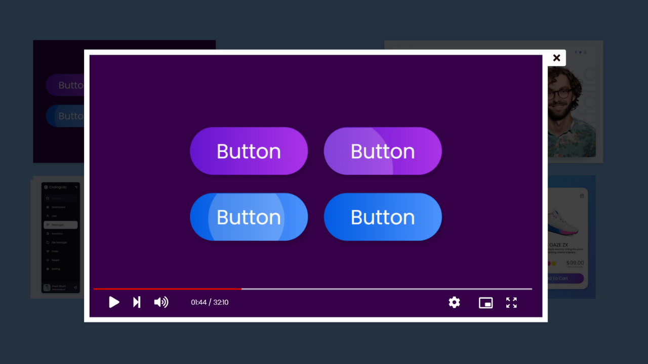
Have a look at the image of our program(Video Gallery Lightbox in HTML CSS and JavaScript), the image you can see is the real example of a video lightbox. Actually, in the background of this lightbox, there are some other videos that we can play. Those videos are in the backside can be popped and can be played.
If you want to see the real demo of this Video Gallery Lightbox then you have to watch the video tutorial that I have given below, and one thing, after watching the following video tutorial you will get all the ideas of the code that I have used to create this video lightbox.
Video Gallery Lightbox in HTML CSS and JavaScript
You will get all the source code file that I have used to create this video gallery lightbox, but before jumping on the source code I have to point out some important topic from this video tutorial.
As you have seen on the video tutorial of this video gallery lightbox, at first there is some video on the screen and when we clicked on every video its popped out and started playing to make video autoplay and controls I have used HTML property of video tag and to change the video source and pops out the video I have used some JavaScript codes.
I believe, now you can make this responsive video gallery lightbox easily. For those friends who are feeling difficulty creating this video gallery lightbox, don’t worry, I have given all the source code of this program (Video Gallery Lightbox in HTML CSS and JavaScript).
You May Like This:
<!DOCTYPE html>
<!-- Coding By CodingNepal - codingnepalweb.com -->
<html lang="en" dir="ltr">
  <head>
    <meta charset="UTF-8">
    <title> Video Player in JavaScript | CodingLab </title>
    <meta name="viewport" content="width=device-width, initial-scale=1.0">
    <link rel="stylesheet" href="style.css">
    <!-- Boxicons Link -->
    <link href='https://unpkg.com/[email protected]/css/boxicons.min.css' rel='stylesheet'>
   </head>
<body>
  <section>
    <div class="container">
      <div class="main-video">
          <video src="videos/button.mp4" autoplay muted controls></video>
          <i class='bx bx-x close'></i>
      </div>
      <div class="videos">
        <video src="videos/button.mp4"></video>
        <i class='bx bx-play-circle'></i>
      </div>
      <div class="videos">
        <video src="videos/website.mp4"></video>
        <i class='bx bx-play-circle'></i>
      </div>
      <div class="videos">
        <video src="videos/sidebar.mp4"></video>
        <i class='bx bx-play-circle'></i>
      </div>
      <div class="videos">
        <video src="videos/productCard.mp4"></video>
        <i class='bx bx-play-circle'></i>
      </div>
    </div>
  </section>

  <script>
    const section = document.querySelector("section"),
    mainVideo = document.querySelector(".main-video video"),
     videos = document.querySelectorAll(".videos"),
     close = document.querySelector(".close");

     for (var i = 0; i < videos.length; i++) {
       videos[i].addEventListener("click", (e)=>{
         const target = e.target;
         section.classList.add("active");
         target.classList.add("active");
         let src = document.querySelector(".videos.active video").src;
         mainVideo.src = src;

         close.addEventListener("click", ()=>{
           section.classList.remove("active");
           target.classList.remove("active");
           mainVideo.src = "";
         });
       });
     };
  </script>
</body>
</html>
@import url('https://fonts.googleapis.com/css2?family=Poppins:wght@200;300;400;500;600;700&display=swap');
*{
  margin: 0;
  padding: 0;
  box-sizing: border-box;
  font-family: 'Poppins',sans-serif;
}
section{
  min-height: 100vh;
  width: 100%;
  display: flex;
  align-items: center;
  justify-content: center;
  background: #009999;
  padding: 50px;
  position: relative;
  overflow: hidden;
}
section::before{
  content: '';
  position: absolute;
  top: 0;
  left: 0;
  height: 100%;
  width: 100%;
  background: rgba(0, 0, 0, 0.6);
  opacity: 0;
  transition: all 0.4s ease;
}
section.active::before{
  opacity: 1;
}
.container{
  max-width: 800px;
  width: 100%;
  display: flex;
  align-items: center;
  justify-content: space-between;
  flex-wrap: wrap;
  background: #fff;
  padding: 5px 10px;
  position: relative;
  box-shadow: 0 5px 10px rgba(0, 0, 0, 0.5);
}
 section.active .container{
   visibility: hidden;
 }
.container .main-video{
  position: absolute;
  top: 50%;
  left: 50%;
  transform: translate(-50%, -50%) scale(1);
  width: 100%;
  z-index: 999;
  opacity: 0;
  pointer-events: none;
  visibility: visible;
  transition: all 0.4s ease;
}
section.active .container .main-video{
  transform:translate(-50%, -50%) scale(1);
  opacity: 1;
  pointer-events: auto;
}
.container .main-video video{
  height: 100%;
  width: 100%;
  object-fit: cover;
  outline: none;
  box-shadow: 0 5px 10px rgba(0, 0, 0, 0.2);
}
.container .main-video .close{
  position: absolute;
  top: -10px;
  right: -36px;
  font-size: 35px;
  color: #fff;
  cursor: pointer;
  transition: all 0.3s ease;
  z-index: 1000;
  pointer-events: auto;
  opacity: 0.6;
}
.container .main-video .close:hover{
  opacity: 1;
}
.container .videos{
  position: relative;
  height: 200px;
  width: calc(100% / 2 - 5px);
  margin: 5px 0;
  cursor: pointer;
}
.container .videos::before{
  content: '';
  position: absolute;
  left: 0;
  top: 0;
  height: 100%;
  width: 100%;
  background: rgba(0,0,0,0.3);
  pointer-events: none;
}
.container .videos video{
  width: 100%;
  height: 100%;
  object-fit: cover;
  outline: none;
  pointer-events: none;
}
.container .videos i{
  position: absolute;
  top: 50%;
  left: 50%;
  transform: translate(-50%, -50%);
  font-size: 50px;
  color: #fff;
  pointer-events: none;
}
@media (max-width: 750px) {
  .container .main-video{
    position: fixed;
    width: 83%;
  }
  .container .videos{
    width: 100%;
    height: 320px;
  }
}
@media (max-width: 600px) {
  .container .videos{
    width: 100%;
    height: 250px;
  }
}
If you face any difficulties while creating your Video Gallery or your code is not working as expected, you can download the source code files for this Video Player for free by clicking on the download button, and you can also view a live demo of this card slider by clicking on the view live button.


Good work
Good work folks
My mind is full of thankful comments but I want to start by saying THANK YOU