Previously, we usually had a light theme for our web and mobile platforms. But now, dark mode is gaining popularity. Many desktop and mobile app platforms are embracing the dark theme because it is more comfortable to look at and saves battery life on mobile devices.
This blog will teach you how to create Toggle Button in Dark/Light Mode HTML and CSS. In my recent blog post, I have provided Top 10 Website Templates Design, which could also enhance your skills in HTML CSS as well as JavaScript.
Although the light theme has some benefits, many people still need to learn to use dark-themed websites. Therefore, it would be advisable to provide users with the ability to switch between dark and light modes in web applications. This way, they can choose the theme that works best for them.
A toggle button is a user interface element that allows users to switch between two states, such as on and off. In the context of dark and light modes, a toggle button would be used to switch between the two color schemes. Toggle buttons can be found on many web pages and apps, such as the wifi toggle button on Windows.
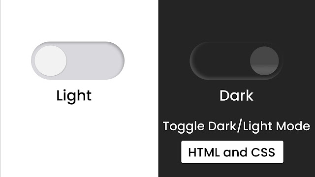
In the provided image of the Dark/Light Toggle Button, the button is in the “off” or “closed” state because the blue circle is on the left side. Additionally, the background is blue, indicating that the current color scheme is the light mode. When the toggle button is clicked, the blue circle moves to the right side, and the color scheme changes to the dark mode, as indicated by the change in color of the background and the toggle button.
If you’re curious about how the Dark/Light Toggle Button works, take a look at the preview I have provided below. I have explained the HTML and CSS code I used to make this Toggle Button and its Dark/Light Mode.
Toggle Button Dark/Light Mode in HTML CSS | Video Tutorial
All of the HTML and CSS code that I used to create this Dark/Light Mode is provided. Instead of duplicating the code or downloading the source code file, I strongly advise you to watch the full video explanation of this Toggle Button Dark/Light Mode. By watching the video tutorial, you can create this Toggle Button.
As you saw in the video tutorial for this Toggle Button with Dark/Light Mode, the initial toggle button was white with a lime green background and the webpage was white. When I clicked the toggle button, the circle moved to the right and changed to dark, and the background of the body also changed to dark with a nice animation.
Now, hopefully, you can create this Toggle Button Dark/Light Mode using HTML and CSS. The source codes for all the HTML and CSS I used to develop this Input Label Animation are provided below.
You May Like This:
- Toggle Button in HTML CSS & JS
- Animated Share Button in HTML & CSS
- Button Ripple Animation in HTML CSS & JS
- Toggle Button Dark/Light Mode in HTML CSS & JS
Toggle Button Dark/Light Mode in HTML & CSS [Source Code]
- Create a folder. You can name this folder whatever you want, and inside this folder, create the mentioned files.
- Create an
index.htmlfile. The file name must be index and its extension .html - Create a
style.cssfile. The file name must be style and its extension .css
Once you create these files, paste the given codes into the specified files. If you don’t want to do these then scroll down and download the Toggle Button Dark/Light by clicking on the given download button.
First, paste the following codes into your index.html file.
<!DOCTYPE html>
<!-- Coding By CodingNepal - codingnepalweb.com -->
<html lang="en">
<head>
  <meta charset="UTF-8">
  <meta name="viewport" content="width=device-width, initial-scale=1.0">
  <meta http-equiv="X-UA-Compatible" content="ie=edge">
  <title> Toggle Button With Dark/Light Mode | CoderGirl</title>
  <!---Custom CSS File--->
  <link rel="stylesheet" href="style.css">
</head>
<body>
  <input type="checkbox" id="dark-mode">
  <label for="dark-mode"></label>
  <div class="background"></div>
</body>
</html>
Second, paste the following codes into your style.css file
/* Import Google font - Poppins */
@import url('https://fonts.googleapis.com/css2?family=Poppins:wght@200;300;400;500;600;700&display=swap');
*{
  margin: 0;
  padding: 0;
  box-sizing: border-box;
  font-family: 'Poppins', sans-serif;
}
body{
  width: 100%;
  height: 100vh;
  display: flex;
  align-items: center;
  justify-content: center;
  flex-direction: column;
}
label{
  position: relative;
  width: 480px;
  height: 180px;
  display: block;
  background: #d9d9d9;
  border-radius: 100px;
  cursor: pointer;
  box-shadow: inset 0px 5px 15px rgba(0,0,0,0.3), inset 0px -5px 15px rgba(255,255,255,0.3);
}
label:after{
  content: '';
  position: absolute;
  height: 160px;
  width: 160px;
  background: #f2f2f2;
  border-radius: 100px;
  top: 10px;
  left: 10px;
  transition: 0.5s;
  box-shadow: 0 5px 10px rgba(0,0,0,0.2);
}
input:checked ~ label:after{
  left: 470px;
  transform: translateX(-100%);
  background: linear-gradient(180deg,#777,#3a3a3a);
}
input:checked ~ label{
  background: #242424;
}
.background{
  position: absolute;
  width: 100%;
  height: 100vh;
  background: #fff;
  z-index: -1;
  transition: 0.5s;
}
input:checked + label + .background{
  background: #242424;
}
input{
  display: none;
}
That’s all, now you’ve successfully created a project on Toggle Button Dark/Light Mode. If your code doesn’t work or you’ve faced any problems, please download the source code files from the given download button. It’s free and a zip file containing the project folder with source code files will be downloaded.


