Hello friend, I hope you are doing awesome. Today you will learn to create a Search Bar in HTML CSS & JavaScript I will add some animation to our search bar also. Earlier I created a Seach Box using HTML and CSS only. But in today’s search box I will add a few JavaScript.
Search Bars are the section where users can search for the things that they want to. Search Bar can be in different designs but the main objective of the search bar is to search.
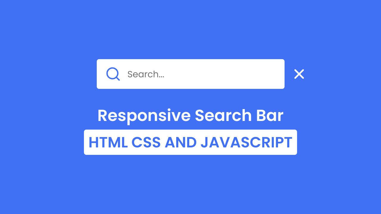
Have a quick look on the given image of our search bar on the webpage. As you can see from the image of our search box. There is a search box, inside the search box there are two icons and a search section. Actually, in our real project, this search bar will be in closed form and when we click on the search icon then the search bar will open, and close the search bar we need to click on the cross icon. I have added beautiful cubic animation too.
To see the real demo of this search bar and its animation, you need to watch the give video tutorial of our search bar. Also by watching the video tutorial, you will get an idea about HTML CSS, and JavaScript codes that I have used to create this search bar.
Search Bar in HTML CSS & JavaScript | Video Tutorial
I have provided all the HTML CSS and JavaScript code that I have used to create this Search Bar. Before getting into the source code file, I would like to explain the given video tutorial briefly.
As you have seen in the video tutorial. At first, we saw one square shape box with a search icon. When I clicked on that square box, the search box opened and cross icons also appeared. When I clicked on that cross icon then the search bar closed and the cross icon disappeared. The search bar is created by HTML and CSS, for the animation, I have used CSS cubic bezier and to open and close the search bar I have used some JavaScript code.
I hope now you can create this search bar using HTML CSS and JavaScript. If you are feeling difficulty creating this sidebar, I have provided all the source code below.
You Might Like This:
- Button with Progress
- Side Bar with Search Box
- Navigation Bar with Search Box
- Responsive Login & Signup Form
Search Bar [Source Code]
<!DOCTYPE html>
<!-- Coding By CodingNepal - codingnepalweb.com -->
    <html lang="en">
    <head>
        <meta charset="UTF-8">
        <meta http-equiv="X-UA-Compatible" content="IE=edge">
        <meta name="viewport" content="width=device-width, initial-scale=1.0">
        <title> Animated Search Bar </title>

        <!-- CSS -->
        <link rel="stylesheet" href="css/style.css">

        <!-- Unicons CSS -->
        <link rel="stylesheet" href="https://unicons.iconscout.com/release/v4.0.0/css/line.css">

    </head>
    <body>
        <div class="input-box">
            <input type="text" placeholder="Search...">
            <span class="icon">
                <i class="uil uil-search search-icon"></i>
            </span>
            <i class="uil uil-times close-icon"></i>
        </div>

        <script>
            let inputBox = document.querySelector(".input-box"),
                searchIcon = document.querySelector(".icon"),
                closeIcon = document.querySelector(".close-icon");

            searchIcon.addEventListener("click", () => inputBox.classList.add("open"));
            closeIcon.addEventListener("click", () => inputBox.classList.remove("open"));
        </script>

    </body>
</html>
/* Google Fonts - Poppins */
@import url('https://fonts.googleapis.com/css2?family=Poppins:wght@300;400;500;600&display=swap');

*{
  margin: 0;
  padding: 0;
  box-sizing: border-box;
  font-family: 'Poppins', sans-serif;
}
body{
  height: 100vh;
  display: flex;
  align-items: center;
  justify-content: center;
  background: #4070f4;
  overflow: hidden;
}
.input-box{
  position: relative;
  height: 55px;
  max-width: 55px;
  width: 100%;
  margin: 0 40px;
  border-radius: 6px;
  background-color: #fff;
  transition: all 0.6s cubic-bezier(0.68, -0.55, 0.265, 1.55);
}
.input-box.open{
  max-width: 350px;
}
input{
  position: relative;
  outline: none;
  border: none;
  height: 100%;
  width: 100%;
  border-radius: 6px;
  font-size: 16px;
  font-weight: 400;
  color: #333;
  background-color: #fff;
}
.input-box.open{
  padding: 0 15px 0 65px;
}
.icon{
  position: absolute;
  height: 100%;
  top: 0;
  left: 0;
  width: 60px;
  border-radius: 6px;
  display: flex;
  justify-content: center;
  background-color: #fff;
}
.search-icon,
.close-icon{
  position: absolute;
  top: 50%;
  font-size: 30px;
  transition: all 0.6s cubic-bezier(0.68, -0.55, 0.265, 1.55);
}
.search-icon{
  color: #4070f4;

  transform: translateY(-50%) rotate(90deg);
}
.input-box.open .search-icon{
  transform: translateY(-50%) rotate(0);
}
.close-icon{
  right: -45px;
  color: #fff;
  padding: 5px;
  opacity: 0;
  pointer-events: none;
  transform: translateY(-50%);
}
.input-box.open .close-icon{
  opacity: 1;
  pointer-events: auto;
  transform: translateY(-50%) rotate(180deg);
}


