 Hello readers, Today in this blog you’ll learn how to create a Responsive Testimonials Section using only HTML & CSS. Earlier I have shared a blog on how to create a Responsive Services Box and now it’s time to create a Testimonials Section.
A website testimonial shows the success of a site’s products and the statement that comments on how good someone or something is. Testimonials help to convince interested users that you’re worth their trust. By strategically website testimonials are placing on a dedicated ‘Testimonials’ page.
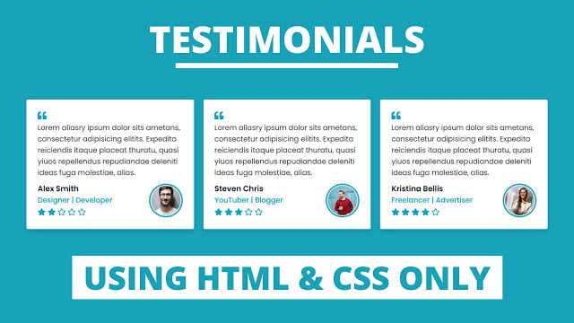
In this program [Responsive Testimonials Section], there are three testimonials box or card on the webpage and inside each box, there is a quote, name, job, and stars rating of that person. This testimonial section is fully responsive for any devices like mobiles and tablets. On the PC, these boxes are shown in a horizontal line but on mobile devices, these boxes are shown vertically.
If you’re feeling difficult to understand what I am saying. You can watch a full video tutorial on this program [Responsive Testimonials Section].
Video Tutorial of Responsive Testimonials Section
In the video, you have seen the Responsive Testimonials and I hope you’ve understood the basic codes behind creating this program. As you know, this is a pure CSS program that means only HTML & CSS are used to create this program. If you’re a beginner, you can also create this type of responsive testimonials bo. To make this section or boxes responsive I used CSS flexbox and @media properties.
If you like this program, and you want to use this on your websites, projects, and wherever you want then you have to do some basic changes on codes according to your website layout or this is enough good for you and you don’t need to change then you don’t need to change anything.
You might like this:
Responsive Testimonials Section [Source Codes]
To create this program (Responsive Testimonials Section). First, you need to create two Files one HTML File and another one is CSS File. After creating these files just paste the following codes in your file.
First, create an HTML file with the name of index.html and paste the given codes in your HTML file. Remember, you’ve to create a file with .html extension and the images that are used on these cards won’t appear. You’ve to download files from the given download button to use images also.
<!DOCTYPE html>
<!-- Created By CodingNepal - www.codingnepalweb.com -->
<html lang="en">
<head>
    <meta charset="UTF-8">
    <meta name="viewport" content="width=device-width, initial-scale=1.0">
    <title>Responsive Testimonials Section | CodingNepal</title>
    <link rel="stylesheet" href="style.css">
    <link rel="stylesheet" href="https://cdnjs.cloudflare.com/ajax/libs/font-awesome/5.15.3/css/all.min.css"/>
</head>
<body>
  <div class="wrapper">
    <div class="box">
      <i class="fas fa-quote-left quote"></i>
      <p>Lorem aliasry ipsum dolor sits ametans, consectetur adipisicing elitits. Expedita reiciendis itaque placeat thuratu, quasi yiuos repellendus repudiandae deleniti ideas fuga molestiae, alias.</p>
      <div class="content">
        <div class="info">
          <div class="name">Alex Smith</div>
          <div class="job">Designer | Developer</div>
          <div class="stars">
            <i class="fas fa-star"></i>
            <i class="fas fa-star"></i>
            <i class="far fa-star"></i>
            <i class="far fa-star"></i>
            <i class="far fa-star"></i>
          </div>
        </div>
        <div class="image">
          <img src="images/profile-1.jpeg" alt="">
        </div>
      </div>
    </div>
    <div class="box">
      <i class="fas fa-quote-left quote"></i>
      <p>Lorem aliasry ipsum dolor sits ametans, consectetur adipisicing elitits. Expedita reiciendis itaque placeat thuratu, quasi yiuos repellendus repudiandae deleniti ideas fuga molestiae, alias.</p>
      <div class="content">
        <div class="info">
          <div class="name">Steven Chris</div>
          <div class="job">YouTuber | Blogger</div>
          <div class="stars">
            <i class="fas fa-star"></i>
            <i class="fas fa-star"></i>
            <i class="fas fa-star"></i>
            <i class="far fa-star"></i>
            <i class="far fa-star"></i>
          </div>
        </div>
        <div class="image">
          <img src="images/profile-2.jpeg" alt="">
        </div>
      </div>
    </div>
    <div class="box">
      <i class="fas fa-quote-left  quote"></i>
      <p>Lorem aliasry ipsum dolor sits ametans, consectetur adipisicing elitits. Expedita reiciendis itaque placeat thuratu, quasi yiuos repellendus repudiandae deleniti ideas fuga molestiae, alias.</p>
      <div class="content">
        <div class="info">
          <div class="name">Kristina Bellis</div>
          <div class="job">Freelancer | Advertiser</div>
          <div class="stars">
            <i class="fas fa-star"></i>
            <i class="fas fa-star"></i>
            <i class="fas fa-star"></i>
            <i class="fas fa-star"></i>
            <i class="far fa-star"></i>
          </div>
        </div>
        <div class="image">
          <img src="images/profile-3.jpeg" alt="">
        </div>
      </div>
    </div>
  </div>

</body>
</html>
Second, create a CSS file with the name of style.css and paste the given codes in your CSS file. Remember, you’ve to create a file with .css extension.
@import url('https://fonts.googleapis.com/css2?family=Poppins:wght@200;300;400;500;600;700&display=swap');
*{
  margin: 0;
  padding: 0;
  box-sizing: border-box;
  font-family: 'Poppins', sans-serif;
}
html,body{
  display: grid;
  height: 100%;
  place-items: center;
  background: #17a2b8;
}
::selection{
  background: rgba(23,162,184,0.3);
}
.wrapper{
  max-width: 1200px;
  margin: auto;
  padding: 0 20px;
  display: flex;
  flex-wrap: wrap;
  align-items: center;
  justify-content: space-between;
}
.wrapper .box{
  background: #fff;
  width: calc(33% - 10px);
  padding: 25px;
  border-radius: 3px;
  box-shadow: 0px 4px 8px rgba(0,0,0,0.15);
}
.wrapper .box i.quote{
  font-size: 20px;
  color: #17a2b8;
}
.wrapper .box .content{
  display: flex;
  flex-wrap: wrap;
  align-items: center;
  justify-content: space-between;
  padding-top: 10px;
}
.box .info .name{
  font-weight: 600;
  font-size: 17px;
}
.box .info .job{
  font-size: 16px;
  font-weight: 500;
  color: #17a2b8;
}
.box .info .stars{
  margin-top: 2px;
}
.box .info .stars i{
  color: #17a2b8;
}
.box .content .image{
  height: 75px;
  width: 75px;
  padding: 3px;
  background: #17a2b8;
  border-radius: 50%;
}
.content .image img{
  height: 100%;
  width: 100%;
  object-fit: cover;
  border-radius: 50%;
  border: 2px solid #fff;
}
.box:hover .content .image img{
  border-color: #fff;
}

@media (max-width: 1045px) {
  .wrapper .box{
    width: calc(50% - 10px);
    margin: 10px 0;
  }
}
@media (max-width: 702px) {
  .wrapper .box{
    width: 100%;
  }
}
That’s all, now you’ve successfully created a Responsive Testimonials Section using only HTML & CSS. If your code doesn’t work or you’ve faced any error/problem then please download the source code files from the given download button. It’s free and a .zip file will be downloaded then you’ve to extract it.


