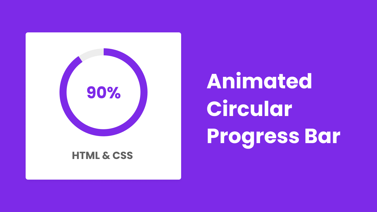
Hello friend, I hope you are doing and creating well. Today you are going to learn to create a Circular Progress Bar in HTML CSS & JavaScript only, I will not any SVG code. There are lots of Progress Bar I have created that are horizontally progressed. Today’s progress will be circular and it will also show the percentage that it has progressed.
Circular Progress Bar is the animation of a progressing bar in a circular motion and it is used to display information like skills in some field, knowledge, and as like this. You may have seen the circular progress bar on someone’s portfolio website, where they display the ability of something that they have in the percentage value.
Have a quick look at the given image of our project [Animated Circular Progress], on the webpage. As you have seen the bluish-purple color circle is not fully closed and inside it, the value of the circle or that shape has displayed. Actually when you refreshed the webpage that will start to progress from 0 and stops at 90%. Bottom of the circular progress bar there is the text “HTML & CSS”, For example, we can understand it, the knowledge of HTML & CSS is 90%
You can watch the real demo of this project [Animated Circular Progress], by watching the video tutorial that I have given below, and of course, you will also get the idea, of how HTM and CSS code work behind this circular progressing bar.
Create Circular Progress Bar | Skills Bar | Video Tutorial
I have provided all the HTML CSS and JavaScript code that I have used to create this Circular Progress Bar, before getting into the source code file, I would like to briefly explain the video tutorial.
As you have seen in the video tutorial of our project [Animated Circular Progress Bar] when I refreshed the webpage the circle and the percentage value, started to progress from zero. As you have seen in the video, to create all the circular progressing bars I used only HTML and CSS, I did not use any SVG code, and to animate it I used some JavaScript code.
I believe, that now you can build this project [Circular Progress Bar], by using HTML CSS, and JavaScript. If you are feeling difficulty building it. I have provided all the source code files below.
You Might Like This:
Circular Progress [Source Code]
<!DOCTYPE html>
<!-- Coding By CodingNepal - codingnepalweb.com -->
    <html lang="en">
    <head>
        <meta charset="UTF-8">
        <meta http-equiv="X-UA-Compatible" content="IE=edge">
        <meta name="viewport" content="width=device-width, initial-scale=1.0">
        <title> Circular Progress Bar </title>

        <!-- CSS -->
        <link rel="stylesheet" href="css/style.css">

    </head>
    <body>
        <div class="container">
            <div class="circular-progress">
                <span class="progress-value">0%</span>
            </div>

            <span class="text">HTML & CSS</span>
        </div>

        <!-- JavaScript -->
        <script src="js/script.js"></script>
    </body>
</html>
/* Google Fonts - Poppins */
@import url('https://fonts.googleapis.com/css2?family=Poppins:wght@300;400;500;600;700&display=swap');

*{
    margin: 0;
    padding: 0;
    box-sizing: border-box;
    font-family: 'Poppins', sans-serif;
}
body{
    height: 100vh;
    display: flex;
    align-items: center;
    justify-content: center;
    background: #7d2ae8;
}
.container{
    display: flex;
    width: 420px;
    padding: 50px 0;
    border-radius: 8px;
    background: #fff;
    row-gap: 30px;
    flex-direction: column;
    align-items: center;
}
.circular-progress{
    position: relative;
    height: 250px;
    width: 250px;
    border-radius: 50%;
    background: conic-gradient(#7d2ae8 3.6deg, #ededed 0deg);
    display: flex;
    align-items: center;
    justify-content: center;
}
.circular-progress::before{
    content: "";
    position: absolute;
    height: 210px;
    width: 210px;
    border-radius: 50%;
    background-color: #fff;
}
.progress-value{
    position: relative;
    font-size: 40px;
    font-weight: 600;
    color: #7d2ae8;
}
.text{
    font-size: 30px;
    font-weight: 500;
    color: #606060;
}
 let circularProgress = document.querySelector(".circular-progress"),
    progressValue = document.querySelector(".progress-value");

let progressStartValue = 0,
    progressEndValue = 90,
    speed = 100;

let progress = setInterval(() => {
    progressStartValue++;

    progressValue.textContent = `${progressStartValue}%`
    circularProgress.style.background = `conic-gradient(#7d2ae8 ${progressStartValue * 3.6}deg, #ededed 0deg)`

    if(progressStartValue == progressEndValue){
        clearInterval(progress);
    }
}, speed);


