Hello reader, I hope you are doing very well. Today we will learn to create Animated Popup Modal Box using HTML CSS and JavaScript. As you know previously I have created a modal by using HTML and CSS that you guys liked so much and some of you have requested me to create a popup modal box using JavaScript. So now we are going to build that popup modal box with beautiful animations.
Popup Modal Box is the special design or template that pops up when the user clicks or hover on the buttons, menu, or text content to show the importance of informative content to the users.
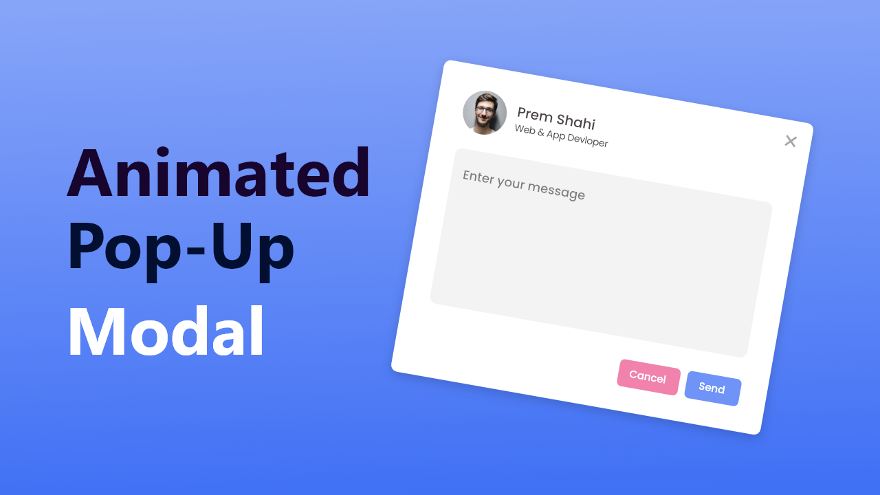
Let’s have a look at the given image of our projects [Animated Popup Modal Box], there is one image of someones with a name and his profession, at the right corner side of that we can see on the close button. In the middle, we can see one message box and two buttons are at the bottom side. Actually, this is the popup ed version of our projects the first interface is hidden form.
Rather than theoretically, I would highly recommend you to watch the video tutorial of our program [Popup Modal Box in HTML CSS & JavaScript], by watching this video tutorial you will know the real demo of our popup modal box and got all the ideas about HTML CSS and JavaScript code that I have used to create this beautiful popup modal box template with beautiful animation.
Popup Modal Box in HTML CSS & JavaScript | Video Tutorial.
I have provided all the HTML CSS and JavaScript codes that I have used to create this popup modal box, before getting into the source code file, you need to know some important explanation of this video tutorial of the pop-up modal box.
As you have seen on the video tutorial, at first there is an image with name, profession and hire me button. When I clicked on the button our popup modal box is appears with beautiful scale-up animation. The UI design is made by using HTML CSS and to show and hide that popup box I have used a few lines of JavaScript. You can also hide and that popup by using HTML and CSS only.
If you are wondering to build this popup modal box by using HTML and CSS, I have already published that popup of modal with source code and you can go for it. Source code for this program, you will get below.
You Might Like This:
Popup Modal Box [Source Code]
<!DOCTYPE html>
<!-- Coding By CodingNepal - codingnepalweb.com -->
<html lang="en">
<head>
    <meta charset="UTF-8">
    <meta http-equiv="X-UA-Compatible" content="IE=edge">
    <meta name="viewport" content="width=device-width, initial-scale=1.0">
     <title>Popup Modal Box</title>
    <link rel="stylesheet" href="style.css">
    <!-- Fontawesome CDN Link -->
    <link rel="stylesheet" href="https://cdnjs.cloudflare.com/ajax/libs/font-awesome/6.0.0-beta3/css/all.min.css"/>

    <!-- Boxicons CSS -->
    <link href='https://unpkg.com/[email protected]/css/boxicons.min.css' rel='stylesheet'>
</head>
<body>
      <section>
          <div class="profile">
              <div class="profile-img">
                  <!--<img src="profile.jpg" alt="">-->
              </div>
              <span class="name">Prem Shahi</span>
              <span class="profession">Web & App Designer</span>
              <div class="button">
                <i class='bx bxs-envelope'></i>
                <button>Hire Me</button>
              </div>
          </div>
          <div class="popup-outer">
              <div class="popup-box">
                <i id="close" class='bx bx-x close'></i>
                  <div class="profile-text">
                      <!--<img src="profile.jpg" alt="">-->
                      <div class="text">
                          <span class="name">Prem Shahi</span>
                          <span class="profession">Web & App Designer</span>
                      </div>
                  </div>
                  <textare placeholder="Enter your message"></textare>
                  <div class="button">
                      <button id="close" class="cancel">Cancel</button>
                      <button class="send">Send</button>
                  </div>
              </div>
          </div>
      </section>

    <script src="script.js"></script>
</body>
</html>
@import url('https://fonts.googleapis.com/css2?family=Poppins:wght@300;400;500;600;700&display=swap');
*{
    margin: 0;
    padding: 0;
    box-sizing: border-box;
    font-family: 'Poppins', sans-serif;
}
body{
    overflow: hidden;
}
section{
    height: 100vh;
    width: 100%;
    display: flex;
    align-items: center;
    justify-content: center;
    overflow: hidden;
}
section .profile{
    display: flex;
    flex-direction: column;
    align-items: center;
}
section.active .profile{
    display: none;
}
.profile .profile-img{
    background-color: #4070F4;
    padding: 2px;
    border-radius: 50%;
    height: 100px;
    width: 100px;
    margin-bottom: 10px;
}
.profile .profile-img img{
    height: 100%;
    width: 100%;
    object-fit: cover;
    border: 3px solid #fff;
    border-radius: 50%;
}
.profile .name{
    font-size: 18px;
    font-weight: 500;
    color: #333;
}
.profile .profession{
    font-size: 18px;
    font-weight: 400;
    margin-top: -6px;
    color: #333;
}
.profile .button{
    display: flex;
    align-items: center;
    background: #4070f4;
    padding: 12px 20px;
    border-radius: 6px;
    margin-top: 15px;
    transition: all 0.3s ease;
    cursor: pointer;
}
.profile .button:hover{
    background: #275df1;
}
.profile .button i{
    font-size: 18px;
    margin-right: 5px;
    color: #fff;
}
.profile .button button{
    background: none;
    display: inline-block;
    outline: none;
    border: none;
    color: #fff;
    cursor: pointer;
    font-size: 16px;
}
/* pop up box styling */
section .popup-outer{
    display: flex;
    align-items: center;
    justify-content: center;
    height: 100%;
    width: 100%;
    background: rgba(0,0,0,0.3);
    position: absolute;
    opacity: 0;
    pointer-events: none;
    box-shadow: 0px 10px 15px rgba(0,0,0,0.1);
    transform: scale(1.2);
    transition: opacity 0.2s 0s ease-in-out,
                transform 0.2s 0s ease-in-out;
}
section.active .popup-outer{
    opacity: 1;
    pointer-events: auto;
    transform: scale(1);
}
section .popup-box{
    position: relative;
    background: #fff;
    border-radius: 12px;
    padding: 30px;
    max-width: 380px;
    width: 100%;
}
.popup-box .close{
    position: absolute;
    top: 16px;
    right: 16px;
    font-size: 24px;
    color: #b4b4b4;
    transition: all 0.2s ease;
    cursor: pointer;
}
.popup-box .close:hover{
    color: #333;
}
.popup-box .profile-text{
    display: flex;
    margin-bottom: 20px;
    align-items: center;
}
.popup-box .profile-text .text{
    display: flex;
    flex-direction: column;
    margin-left: 15px;
}
.profile-text .text .name{
    font-size: 14px;
    font-weight: 400;
}
.profile-text .text .profession{
    font-size: 12px;
    font-weight: 500;
    margin-top: -4px;
}
 .popup-box img{
    height: 60px;
    width: 60px;
    object-fit: cover;
    border-radius: 50%;
}
.popup-box textarea{
    min-height: 140px;
    width: 100%;
    resize: none;
    outline: none;
    border: 1px solid #ddd;
    border-radius: 6px;
    font-size: 14px;
    padding: 10px 10px 10px 14px;
    font-weight: 400;
    background: #f3f3f3;
}
.popup-box .button{
    display: flex;
    justify-content: flex-end;
}
.popup-box .button button{
    outline: none;
    border: none;
    margin-left: 10px;
    background: #6f93f6;
    padding: 6px 12px;
    border-radius: 4px;
    margin-top: 15px;
    transition: all 0.3s ease;
    cursor: pointer;
    color: #fff;
    font-size: 14px;
    transition: all 0.3s ease;
}
.button button.cancel{
    background: #f082ac;
}
.button button.cancel:hover{
    background: #ec5f95;
}
.button button.send:hover{
    background: #275df1;
}
const section = document.querySelector("section"),
hireBtn = section.querySelector("#hireBtn"),
closeBtn = section.querySelectorAll("#close"),
textArea = section.querySelector("textarea");

hireBtn.addEventListener("click" , () =>{
  section.classList.add("show");
});

closeBtn.forEach(cBtn => {
  cBtn.addEventListener("click" , ()=>{
      section.classList.remove("show");
      textArea.value = "";
  });
});
If you face any difficulties while creating your Animated Popup Modal Box or your code is not working as expected, you can download the source code files for this Modal Box for free by clicking on the download button, and you can also view a live demo of this card slider by clicking on the view live button.







Please make a tutorial on pop-up notification in html css and JavaScript
js files nahi mil rahi he bhai…