Hello friend, I hope you are doing awesome. Today here I have shown how to create a Navigation Menu with Indicator Bar using HTML CSS and JavaScript. As you know there are lots of Responsive Navigation Menu bar that I have created.
We have seen the various type of navbar hover animation on there. Today we are going to create clickable navigation links with beautifully animated indicators.
A navigation menu bar is the collection of several navigation links which helps the user to redirect to the different section of the webpages and an indicator is the design that indicates uses to know in what nav links or page they are. The Navigation menu bar can be aligned horizontally or vertically that depending on website UI/UX designs and concepts.
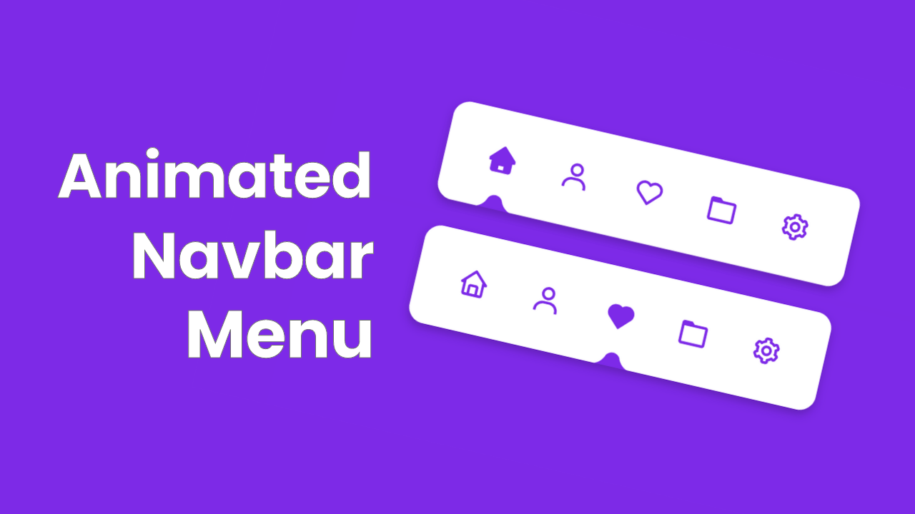
The navigation menu bar that we are going to build is specially designed for mobile devices. As you can see on the given image of our navigation menu bar with a beautiful indicator. This type of navigation bar is typically seen on the mobile devices at the bottom aligned.
Let’s have a look at the given image of our navbar menu with an indicator. There is a total of five nav links on that navigation bar with an indicator. In the first navigation bar, our first nav link is inactive condition. At the second navbar, the third nav link is in-active condition. Actually, when we click on any nav link, that indicator moves to that clicked nav links icon, and also ion changes into a solid color.
Rather than theoretically, I would like to show you the virtual demo of this Navigation Menu with Indicator. Also plus point for you is, you will know what HTML CSS and JavaScript codes I used and how they work perfectly.
Video Tutorial of Navigation Bar with Indicator
You will get all the HTML CSS and JavaScript source code that I have used to create this Animated Navigation Menu with Indicator. Before jumping to the source code, you need to know some basic points of this video tutorial.
As you have seen on the given video tutorial of this Animated Navbar Menu with Indicator. At first, we have seen the first we have seen five nav links icons and one indicator. The first nav link is in-active condition. Because that icon is different from the other four nav links and also indicator is at the bottom of the icon.
When I click on the other icon the indicator is slides to that clicked icon and the icon is changed into a different color. Actually, there are 10 icons, five are solid shapes and 5 are regular shapes. To create that curved shape on the indicator I used before and after CSS property and box-shadow. The UI design is made by HTML and CSS only. To change the icon from regular to solid and to slide the indicator I used some JavaScript.
I have provided all the HTML CSS and JavaScript code of this animated navigation menu bar with a beautiful indicator.
You Might Like This:
- Side Navigation Menu Bar
- Responsive Navigation Bar
- All Hamburger Menu Animation
- All Navbar Menu Hover Animation
Navigation Menu with Indicator [Source Code]
<!DOCTYPE html>
<!-- Coding By CodingNepal - codingnepalweb.com -->
<html lang="en" dir="ltr">
  <head>
    <meta charset="UTF-8">
     <title> Navigation Menu with Indicator | CodingLab </title>
    <link rel="stylesheet" href="style.css">
    <!-- Boxicons CSS -->
    <link href='https://unpkg.com/[email protected]/css/boxicons.min.css' rel='stylesheet'>
   </head>
<body>
  <div class="navbar">
    <ul>
      <li class="active">
        <a href="#">
          <i class='bx bx-home icon'></i>
          <i class='bx bxs-home activeIcon'></i>
        </a>
      </li>
      <li>
        <a href="#">
          <i class='bx bx-user icon'></i>
          <i class='bx bxs-user activeIcon'></i>
        </a>
      </li>
      <li>
        <a href="#">
          <i class='bx bx-heart icon'></i>
          <i class='bx bxs-heart activeIcon'></i>
        </a>
      </li>
      <li>
        <a href="#">
          <i class='bx bx-folder icon'></i>
          <i class='bx bxs-folder activeIcon'></i>
        </a>
      </li>
      <li>
        <a href="#">
          <i class='bx bx-cog icon'></i>
          <i class='bx bxs-cog activeIcon'></i>
        </a>
      </li>
      <div class="indicator"></div>
    </ul>
  </div>

  <script>

  const navBar = document.querySelector(".navbar")
        allLi = document.querySelectorAll("li");

  allLi.forEach((li, index) => {
     li.addEventListener("click" , e =>{
       e.preventDefault(); //preventing from submitting
       navBar.querySelector(".active").classList.remove("active");
       li.classList.add("active");

       const indicator = document.querySelector(".indicator");
       indicator.style.transform = `translateX(calc(${index * 90}px))`;
     });
  });

  </script>

</body>
</html>
*{
  margin: 0;
  padding: 0;
  box-sizing: border-box;
  font-family: 'Poppins', sans-serif;
}
body{
  height: 100vh;
  display: flex;
  align-items: center;
  justify-content: center;
  background: #7d2ae8;
}
.navbar{
  position: relative;
  height: 120px;
  width: 500px;
  background: #fff;
  border-radius: 20px;
  display: flex;
  align-items: center;
  justify-content: center;
  overflow: hidden;
  box-shadow: 0 5px 10px rgba(0, 0, 0, 0.2);
}
.navbar ul{
  position: relative;
  display: flex;
}
.navbar ul li{
  position: relative;
  list-style-type: none;
}
.navbar ul li a{
  position: relative;
  height: 120px;
  width: 90px;
  display: flex;
  align-items: center;
  justify-content: center;
  text-decoration: none;
}
.navbar ul li a i{
  position: absolute;
  font-size: 38px;
  color: #7d2ae8;
}
ul li a i.activeIcon{
  opacity: 0;
  pointer-events: none;
  transition: all 0.6s ease;
  transition-delay: 0.2s;
}
.navbar ul li.active a i{
  opacity: 1;
  pointer-events: auto;
}
.navbar ul .indicator{
  position: absolute;
  bottom: -19px;
  left: 34px;
  height: 36px;
  width: 25px;
  background: #7d2ae8;
  border-radius: 50%;
  transition: all 0.5s cubic-bezier(0.68, -0.55, 0.265, 1.55);
}
ul .indicator::before{
  content: "";
  position: absolute;
  left: -15px;
  bottom: 50%;
  height: 22px;
  width: 20px;
  background: #fff;
  border-bottom-right-radius: 20px;
  box-shadow: 0 10px 0 #7d2ae8;
}
ul .indicator::after{
  content: "";
  position: absolute;
  right: -15px;
  bottom: 50%;
  height: 22px;
  width: 20px;
  background: #fff;
  border-bottom-left-radius: 20px;
  box-shadow: 0 10px 0 #7d2ae8;
}
If you face any difficulties while creating your Navigation Bar or your code is not working as expected, you can download the source code files for this Navbar Menu for free by clicking on the download button, and you can also view a live demo of this card slider by clicking on the view live button.


I think your design is very good for research and samples
and Thanks for sharing
Regardas
S.B
I think that your coding is very good
and thanks a lot for sharing
Regards
S>B
You are just the god of design coding