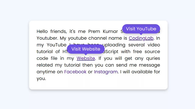
Hello readers, welcome to my other blog of CSS Hover Animation. Today in this blog, We will learn to create a tooltip hover animation on navigation links. Already I have created lots of video tutorials of CSS Hover Animation On Image but today we will create something different and unique design.
Hover animation means the type of motion or transition that happens in the elements while we take cursor on them. Animation can be anything like changing element color, background color, changing element’s size, and others.
I have given an image on the top of this webpage that you can see. There is a total of four navigation links, the first two navigation are in hovered form. Basically, when we hover on those navigation links beautiful tooltip, appears with text in a smooth animation, all navigation links have their different text.
If you want to see the real example of this programming and want to see every code that I have used to build this design, please do watch the full video tutorial that I have given below.
Tutorial of Navigation Links Hover Animation in HTML CSS
As you have seen in the video tutorial of CSS hover animation. At first, all navigation links are hover animation in blue color, when I hovered on those navigation links tooltip appears with beautiful animation and text. All navigation links have different text as their topic. To create this program I have used only HTML & CSS.
Those friends who are familiar with HTML & CSS can easily create this hover animation, for those friends who are feeling difficulty building this hover animation, I have provided full source code files below. You can copy or download code and files from there.
You May Like This:
Navigation Links Hover Animation [Source Code]
To copy-paste the given code of this tooltip hover animation, first, you need to create two files, one is an HTML file and another is a CSS file. After creating these two files then you can copy-paste the given code of this hover animation in your document. You can also download all source code files from the given download button.
<!DOCTYPE html>
<!-- Coding by CodingNepal | www.codingnepalweb.com -->
<html lang="en" dir="ltr">
  <head>
    <meta charset="UTF-8">
    <title> Navigation Links Hover Animation | CodingLab </title>
    <link rel="stylesheet" href="style.css">
    <!-- Fontawesome CDN Link -->
    <link rel="stylesheet" href="https://cdnjs.cloudflare.com/ajax/libs/font-awesome/5.15.2/css/all.min.css"/>
     <meta name="viewport" content="width=device-width, initial-scale=1.0">
   </head>
<body>
  <div class="container">
    <p>Hello friends, it's me Prem Kumar Shahi and I'm a Youtuber.
    My youtube channel name is <a href="#">CodingLab<span>Visit YouTube</span></a>.
    In my YouTube I have been uploading several video tutorial of HTML CSS & JavaScript
    with free source code file in my <a href="#">Website <span>Visit Website</span></a>.
    If you will get any quries related my tutorial then you can send me message anytime on <a href="#">Facebook<span>Visit Facebook</span></a> or <a href="#">Instagram<span>Visit Instagram</span></a>. I will available for you.</p>
  </div>
</body>
</html>
/* Google Font Import Link */
@import url('https://fonts.googleapis.com/css2?family=Poppins:wght@200;300;400;500;600;700&display=swap');
*{
  margin: 0;
  padding: 0;
  box-sizing: border-box;
  font-family: 'Poppins', sans-serif;
}
body{
  display: flex;
  min-height: 100vh;
  align-items: center;
  justify-content: center;
  background: #F4F7FF;
}
.container{
  max-width: 550px;
  margin: 0 20px;
  background: #fff;
  box-shadow: 0 5px 10px rgba(0, 0, 0, 0.2);
  padding: 40px 40px;
  border-radius: 12px;
  /* transform: scale(); */
}
.container p{
  font-size: 18px;
  font-weight: 400;
  text-align: justify;
}
.container p a{
  position: relative;
  text-decoration: none;
}
.container p  a span{
  position: absolute;
  white-space: nowrap;
  padding: 6px 15px;
  background: #6d50e2;
  border-radius: 25px;
  text-align: center;
  color: #fff;
  font-size: 16px;
  top: -44px;
  left: 50%;
  transform: translate(-40% , -20px);
  opacity: 0;
  pointer-events: none;
  transition: all 0.3s ease;
  box-shadow: 0 5px 10px rgba(0, 0, 0, 0.2);
}
.container p a:hover span{
  opacity: 1;
  pointer-events: auto;
  transform: translate(-50% , 0);
}
.container p span::before{
  content: ' ';
  position: absolute;
  height: 15px;
  width: 15px;
  background: #6d50e2;
  bottom: -6px;
  left: 50%;
  z-index: -1;
  transform: translate(-50%) rotate(45deg);
}
.container p a:hover{
  text-decoration: underline;
}


Cool