For both users and the website’s creator, the Navigation Bar has emerged as its most crucial element. Did you know that even the most crucial elements of a website may be created using simple HTML, CSS, and JavaScript code?
If you’re looking for a responsive navigation bar with a search box then you are in right place. Even if you only know the fundamentals of HTML and CSS, then also you will be able to make a navigation bar. Recently I have provided the Top 10 Best CSS Animations I hope that blog will also help you to boost your CSS skills.
A navigation bar is a section that is located at the top of a website and contains the logo, essential navigation links, and other items as needed for the website’s functionality. In essence, navigation facilitates user flow from one page to another.
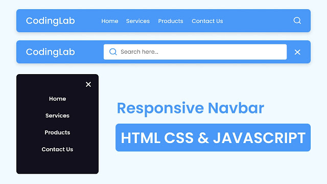
Take a brief look at the picture of our navigation menu bar. You can see that I tried to present a general idea of the Navigation Bar there. As you can see, this navigation bar will also have a search bar with a responsive feature.
The demonstration of this Navigation Bar is now available in the provided video instruction. You should try to design this navigation menu step-by-step by following the instructions in the provided video tutorial. This will make the process easier for you.
Navigation Bar in HTML CSS & JS | Video Tutorial
In the video tutorial for this responsive navigation bar, as you have seen. The top of the page had a navigation bar. The menu bar featured a logo, a few links, and a search bar. A search bar emerged when I clicked the search symbol, and all of the navigation links vanished. I’ve also demonstrated the complete responsiveness of this navigation.
I believe, now you can make this Navigation Bar in HTML CSS & JavaScript without using bootstrap. If you are feeling difficulty creating this Navigation Menu then I have provided all the source codes that I used to create it.
You May Like This:
- Navigation Bar in HTML & CSS
- Dropdown Navigation Bar in HTML & CSS
- Side Navigation Bar in HTML CS & JavaScript
Navigation Bar HTML CSS & JS [Source Code]
- Create a folder. You can name this folder whatever you want, and inside this folder, create the mentioned files.
- Create an
index.htmlfile. The file name must be index and its extension .html - Create a
style.cssfile. The file name must be style and its extension .css - Create a
script.jsfile. The file name must be script and its extension .js
Once you create these files, paste the given codes into the specified files. If you don’t want to do these then scroll down and download the Navigation Bar HTML CSS & JavaScript by clicking on the given download button.
First, paste the following codes into your index.html file.
<!DOCTYPE html>
<!-- Coding By CodingNepal - codingnepalweb.com -->
<html lang="en">
  <head>
    <meta charset="UTF-8" />
    <meta http-equiv="X-UA-Compatible" content="IE=edge" />
    <meta name="viewport" content="width=device-width, initial-scale=1.0" />
    <title>Navigation Bar with Search Box</title>
    <link rel="stylesheet" href="style.css" />
    <!-- Unicons CSS -->
    <link rel="stylesheet" href="https://unicons.iconscout.com/release/v4.0.0/css/line.css" />
   <script src="script.js" defer></script>
  </head>
  <body>
    <nav class="nav">
      <i class="uil uil-bars navOpenBtn"></i>
      <a href="#" class="logo">CodingLab</a>

      <ul class="nav-links">
        <i class="uil uil-times navCloseBtn"></i>
        <li><a href="#">Home</a></li>
        <li><a href="#">Services</a></li>
        <li><a href="#">Products</a></li>
        <li><a href="#">About Us</a></li>
        <li><a href="#">Contact Us</a></li>
      </ul>

      <i class="uil uil-search search-icon" id="searchIcon"></i>
      <div class="search-box">
        <i class="uil uil-search search-icon"></i>
        <input type="text" placeholder="Search here..." />
      </div>
    </nav>
  </body>
</html>
Second, paste the following codes into your style.css file.
/* Google Fonts - Poppins */
@import url("https://fonts.googleapis.com/css2?family=Poppins:wght@300;400;500;600&display=swap");

* {
  margin: 0;
  padding: 0;
  box-sizing: border-box;
  font-family: "Poppins", sans-serif;
}
body {
  background: #f0faff;
}
.nav {
  position: fixed;
  top: 0;
  left: 0;
  width: 100%;
  padding: 15px 200px;
  background: #4a98f7;
  box-shadow: 0 4px 10px rgba(0, 0, 0, 0.1);
}
.nav,
.nav .nav-links {
  display: flex;
  align-items: center;
}
.nav {
  justify-content: space-between;
}
a {
  color: #fff;
  text-decoration: none;
}
.nav .logo {
  font-size: 22px;
  font-weight: 500;
}
.nav .nav-links {
  column-gap: 20px;
  list-style: none;
}
.nav .nav-links a {
  transition: all 0.2s linear;
}
.nav.openSearch .nav-links a {
  opacity: 0;
  pointer-events: none;
}
.nav .search-icon {
  color: #fff;
  font-size: 20px;
  cursor: pointer;
}
.nav .search-box {
  position: absolute;
  right: 250px;
  height: 45px;
  max-width: 555px;
  width: 100%;
  opacity: 0;
  pointer-events: none;
  transition: all 0.2s linear;
}
.nav.openSearch .search-box {
  opacity: 1;
  pointer-events: auto;
}
.search-box .search-icon {
  position: absolute;
  left: 15px;
  top: 50%;
  left: 15px;
  color: #4a98f7;
  transform: translateY(-50%);
}
.search-box input {
  height: 100%;
  width: 100%;
  border: none;
  outline: none;
  border-radius: 6px;
  background-color: #fff;
  padding: 0 15px 0 45px;
}

.nav .navOpenBtn,
.nav .navCloseBtn {
  display: none;
}

/* responsive */
@media screen and (max-width: 1160px) {
  .nav {
    padding: 15px 100px;
  }
  .nav .search-box {
    right: 150px;
  }
}
@media screen and (max-width: 950px) {
  .nav {
    padding: 15px 50px;
  }
  .nav .search-box {
    right: 100px;
    max-width: 400px;
  }
}
@media screen and (max-width: 768px) {
  .nav .navOpenBtn,
  .nav .navCloseBtn {
    display: block;
  }
  .nav {
    padding: 15px 20px;
  }
  .nav .nav-links {
    position: fixed;
    top: 0;
    left: -100%;
    height: 100%;
    max-width: 280px;
    width: 100%;
    padding-top: 100px;
    row-gap: 30px;
    flex-direction: column;
    background-color: #11101d;
    box-shadow: 0 2px 10px rgba(0, 0, 0, 0.1);
    transition: all 0.4s ease;
    z-index: 100;
  }
  .nav.openNav .nav-links {
    left: 0;
  }
  .nav .navOpenBtn {
    color: #fff;
    font-size: 20px;
    cursor: pointer;
  }
  .nav .navCloseBtn {
    position: absolute;
    top: 20px;
    right: 20px;
    color: #fff;
    font-size: 20px;
    cursor: pointer;
  }
  .nav .search-box {
    top: calc(100% + 10px);
    max-width: calc(100% - 20px);
    right: 50%;
    transform: translateX(50%);
    box-shadow: 0 2px 10px rgba(0, 0, 0, 0.1);
  }
}
Third, paste the following codes into your script.js file.
const nav = document.querySelector(".nav"),
  searchIcon = document.querySelector("#searchIcon"),
  navOpenBtn = document.querySelector(".navOpenBtn"),
  navCloseBtn = document.querySelector(".navCloseBtn");

searchIcon.addEventListener("click", () => {
  nav.classList.toggle("openSearch");
  nav.classList.remove("openNav");
  if (nav.classList.contains("openSearch")) {
    return searchIcon.classList.replace("uil-search", "uil-times");
  }
  searchIcon.classList.replace("uil-times", "uil-search");
});

navOpenBtn.addEventListener("click", () => {
  nav.classList.add("openNav");
  nav.classList.remove("openSearch");
  searchIcon.classList.replace("uil-times", "uil-search");
});
navCloseBtn.addEventListener("click", () => {
  nav.classList.remove("openNav");
});
If you face any difficulties while creating your Navigation Menu Bar or your code is not working as expected, you can download the source code files for this Navbar Menu for free by clicking on the download button, and you can also view a live demo of this card slider by clicking on the view live button.


