Hello buddy, I believe that you are doing and creating incredible pieces of stuff. Today in this blog, you will learn to make Social Media Navigation Button in HTML CSS & JavaScript. I would like to tell you that I have created many projects about Media Icons and Hover animation. As with others, today’s project will be beneficial for all types of websites.
Social Media Navigation button is the Icon that acts like a button and helps the user to redirect particular webpage. For example, we can see on the website there is lots of social media icons like Facebook, Twitter, Instagram, and all and, when we click on the Facebook icons we are redirected to the Facebook website or application.
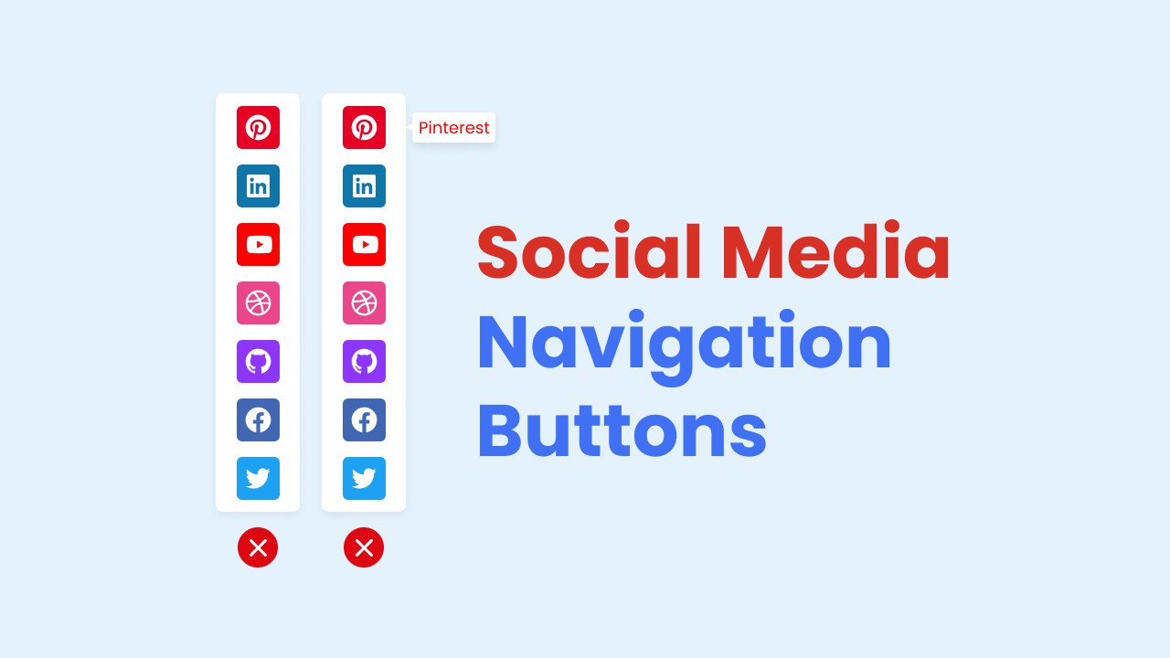
Have a quick look at the given image of our project [Social Media Navigation Button], On the image you can see a total of seven media icons, and at the bottom of those icons, there is a close button. Also, when we hover over that medial icon they indicate the name of the social media icon through the tooltip. Actually at first on the screen, those media icons will be hidden and there will be a icon. When clicking on that icon all the social media navigation button appears.
Let’s watch the give video tutorial of our project [Social Media Navigation Button], a demo of our project, and all the HTML CSS and JavaScript code that I have used to create this project.
Social Media Navigation Button in HTML CSS & JavaScript
I have provided all the HTML CSS and JavaScript codes that I have used to make this Social Media Navigation Button. Before getting into the source code file, I would like to explicate the given video tutorial shortly.
As you have seen in the video tutorial of our project [Social Media Navigation Button], there was a button with a plus icon, and all the social media nav buttons were hidden. When I clicked on the plus icon, all the social media navigation buttons appeared and the plus icon also changed into a cross. Similarly, when I again clicked on that cross icon all the media navigation buttons disappeared and the plus icon changed into a plus icon. When I hover over that icon those icons a tooltip appeared with the name of that icon.
To create the UI design and bring all font icons of that social media navigation menu button I have used HTML and CSS and to show and hide the median nav icon and change the plus and cross buttons I have used some javascript code.
Now I supposed that you can build this Social Media Navigation Button in HTML CSS and JavaScript. If you are feeling tough to create this, I have provided all the source code below.
You Might Like This:
Social Media Navigation Button [Source Code]
<!DOCTYPE html>
<!-- Coding by CodingLab | www.codinglabweb.com-->
<html lang="en">
  <head>
    <meta charset="UTF-8" />
    <meta http-equiv="X-UA-Compatible" content="IE=edge" />
    <meta name="viewport" content="width=device-width, initial-scale=1.0" />
    <!--<title>Social Media Navigation Buttons</title>-->
    <!-- CSS -->
    <link rel="stylesheet" href="css/style.css" />
    <!-- Fontawesome -->
    <link
      rel="stylesheet"
      href="https://cdnjs.cloudflare.com/ajax/libs/font-awesome/6.1.2/css/all.min.css"
    />
  </head>
  <body>
    <div class="container">
      <span class="close-btn">
        <i class="fa-solid fa-xmark"></i>
      </span>

      <div class="media-icons">
        <a href="#" style="background: #e60023">
          <i class="fa-brands fa-pinterest"></i>
          <span class="tooltip" style="color: #e60023">Pinterest</span>
        </a>
        <a href="#" style="background: #0e76a8">
          <i class="fa-brands fa-linkedin"></i>
          <span class="tooltip" style="color: #0e76a8">Linkedin</span>
        </a>
        <a href="#" style="background: #ff0000">
          <i class="fa-brands fa-youtube"></i>
          <span class="tooltip" style="color: #ff0000">YouTube</span>
        </a>
        <a href="#" style="background: #ea4689">
          <i class="fa-brands fa-dribbble"></i>
          <span class="tooltip" style="color: #ea4689">Dribbble</span>
        </a>
        <a href="#" style="background: #8e36ff">
          <i class="fa-brands fa-github"></i>
          <span class="tooltip" style="color: #8e36ff">Github</span>
        </a>
        <a href="#" style="background: #4267b2">
          <i class="fa-brands fa-facebook-f"></i>
          <span class="tooltip" style="color: #4267b2">Facebook</span>
        </a>
        <a href="#" style="background: #1da1f2">
          <i class="fa-brands fa-twitter"></i>
          <span class="tooltip" style="color: #1da1f2">Twitter</span>
        </a>
      </div>
    </div>

    <script>
      const closeBtn = document.querySelector(".close-btn");

      closeBtn.addEventListener("click", () => {
        closeBtn.classList.toggle("open");
      });
    </script>
  </body>
</html>
/* Google Fonts - Poppins */
@import url("https://fonts.googleapis.com/css2?family=Poppins:wght@300;400;500;600&display=swap");

* {
  margin: 0;
  padding: 0;
  box-sizing: border-box;
  font-family: "Poppins", sans-serif;
}
body {
  background: #e3f2fd;
}
.container {
  position: absolute;
  top: 50%;
  left: 0;
  transform: translateY(-50%);
  display: flex;
  flex-direction: column-reverse;
  align-items: center;
}
.media-icons {
  display: flex;
  align-items: flex-start;
  flex-direction: column;
  justify-content: center;
  background-color: #fff;
  padding: 6px;
  border-radius: 6px;
  box-shadow: 0 5px 10px rgba(0, 0, 0, 0.1);
  transform: translateX(-100%);
  transition: all 0.5s cubic-bezier(0.68, -0.55, 0.265, 1.55);
}
.close-btn.open ~ .media-icons {
  transform: translateX(0);
}
.media-icons a {
  text-decoration: none;
  position: relative;
  height: 35px;
  width: 35px;
  display: flex;
  align-items: center;
  justify-content: center;
  border-radius: 6px;
  margin: 6px;
}
.media-icons a i {
  color: #fff;
}
.media-icons a .tooltip {
  position: absolute;
  left: 55px;
  font-size: 14px;
  font-weight: 400;
  pointer-events: none;
  background-color: #fff;
  padding: 4px 8px;
  border-radius: 4px;
  transform: translateY(-25px);
  opacity: 0;
  transition: all 0.2s linear;
  box-shadow: 0 5px 10px rgba(0, 0, 0, 0.05);
}
a:hover .tooltip {
  opacity: 1;
  transform: translateY(0);
}
a .tooltip::before {
  content: "";
  position: absolute;
  height: 10px;
  width: 10px;
  top: 50%;
  left: -5px;
  transform: translateY(-50%) rotate(45deg);
  background-color: #fff;
}
.close-btn {
  display: flex;
  align-items: center;
  justify-content: center;
  height: 35px;
  width: 35px;
  border-radius: 50%;
  color: #fff;
  font-size: 18px;
  margin-top: 20px;
  background-color: #8e36ff;
  box-shadow: 0 5px 10px rgba(0, 0, 0, 0.1);
  cursor: pointer;
  transform: rotate(45deg);
  transition: all 0.5s cubic-bezier(0.68, -0.55, 0.265, 1.55);
}
.close-btn.open {
  transform: rotate(90deg);
  background-color: #de0611;
}
If you face any difficulties while creating your Social Media Navigation Buttons or your code is not working as expected, you can download the source code files for this Social Media Nav Buttons for free by clicking on the download button, and you can also view a live demo of this card slider by clicking on the view live button.


