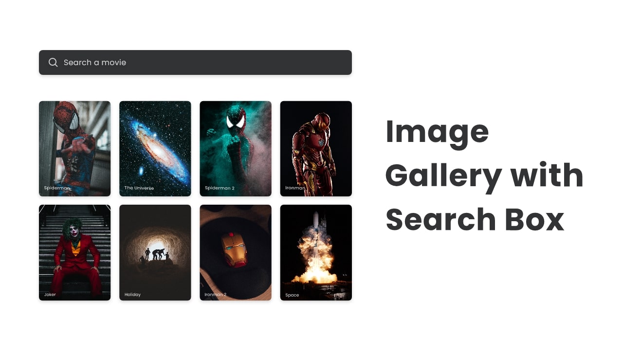
Hello friend, I hope you are doing awesome, today in this blog you are going to learn to create a responsive Image Gallery with a Search Box using HTML CSS, and JavaScript. Earlier I created a responsive Image Gallery with Lightbox and also Video Gallery with Lightbox.
An image gallery is the combination of more than two images and the search box is the field where users can search for the thing they want to watch in a faster way.
Let’s have a quick look at the given image or our Image gallery with a search box. On the Image, we can see a search box on the top and different types of images with different names underneath the search box. Basically, when we search the name of that image, only searched named images will appear on the screen.
I have provided the real demo of this tutorial [Image Gallery with Search Box], and also you can watch the HTML CSS, and JavaScript codes that I have used to create this project.
Image Gallery with Search Box in HTML CSS & JavaScript
I have provided all the HTML CSS and JavaScript code that I have used to create this Image Gallery with Search Box, before jumping into the source code files, I would like to quickly explain the given video tutorial.
As you have seen in the video tutorial, first we have seen a search box and lots of images with the movie names. When I typed one movie name on the search box and pressed enter then only those images were visible, that have those names. And when I removed the name from the search box all images appeared.
To make the image gallery and search box I have used HTML and CSS, and to make a working search box to search the images I have used some JavaScript codes.
Now I believe, you can make this Imaged gallery with Searchbox easily, If you are feeling difficulty building this project, I have provided all the HTML CSS, and JavaScript code below:
You Might Like This:
Image Gallery with Search Box [Source Code]
<!DOCTYPE html>
<!-- Coding By CodingNepal - codingnepalweb.com -->
<html lang="en">
<head>
    <meta charset="UTF-8">
    <meta http-equiv="X-UA-Compatible" content="IE=edge">
    <meta data-name="viewport" content="width=device-width, initial-scale=1.0">

    <!----======== CSS ======== -->
    <link rel="stylesheet" href="style.css">

    <!--===== Boxicons CSS =====-->
    <link href='https://unpkg.com/[email protected]/css/boxicons.min.css' rel='stylesheet'>

    <title>Image Gallery with Search Box</title>
</head>
<body>
    <div class="container">
        <div class="search-box">
            <i class="bx bx-search"></i>
            <input type="text" placeholder="Search a movie">
        </div>

        <div class="images">
            <div class="image-box" data-name="spiderman">
                <!--<img src="images/spiderman.jpg" alt="">-->
                <h6>spiderman</h6>
            </div>
            <div class="image-box" data-name="joker">
                <!--<img src="images/joker.jpg" alt="">-->
                <h6>joker</h6>
            </div>
            <div class="image-box" data-name="ironman">
                <!--<img src="images/ironman.jpg" alt="">-->
                <h6>ironman</h6>
            </div>
            <div class="image-box" data-name="passenger">
                <!--<img src="images/passenger.jpg" alt="">-->
                <h6>passenger</h6>
            </div>
            <div class="image-box" data-name="space">
                <!--<img src="images/space.jpg" alt="">-->
                <h6>the space</h6>
            </div>
            <div class="image-box" data-name="spiderman">
                <!--<img src="images/spiderman2.jpg" alt="">-->
                <h6>spiderman 2</h6>
            </div>
            <div class="image-box" data-name="universe">
                <!--<img src="images/universe.jpg" alt="">-->
                <h6>the universe</h6>
            </div>
            <div class="image-box" data-name="spiderman">
                <!--<img src="images/spiderman3.jpg" alt="">-->
                <h6>spiderman 3</h6>
            </div>
            <div class="image-box" data-name="holiday">
                <!--<img src="images/holiday.jpg" alt="">-->
                <h6>holiday</h6>
            </div>
            <div class="image-box" data-name="ironman">
                <!--<img src="images/ironman2.jpg" alt="">-->
                <h6>ironman 2</h6>
            </div>
        </div>
    </div>

    <script src="script.js"></script>
</body>
</html>
/* ===== Google Font Import - Poppins ===== */
@import url('https://fonts.googleapis.com/css2?family=Poppins:wght@200;300;400;500;600&display=swap');
*{
    margin: 0;
    padding: 0;
    box-sizing: border-box;
    font-family: 'Poppins', sans-serif;
}
.container{
    position: relative;
    min-height: 100vh;
    max-width: 1000px;
    width: 100%;
    margin: 0 auto;
    padding: 40px 20px;
}
.container .search-box{
    position: relative;
    height: 42px;
    max-width: 400px;
    margin: 0 auto;
    margin-bottom: 40px;
}
.search-box input{
    position: absolute;
    height: 100%;
    width: 100%;
    outline: none;
    border: none;
    background-color: #323334;
    padding: 0 15px 0 45px;
    color: #fff;
    border-radius: 6px;
}
.search-box i{
    position: absolute;
    z-index: 2;
    color: #999;
    top: 50%;
    left: 15px;
    font-size: 20px;
    transform: translateY(-50%);
}
.container .images .image-box{
    position: relative;
    height: 300px;
    width: 210px;
    border-radius: 6px;
    overflow: hidden;
}
.images{
    width: 100%;
    display: flex;
    justify-content: center;
    flex-wrap: wrap;
}
.images .image-box{
    margin: 8px;
}
.images .image-box img{
    height: 100%;
    width: 100%;
    border-radius: 6px;
    transition: transform 0.2s linear;
}
.image-box:hover img{
    transform: scale(1.05);
}
.image-box h6{
    position: absolute;
    bottom: 10px;
    left: 10px;
    color: #fff;
    font-size: 12px;
    font-weight: 400;
    text-transform: capitalize;
}
const search = document.querySelector(".search-box input"),
      images = document.querySelectorAll(".image-box");

search.addEventListener("keyup", e =>{
    if(e.key == "Enter"){
        let searcValue = search.value,
            value = searcValue.toLowerCase();
            images.forEach(image =>{
                if(value === image.dataset.name){ //matching value with getting attribute of images
                    return image.style.display = "block";
                }
                image.style.display = "none";
         });
    }
});

search.addEventListener("keyup", () =>{
    if(search.value != "") return;

    images.forEach(image =>{
        image.style.display = "block";
    })
})
If you face any difficulties while creating your Responsive Image Gallery or your code is not working as expected, you can download the source code files for this Image Gallery for free by clicking on the download button, and you can also view a live demo of this card slider by clicking on the view live button.


sir please this image click after open pdf file