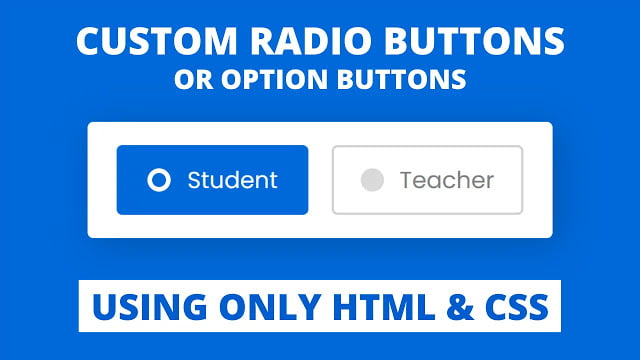
Hello readers, Today in this blog you’ll learn how to create the Custom Radio Buttons using only HTML & CSS. Earlier I’ve shared a blog on how to create the Custom Checkbox or Toggle On/Off Switch using only HTML & CSS and now it’s time to create a radio button.
A radio button or option button is one type of selection indicator or button that allows the user to choose only one option in a form list. In the radio button, if an option is selected, the circle is filled to inform the user, that option is selected.
In this program [Custom Radio Buttons], there are two options on the webpage labeled as Student and Teacher. The student option is selected by default and when you select the second option, the background color of this option will be changed and a circle is filled with animation as you can see in the image. If you’re feeling difficult to understand what I am saying. You can watch a full video tutorial on this program [Custom Radio Buttons].
Video Tutorial of Custom Radio Buttons or Option Buttons
In the video, you’ve seen the custom radio or option buttons. As you know, this is a pure CSS program that means only HTML & CSS are used to create these buttons. To make these buttons, I used HTML <input type=”radio”> and <label> tags. You can also use the radio tag only to create a custom radio button but I used a label tag to control the radio button on text or label click.
If you want to control the <input type=”radio”> with <label> then you need to pass the id name of radio tag inside for attribute of the label tag like this <input type=”radio” name=”select” id=”option-1″> and <label for=”option-1″></label>. You’re thinking about why I used name attribute in radio tag, if you want, the user can select only one option in a form then this name attribute value must be the same as all other radio tags.
You might like this:
Custom Radio Buttons or Option Buttons [Source Codes]
To create this program (Custom Radio Buttons). First, you need to create two Files one HTML File and another one is CSS File. After creating these files just paste the following codes in your file.
First, create an HTML file with the name of index.html and paste the given codes in your HTML file. Remember, you’ve to create a file with .html extension.
<!DOCTYPE html>
<!-- Created By CodingNepal -->
<html lang="en" dir="ltr">
  <head>
    <meta charset="utf-8">
    <title>Custom Radio Buttons | CodingLab</title>
    <link rel="stylesheet" href="style.css">
  </head>
  <body>
    <div class="wrapper">
      <input type="radio" name="select" id="option-1" checked>
      <input type="radio" name="select" id="option-2">
      <label for="option-1" class="option option-1">
        <div class="dot"></div>
        <span>Student</span>
      </label>
      <label for="option-2" class="option option-2">
        <div class="dot"></div>
        <span>Teacher</span>
      </label>
    </div>

  </body>
</html>
Second, create a CSS file with the name of style.css and paste the given codes in your CSS file. Remember, you’ve to create a file with .css extension.
@import url('https://fonts.googleapis.com/css?family=Poppins:400,500,600,700&display=swap');
*{
  margin: 0;
  padding: 0;
  box-sizing: border-box;
  font-family: 'Poppins', sans-serif;
}
html,body{
  display: grid;
  height: 100%;
  place-items: center;
  background: #0069d9;
}
.wrapper{
  display: inline-flex;
  background: #fff;
  height: 100px;
  width: 400px;
  align-items: center;
  justify-content: space-evenly;
  border-radius: 5px;
  padding: 20px 15px;
  box-shadow: 5px 5px 30px rgba(0,0,0,0.2);
}
.wrapper .option{
  background: #fff;
  height: 100%;
  width: 100%;
  display: flex;
  align-items: center;
  justify-content: space-evenly;
  margin: 0 10px;
  border-radius: 5px;
  cursor: pointer;
  padding: 0 10px;
  border: 2px solid lightgrey;
  transition: all 0.3s ease;
}
.wrapper .option .dot{
  height: 20px;
  width: 20px;
  background: #d9d9d9;
  border-radius: 50%;
  position: relative;
}
.wrapper .option .dot::before{
  position: absolute;
  content: "";
  top: 4px;
  left: 4px;
  width: 12px;
  height: 12px;
  background: #0069d9;
  border-radius: 50%;
  opacity: 0;
  transform: scale(1.5);
  transition: all 0.3s ease;
}
input[type="radio"]{
  display: none;
}
#option-1:checked:checked ~ .option-1,
#option-2:checked:checked ~ .option-2{
  border-color: #0069d9;
  background: #0069d9;
}
#option-1:checked:checked ~ .option-1 .dot,
#option-2:checked:checked ~ .option-2 .dot{
  background: #fff;
}
#option-1:checked:checked ~ .option-1 .dot::before,
#option-2:checked:checked ~ .option-2 .dot::before{
  opacity: 1;
  transform: scale(1);
}
.wrapper .option span{
  font-size: 20px;
  color: #808080;
}
#option-1:checked:checked ~ .option-1 span,
#option-2:checked:checked ~ .option-2 span{
  color: #fff;
}
If you face any difficulties while creating your Custom Radio Button or your code is not working as expected, you can download the source code files for this Custom Radio Button for free by clicking on the download button, and you can also view a live demo of this card slider by clicking on the view live button.


