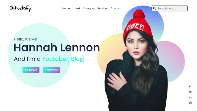
Hello guys, today in this blog you will learn to create a Website With Typing Text Animation using HTML & CSS. As you know, in my earlier blog I have shared how to create a Simple Website in HTML & CSS, also I will add some essential features to this website that we had a skip in the previous website design.
Website is the combination of various webpages and it contains articles, images hyperlinks, navigation menus, and so many other things. We can find various types of website on the internet, some give us news, text article, some sells us products, and some provide us jokes also. The website could be different in design and contains but they are built to fulfill user’s needs.
As you see on the given image of the website on the webpage. Basically website header looks like this, one navigation menu some images, and buttons. Also, you can see some social media buttons on the right bottom side. Those on the image have typing text animation, I’m mean they appear like someone is typing them. When we will hover those media icon brightness increase smoothly and also I have added hover animation one that two buttons.
To see all the essential codes and animation that I have added to this website please do watch the full video tutorial which I have provided below.
Video Tutorial of Website With Typing Text Animation using HTML & CSS
As you have seen on the given video tutorial of this website design with typing text animation. That text effect is made by pure CSS animation property and when I hovered on the button their height smoothly decrease, this animation also made from CSS scale property. In media buttons, I have increased their opacity while it hovered.
If you are familiar with HTML & CSS then you can easily build this website by typing text animation, those friends who are feeling difficulty creating this website design, you can take all codes of this program from below.
You Might Like This:
Website With Typing Text Animation [Source Code]
To copy-paste the given codes this website design, first you need to create two files, one is HTML File and another is the CSS file. after creating these two files you can copy-paste all codes in your document. You can also download all source code from the given “Download Button” directly.
<!DOCTYPE html>
<!-- Created By CodingLab - www.codinglabweb.com -->
<html lang="en" dir="ltr">
  <head>
    <meta charset="UTF-8">
    <title> Simple Website Design | CodingLab </title>
    <link rel="stylesheet" href="style.css">
        <link rel="stylesheet" href="https://cdnjs.cloudflare.com/ajax/libs/font-awesome/5.15.2/css/all.min.css"/>
     <meta name="viewport" content="width=device-width, initial-scale=1.0">
   </head>
<body>
 <header>
   <nav>
   <div class="navbar">
     <div class="logo">
      <img src="images/logo.png" alt="">
     </div>
     <ul class="menu">
        <li><a href="#">Home</a></li>
        <li><a href="#">Latest</a></li>
        <li><a href="#">Category</a></li>
         <li><a href="#">Services</a></li>
        <li><a href="#">Contact</a></li>
      </ul>
      <div class="search-box">
        <input type="text" placeholder="Search here...">
        <a href="#"><i class="fas fa-search"></i></a>
      </div>
   </div>
   </nav>
   <div class="content">
     <div class="text-content">
       <div class="text">Hello, It's Me </div>
       <div class="name">Hannah Lennon</div>
       <div class="job">
         <div class="job">
           <span>And I'm a</span>
            <div class="typing-text">
              <span class="one">Youtuber,</span>
              <span class="two">Blogger.</span>
            </div>
          </div>
       </div>
       <div class="buttons">
   <button>About Me</button>
   <button>Follow Me</button>
 </div>
     </div>
     <div class="girl">
       <img src="images/girl.png" alt="">
     </div>
   </div>
   <div class="media-icons">
    <a href="#"><i class="fab fa-facebook-f"></i></a>
    <a href="#"><i class="fab fa-twitter"></i></a>
    <a href="#"><i class="fab fa-linkedin-in"></i></a>
    <a href="#"><i class="fab fa-pinterest"></i></a>
  </div>
 </header>
</body>
</html>
@import url('https://fonts.googleapis.com/css2?family=Poppins:wght@200;300;400;500;600;700&display=swap');
*{
  margin: 0;
  padding: 0;
  box-sizing: border-box;
  font-family: 'Poppins',sans-serif;
}
header{
  height: 100vh;
  width: 100%;
  background: url("images/background.png") no-repeat;
  background-position: center;
}
::selection{
  background: #a3f5ec;
}
header nav{
  position: fixed;
  width: 100%;
  left: 0;
  top: 0;
  z-index: 12;
}
.navbar{
  width: 90%;
  display: flex;
  margin: 20px auto 0 auto;
  align-items: center;
  justify-content: space-between;
}
  header nav .logo{
  height: 80px;
  width: 150px;
}
.logo img{
  height: 100%;
  width: 100%;
  object-fit: contain;
}
nav .menu{
  display: flex;
}
nav .menu li{
  list-style: none;
  margin: 0 10px;
}
nav .menu a{
  color: #2c3e50;
  font-size: 17px;
  font-weight: 500;
  text-decoration: none;
}
nav .menu a:hover{
  color: #000;
}
nav .search-box{
  position: relative;
  height: 40px;
  width: 250px;
}
.search-box input[type="text"]{
  position: absolute;
  font-size: 18px;
  height: 100%;
  width: 100%;
  border-radius: 8px;
  outline: none;
  color: #2c3350;
  border: 2px solid #2c3350;
  background: #f2f2f2;
  padding: 0 10px 0 40px;
}
.search-box a{
  position: absolute;
  top: 50%;
  left: 10px;
  font-size: 20px;
  color: #2c3350;
  transform: translateY(-50%);
  border-right: 2px solid #2c3350;
  padding: 0 5px 0 0;
}
.text-content{
  position: absolute;
  top: 33%;
  left: 7%;
  z-index: 12;
}
header .text-content .text{
  font-size: 27px;
  color: #2c3350;
}
header .text-content .name{
color: #2c3350;
 font-size: 75px;
 font-weight: 600;
 margin: -20px 0 0 -3px;
}
header .text-content .job{
 color: #2c3350;
 font-size: 40px;
 margin: 5px 0;
 margin-top: -4px;
 display: flex;
}
.text-content .typing-text{
  margin-left: 10px;
  overflow: hidden;
  white-space: nowrap;
  border-right: 4px solid #1de2d1;
  animation: typing 5s steps(15) infinite;
}
@keyframes typing{
  0%{
    width: 0ch;
  }
  50%{
    width: 15ch;
  }
  100%{
    width: 0ch;
  }
}
.text-content .job .one{
  color: #1de2d1;
}
.text-content .job .two{
  color: #1de2d1;
}
.buttons{
  margin: 20px 0 0 50px;
}
.text-content .buttons button{
  outline: none;
  margin: 0 10px;
  border: none;
  border-radius: 6px;
  font-size: 18px;
  color: #fff;
  padding: 8px 16px;
  cursor: pointer;
  transition: all 0.3s ease;
  background-image: linear-gradient( 135deg, #2AFADF     10%, #C346C2 100%);
}
.buttons button:hover{
  transform: scale(0.97);
}
.content .girl img{
  position: absolute;
  height: 95%;
  bottom: 0;
  right: 80px;
  position: absolute;
}
header .media-icons{
  display: flex;
  flex-direction: column;
  position: absolute;
  right: 40px;
  bottom: 40px;
}
.media-icons a{
 margin-top: 8px;
 font-size: 20px;
 font-weight: 500;
 text-decoration: none;
 opacity: 0.7;
 color: #2c3350;
 transition: all 0.3s ease;
}
.media-icons a:hover{
 opacity: 1;
}
If you face any difficulties while creating your Website with Typing Text Animation or your code is not working as expected, you can download the source code files for this Portfolio Website for free by clicking on the download button, and you can also view a live demo of this card slider by clicking on the view live button.


That's easy man
viry good
How can i use this code on blogger??? Please help…
Thank you.
You are just amazing!!