Hello friend I hope you are doing and creating mindblowing UI/UX designs. Today in this blog you will learn, to Create a Sidebar in HTML CSS JavaScript, there are lots of Navigation Menus that I have created like a sidebar menu and a horizontal menu bar also hover animation on navigation links. Today’s sidebar bar will be simple and very useful. The main feature of this sidebar is, that we can close it by clicking outside.
The sidebar Menu is the section that aligns the right or left side of the website and apps and helps users get redirected as they want. Generally, the sidebar is the transformation of the horizontal navigation menu that appears on small-width devices like tablets and mobile.
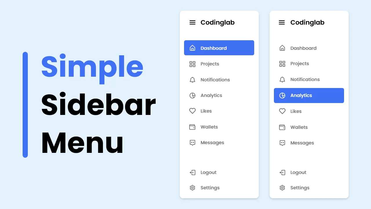
Have a quick look at the given image of our Side Navigation Menu Bar. As you can see on the preview of our sidebar menu, it is aligned on the left side. There is a logo name open/close button and some navigation links. Literally, according to my project, the sidebar is in the closed state and we will see a logo and open and close button. When we click on that open/close button then the sidebar will appear. Also, we can close the sidebar by clicking on the open/close button or outside of the sidebar.
Let’s watch the given video of our dashboard Sidebar Menu. By watching the given video tutorial, you will see the virtual demo of this Side Navigation Bar and all the HTML CSS, and JavaScript codes that I have used to create this beautiful sidebar menu.
Create Sidebar in HTML CSS JavaScript | Video Tutorial
I have provided all the HTML CSS and JavaScript codes that I have used to create this beautiful Sidebar Menu. Before getting into the source code file. I would like to briefly explain the given video tutorial on our Side Navigation Menu Bar.
As you have seen in the video tutorial of our Sidebar Menu. At first, on the screen, there was a logo name and an open/close button. When I clicked on the open/close button, the sidebar appeared by siding on the left side. When the sidebar opened the outside part of the sidebar turned a little dark and when I closed the sidebar then that dark part disappeared. Then when I opened the sidebar and clicked on the dark part the sidebar closed, then we knew that we can close the sidebar by clicking on those dark parts too.
For the UI and UX part of this sidebar, I have used HTML and CSS. And, to open and close the sidebar I have used some JavaScript. All the fonts are brought from the box icons website and the fonts are imported from the google fonts website as you have seen in the video tutorial.
I hope now you can build this Sidebar Menu using HTML CSS and JavaScript. If you are feeling difficult to make this sidebar, I have provided all the source codes below.
You Might Like This:
Sidebar Menu [Source Code]
<!DOCTYPE html>
<!-- Coding By CodingNepal - codingnepalweb.com -->
<html lang="en">
  <head>
    <meta charset="UTF-8" />
    <meta http-equiv="X-UA-Compatible" content="IE=edge" />
    <meta name="viewport" content="width=device-width, initial-scale=1.0" />
   <title>Sidebar Menu | Side Navigation Bar</title>
    <!-- CSS -->
    <link rel="stylesheet" href="css/style.css" />
    <!-- Boxicons CSS -->
    <link
      href="https://unpkg.com/[email protected]/css/boxicons.min.css"
      rel="stylesheet"
    />
  </head>
  <body>
    <nav>
      <div class="logo">
        <i class="bx bx-menu menu-icon"></i>
        <span class="logo-name">CodingLab</span>
      </div>
      <div class="sidebar">
        <div class="logo">
          <i class="bx bx-menu menu-icon"></i>
          <span class="logo-name">CodingLab</span>
        </div>

        <div class="sidebar-content">
          <ul class="lists">
            <li class="list">
              <a href="#" class="nav-link">
                <i class="bx bx-home-alt icon"></i>
                <span class="link">Dashboard</span>
              </a>
            </li>
            <li class="list">
              <a href="#" class="nav-link">
                <i class="bx bx-bar-chart-alt-2 icon"></i>
                <span class="link">Revenue</span>
              </a>
            </li>
            <li class="list">
              <a href="#" class="nav-link">
                <i class="bx bx-bell icon"></i>
                <span class="link">Notifications</span>
              </a>
            </li>
            <li class="list">
              <a href="#" class="nav-link">
                <i class="bx bx-message-rounded icon"></i>
                <span class="link">Messages</span>
              </a>
            </li>
            <li class="list">
              <a href="#" class="nav-link">
                <i class="bx bx-pie-chart-alt-2 icon"></i>
                <span class="link">Analytics</span>
              </a>
            </li>
            <li class="list">
              <a href="#" class="nav-link">
                <i class="bx bx-heart icon"></i>
                <span class="link">Likes</span>
              </a>
            </li>
            <li class="list">
              <a href="#" class="nav-link">
                <i class="bx bx-folder-open icon"></i>
                <span class="link">Files</span>
              </a>
            </li>
          </ul>

          <div class="bottom-cotent">
            <li class="list">
              <a href="#" class="nav-link">
                <i class="bx bx-cog icon"></i>
                <span class="link">Settings</span>
              </a>
            </li>
            <li class="list">
              <a href="#" class="nav-link">
                <i class="bx bx-log-out icon"></i>
                <span class="link">Logout</span>
              </a>
            </li>
          </div>
        </div>
      </div>
    </nav>

    <section class="overlay"></section>

    <script src="script.js"></script>
  </body>
</html>
/* Google Fonts - Poppins */
@import url("https://fonts.googleapis.com/css2?family=Poppins:wght@300;400;500;600&display=swap");

* {
  margin: 0;
  padding: 0;
  box-sizing: border-box;
  font-family: "Poppins", sans-serif;
}
body {
  min-height: 100%;
  background: #e3f2fd;
}
nav {
  position: fixed;
  top: 0;
  left: 0;
  height: 70px;
  width: 100%;
  display: flex;
  align-items: center;
  background: #fff;
  box-shadow: 0 0 1px rgba(0, 0, 0, 0.1);
}
nav .logo {
  display: flex;
  align-items: center;
  margin: 0 24px;
}
.logo .menu-icon {
  color: #333;
  font-size: 24px;
  margin-right: 14px;
  cursor: pointer;
}
.logo .logo-name {
  color: #333;
  font-size: 22px;
  font-weight: 500;
}
nav .sidebar {
  position: fixed;
  top: 0;
  left: -100%;
  height: 100%;
  width: 260px;
  padding: 20px 0;
  background-color: #fff;
  box-shadow: 0 5px 1px rgba(0, 0, 0, 0.1);
  transition: all 0.4s ease;
}
nav.open .sidebar {
  left: 0;
}
.sidebar .sidebar-content {
  display: flex;
  height: 100%;
  flex-direction: column;
  justify-content: space-between;
  padding: 30px 16px;
}
.sidebar-content .list {
  list-style: none;
}
.list .nav-link {
  display: flex;
  align-items: center;
  margin: 8px 0;
  padding: 14px 12px;
  border-radius: 8px;
  text-decoration: none;
}
.lists .nav-link:hover {
  background-color: #4070f4;
}
.nav-link .icon {
  margin-right: 14px;
  font-size: 20px;
  color: #707070;
}
.nav-link .link {
  font-size: 16px;
  color: #707070;
  font-weight: 400;
}
.lists .nav-link:hover .icon,
.lists .nav-link:hover .link {
  color: #fff;
}
.overlay {
  position: fixed;
  top: 0;
  left: -100%;
  height: 1000vh;
  width: 200%;
  opacity: 0;
  pointer-events: none;
  transition: all 0.4s ease;
  background: rgba(0, 0, 0, 0.3);
}
nav.open ~ .overlay {
  opacity: 1;
  left: 260px;
  pointer-events: auto;
}
const navBar = document.querySelector("nav"),
       menuBtns = document.querySelectorAll(".menu-icon"),
       overlay = document.querySelector(".overlay");

     menuBtns.forEach((menuBtn) => {
       menuBtn.addEventListener("click", () => {
         navBar.classList.toggle("open");
       });
     });

     overlay.addEventListener("click", () => {
       navBar.classList.remove("open");
     });
If you face any difficulties while creating your Sidebar Menu or your code is not working as expected, you can download the source code files for this Side Navigation Menu Bar for free by clicking on the download button, and you can also view a live demo of this card slider by clicking on the view live button.


