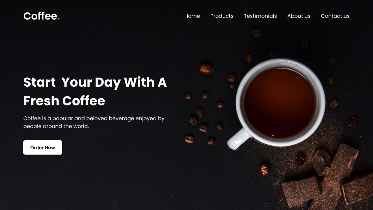
As a beginner in web development, creating a simple yet responsive website can be an exciting and educational project. It is a great way to learn the basics of HTML fundamentals and CSS styles and gain practical experience in creating and designing a website.
In this blog post, I will guide you through the process of creating an attractive, responsive coffee website using HTML and CSS. My website will focus on a coffee theme, but you can customize it. By creating this website, not only will you learn to create a website, but you’ll also learn how to structure web content properly and apply styling to make it responsive to different screen sizes.
To create our coffee website, we will use common HTML elements like header, navigation bar (nav), ul, li, a, and button, along with some basic CSS properties to style and make our website responsive and attractive. So as a beginner, you should have no trouble following the steps and understanding the codes.
Video Tutorial of Responsive Coffee Website HTML & CSS
Steps to Create Responsive Coffee Website HTML and CSS
To create a responsive coffee website using HTML and CSS, follow these simple step-by-step instructions:
- First, create a folder with any name you like. Then, put the necessary files inside it.
- Create a file called
index.htmlto serve as the main file. - Create a file called
style.cssfor the CSS code. - Download coffee-hero-bg.jpg image and put it in the project folder.
To start, add the following HTML code to your index.html file: This code includes essential HTML markup with different semantic tags, such as header, nav, h2, a, ul, li, p, and button, which are used to create the layout of our website. Additionally, this code includes a few lines of JavaScript code to toggle the mobile menu on small screens.
<!DOCTYPE html>
<!-- Coding By CodingNepal - www.codingnepalweb.com -->
<html lang="en">
  <head>
    <meta charset="UTF-8">
    <meta name="viewport" content="width=device-width, initial-scale=1.0">
    <title>Coffee Website HTML and CSS | CodingNepal</title>
    <link rel="stylesheet" href="style.css">
    <!-- Google Fonts Links For Icon -->
    <link rel="stylesheet" href="https://fonts.googleapis.com/css2?family=Material+Symbols+Outlined:opsz,wght,FILL,GRAD@24,400,0,0">
  </head>
  <body>
    <header>
      <nav class="navbar">
        <a class="logo" href="#">Coffee<span>.</span></a>
        <ul class="menu-links">
          <span id="close-menu-btn" class="material-symbols-outlined">close</span>
          <li><a href="#">Home</a></li>
          <li><a href="#">Products</a></li>
          <li><a href="#">Testimonials</a></li>
          <li><a href="#">About us</a></li>
          <li><a href="#">Contact us</a></li>
        </ul>
        <span id="hamburger-btn" class="material-symbols-outlined">menu</span>
      </nav>
    </header>

    <section class="hero-section">
      <div class="content">
        <h2>Start Your Day With Fresh Coffee</h2>
        <p>
          Coffee is a popular and beloved beverage enjoyed by
          people around the world.Awaken your senses with a steaming cup of liquid motivation.
        </p>
        <button>Order Now</button>
      </div>
    </section>

    <script>
      const header = document.querySelector("header");
      const hamburgerBtn = document.querySelector("#hamburger-btn");
      const closeMenuBtn = document.querySelector("#close-menu-btn");

      // Toggle mobile menu on hamburger button click
      hamburgerBtn.addEventListener("click", () => header.classList.toggle("show-mobile-menu"));

      // Close mobile menu on close button click
      closeMenuBtn.addEventListener("click", () => hamburgerBtn.click());
    </script>

  </body>
</html>
Next, add the following CSS code to your style.css file to style and make your coffee website responsive and attractive. Feel free to experiment with different CSS properties, such as colors, fonts, and backgrounds, to give your personal touch and make the website even more beautiful.
/* Importing Google font - Poppins */
@import url('https://fonts.googleapis.com/css2?family=Poppins:wght@300;400;500;600;700&display=swap');

* {
  margin: 0;
  padding: 0;
  box-sizing: border-box;
  font-family: 'Poppins', sans-serif;
}

header {
  position: fixed;
  top: 0;
  left: 0;
  width: 100%;
  padding: 20px;
}

header .navbar {
  display: flex;
  align-items: center;
  justify-content: space-between;
  max-width: 1200px;
  margin: 0 auto;
}

.navbar .logo {
  color: #fff;
  font-weight: 600;
  font-size: 2.1rem;
  text-decoration: none;
}

.navbar .logo span {
  color: #C06B3E;
}

.navbar .menu-links {
  display: flex;
  list-style: none;
  gap: 35px;
}

.navbar a {
  color: #fff;
  text-decoration: none;
  transition: 0.2s ease;
}

.navbar a:hover {
  color: #C06B3E;
}

.hero-section {
  height: 100vh;
  background-image: url("coffee-hero-bg.jpg");
  background-position: center;
  background-size: cover;
  display: flex;
  align-items: center;
  padding: 0 20px;
}

.hero-section .content {
  max-width: 1200px;
  margin: 0 auto;
  width: 100%;
  color: #fff;
}

.hero-section .content h2 {
  font-size: 3rem;
  max-width: 600px;
  line-height: 70px;
}

.hero-section .content p {
  font-weight: 300;
  max-width: 600px;
  margin-top: 15px;
}

.hero-section .content button {
  background: #fff;
  padding: 12px 30px;
  border: none;
  font-size: 1rem;
  border-radius: 6px;
  margin-top: 38px;
  cursor: pointer;
  font-weight: 500;
  transition: 0.2s ease;
}

.hero-section .content button:hover {
  color: #fff;
  background: #C06B3E;
}

#close-menu-btn {
  position: absolute;
  right: 20px;
  top: 20px;
  cursor: pointer;
  display: none;
}

#hamburger-btn {
  color: #fff;
  cursor: pointer;
  display: none;
}

@media (max-width: 768px) {
  header {
    padding: 10px;
  }

  header.show-mobile-menu::before {
    content: "";
    position: fixed;
    left: 0;
    top: 0;
    width: 100%;
    height: 100%;
    backdrop-filter: blur(5px);
  }

  .navbar .logo {
    font-size: 1.7rem;
  }


  #hamburger-btn, #close-menu-btn {
    display: block;
  }

  .navbar .menu-links {
    position: fixed;
    top: 0;
    left: -250px;
    width: 250px;
    height: 100vh;
    background: #fff;
    flex-direction: column;
    padding: 70px 40px 0;
    transition: left 0.2s ease;
  }

  header.show-mobile-menu .navbar .menu-links {
    left: 0;
  }

  .navbar a {
    color: #000;
  }

  .hero-section .content {
    text-align: center;
  }

  .hero-section .content :is(h2, p) {
    max-width: 100%;
  }

  .hero-section .content h2 {
    font-size: 2.3rem;
    line-height: 60px;
  }

  .hero-section .content button {
    padding: 9px 18px;
  }
}
Conclusion and final words
In conclusion, creating a responsive website is a valuable and rewarding experience for beginners in the world of web development. I believe that by following the steps and the codes in this post, you’ve successfully created your responsive coffee website using HTML and CSS.
To further improve your HTML and CSS skills for web development, I suggest recreating other attractive website designs available on this website. This practice will help you gain a better understanding of HTML and CSS and boost your confidence in creating entire websites or website components.
If you encounter any problems while creating your website, you can download the source code files for this website project for free by clicking the Download button. Additionally, you can view a live demo of it by clicking the View Live button.


Always add the link to where we can download the images for creating the website now pls I need ot