Hey buddy, I hope you are doing and creating mindblowing content. Today I have brought a beautiful and valuable project for you. Today you will learn to Create a Popup Modal Box in HTML CSS and JavaScript. As far as the modal box is concerned, if you want to create Popup Modal with Message Box HTML and CSS only click the given link. It is also called a dialog box.
A modal Box is the type of section which is displayed on the front of the webpage, and it contains information, warning, errors, and other things. Actually, it appears when the user did any action on the webpage. Similarly, content models can have different sizes and shapes.
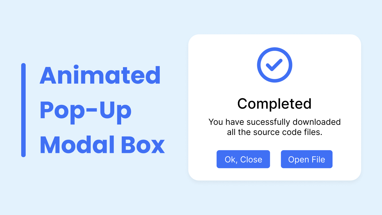
Take a look at the given image of our project [ Popup Modal Box]. Basically, at the top, there is an icon of the tick, and below that tick, there is some text and underneath that text, there are two buttons. In fact, according to this project [ Popup Modal Box], the given modal box will appear after we click on the button which will be available before coming to this modal box. We can close this modal box simply by clicking on the close button or the outside of the modal box which will be in a little darker color.
To see the real demo of this project [Popup Modal Box]. How it appears, how we can close it, and all the animation I have added to this Modal Box you have to watch the video tutorial of this project, after watching the video tutorial of this project [ Popup Modal Box], you will also get the idea of HTML CSS and JavaScript code.
Create Popup Modal Box in HTML CSS & JavaScript | Video
Yeah, I have provided all the HTML CSS, and JavaScript code that I have used to create this project [ Popup Modal Box]. Before getting into the source code file, I would like to briefly explain the given video tutorial.
As you have seen in the video of this project [ Popup Modal Box]. At first, there was a button on the screen with the name “Open Modal”, When I clicked on that button the button disappeared and a modal box, as well as a little dark color overly behind the modal box, appeared. As you the modal box can be closed by clicking on the close button or just by clicking on the outside of the modal box. To make the UI design of this project [ Popup Modal Box], I just used HTML and CSS, and to open and close it, I used some JavaScript code.
I hope now you can create this project [ Popup Modal Box] easily. If you are feeling difficulty making this modal box. You can take all the HTML CSS and JavaScript code of this modal box from below.
You May Like This:
Popup Modal Box [Source Codes]
<!DOCTYPE html>
<!-- Coding By CodingNepal - codingnepalweb.com -->
<html lang="en">
  <head>
    <meta charset="UTF-8" />
    <meta http-equiv="X-UA-Compatible" content="IE=edge" />
    <meta name="viewport" content="width=device-width, initial-scale=1.0" />
    <title>Popup Modal Box</title>
    <!-- CSS -->
    <link rel="stylesheet" href="style.css" />
    <!-- Fontawesome CDN Link -->
    <link rel="stylesheet" href="https://cdnjs.cloudflare.com/ajax/libs/font-awesome/6.2.0/css/all.min.css"/>
  </head>
  <body>
    <section>
      <button class="show-modal">Show Modal</button>
      <span class="overlay"></span>

      <div class="modal-box">
        <i class="fa-regular fa-circle-check"></i>
        <h2>Completed</h2>
        <h3>You have sucessfully downloaded all the source code files.</h3>

        <div class="buttons">
          <button class="close-btn">Ok, Close</button>
          <button>Open File</button>
        </div>
      </div>
    </section>

    <script>
      const section = document.querySelector("section"),
        overlay = document.querySelector(".overlay"),
        showBtn = document.querySelector(".show-modal"),
        closeBtn = document.querySelector(".close-btn");

      showBtn.addEventListener("click", () => section.classList.add("active"));

      overlay.addEventListener("click", () =>
        section.classList.remove("active")
      );

      closeBtn.addEventListener("click", () =>
        section.classList.remove("active")
      );
    </script>
  </body>
</html>
/* Google Fonts - Poppins */
@import url("https://fonts.googleapis.com/css2?family=Poppins:wght@300;400;500;600&display=swap");

* {
  margin: 0;
  padding: 0;
  box-sizing: border-box;
  font-family: "Poppins", sans-serif;
}
section {
  position: fixed;
  height: 100%;
  width: 100%;
  background: #e3f2fd;
}
button {
  font-size: 18px;
  font-weight: 400;
  color: #fff;
  padding: 14px 22px;
  border: none;
  background: #4070f4;
  border-radius: 6px;
  cursor: pointer;
}
button:hover {
  background-color: #265df2;
}
button.show-modal,
.modal-box {
  position: fixed;
  left: 50%;
  top: 50%;
  transform: translate(-50%, -50%);
  box-shadow: 0 5px 10px rgba(0, 0, 0, 0.1);
}
section.active .show-modal {
  display: none;
}
.overlay {
  position: fixed;
  height: 100%;
  width: 100%;
  background: rgba(0, 0, 0, 0.3);
  opacity: 0;
  pointer-events: none;
}
section.active .overlay {
  opacity: 1;
  pointer-events: auto;
}
.modal-box {
  display: flex;
  flex-direction: column;
  align-items: center;
  max-width: 380px;
  width: 100%;
  padding: 30px 20px;
  border-radius: 24px;
  background-color: #fff;
  opacity: 0;
  pointer-events: none;
  transition: all 0.3s ease;
  transform: translate(-50%, -50%) scale(1.2);
}
section.active .modal-box {
  opacity: 1;
  pointer-events: auto;
  transform: translate(-50%, -50%) scale(1);
}
.modal-box i {
  font-size: 70px;
  color: #4070f4;
}
.modal-box h2 {
  margin-top: 20px;
  font-size: 25px;
  font-weight: 500;
  color: #333;
}
.modal-box h3 {
  font-size: 16px;
  font-weight: 400;
  color: #333;
  text-align: center;
}
.modal-box .buttons {
  margin-top: 25px;
}
.modal-box button {
  font-size: 14px;
  padding: 6px 12px;
  margin: 0 10px;
}
If you face any difficulties while creating your Modal Box or your code is not working as expected, you can download the source code files for this Modal Box for free by clicking on the download button, and you can also view a live demo of this card slider by clicking on the view live button.


