Hello readers, Today in this blog you’ll learn how to create Buttons Shining Hover Effect using HTML & CSS. Previously I have shared an Animated Glowing Inputs Login Form in HTML & CSS, now it’s time to create Buttons with Cool Shining Hover Effect using only HTML CSS.
Generally, A button is a fundamental UI element that will heavily affect your interaction design of the website between visitors or users. Buttons have the power to compel users to convert, to act.
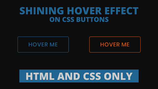
As you can see in the image, there are two CSS Buttons. These buttons are really attractive. Basically, at first, these buttons are in the initial stage where there is no shining effect. But when you hover on a specific button, A button background color filled with their border color and a cool shining hover effect sliding from the left side of a button to the right side.
If you’re feeling difficulty understanding what I am saying. You can watch a full video tutorial on this program (Buttons Shining Hover Effect).
Video Tutorial of Shining Hover Effect on CSS Buttons
I believe you like this button and its shining hover effect. You can easily use this button in your project, sites, and anywhere you want. And you can take this button to the next level with your creativity.
If you like this program (Buttons Shining Hover Effect) and want to get codes of this. You can easily get the source codes of this program. To get the source codes you just need to scroll down.
CSS Buttons with Shining Hover Effect [Source Codes]
To create this program (Buttons Shining Hover Effect). First, you need to create two Files one HTML File and another one is CSS File. After creating these files just paste the following codes in your file. First, create an HTML file with the name of index.html and paste the given codes in your HTML file. Remember, you’ve to create a file with .html extension.
<!DOCTYPE html>
<!-- Created By CodingNepal -->
<html lang="en" dir="ltr">
  <head>
    <meta charset="utf-8">
    <title>Button Shining Hover Effect | CodingNepal</title>
    <link rel="stylesheet" href="style.css">
  </head>
  <body>
    <div>
      <button>Hover Me</button>
      <button>Hover Me</button>
    </div>
</body>
</html>
Second, create a CSS file with the name of style.css and paste the given codes in your CSS file. Remember, you’ve to create a file with .css extension.
@import url('https://fonts.googleapis.com/css?family=Poppins:400,500,600,700&display=swap');
*{
  margin: 0;
  padding: 0;
  box-sizing: border-box;
  font-family: 'Poppins',sans-serif;
}
html,body{
  display: grid;
  height: 100%;
  place-items: center;
  background: #0d0d0d;
}
button{
  position: relative;
  height: 65px;
  width: 210px;
  margin: 0 40px;
  font-size: 23px;
  font-weight: 500;
  letter-spacing: 1px;
  border-radius: 5px;
  text-transform: uppercase;
  border: 1px solid transparent;
  outline: none;
  cursor: pointer;
  background: #0d0d0d;
  overflow: hidden;
  transition: 0.6s;
}
button:first-child{
  color: #206592;
  border-color: #206592;
}
button:last-child{
  color: #ce5c0c;
  border-color: #ce5c0c;
}
button:before, button:after{
  position: absolute;
  content: '';
  left: 0;
  top: 0;
  height: 100%;
  filter: blur(30px);
  opacity: 0.4;
  transition: 0.6s;
}
button:before{
  width: 60px;
  background: rgba(255,255,255,0.6);
  transform: translateX(-130px) skewX(-45deg);
}
button:after{
  width: 30px;
  background: rgba(255,255,255,0.6);
  transform: translateX(-130px) skewX(-45deg);
}
button:hover:before,
button:hover:after{
  opacity: 0.6;
  transform: translateX(320px) skewX(-45deg);
}
button:hover{
  color: #f2f2f2;
}
button:hover:first-child{
  background: #206592;
}
button:hover:last-child{
  background: #ce5c0c;
}
That’s all, now you’ve successfully created a Button Shining Hover Effect using HTML & CSS. If your code does not work or you’ve faced any error/problem then please comment down or contact us from the contact page.


