Hello guys hope you are doing well, after a long time, today we are going to create something useful animation and that is Button Ripple Animation in HTML CSS and JavaScript. Also, I want to thank you all for liking my previous blog about All Hamburger Animation.
Button ripple animation is that appears on the button’s surface while the user clicks on it. Basically, this type of ripple animation is used to showing confirmation that the button has clicked. There are various animations we can get while clicking on the button, but ripple is the most popular.
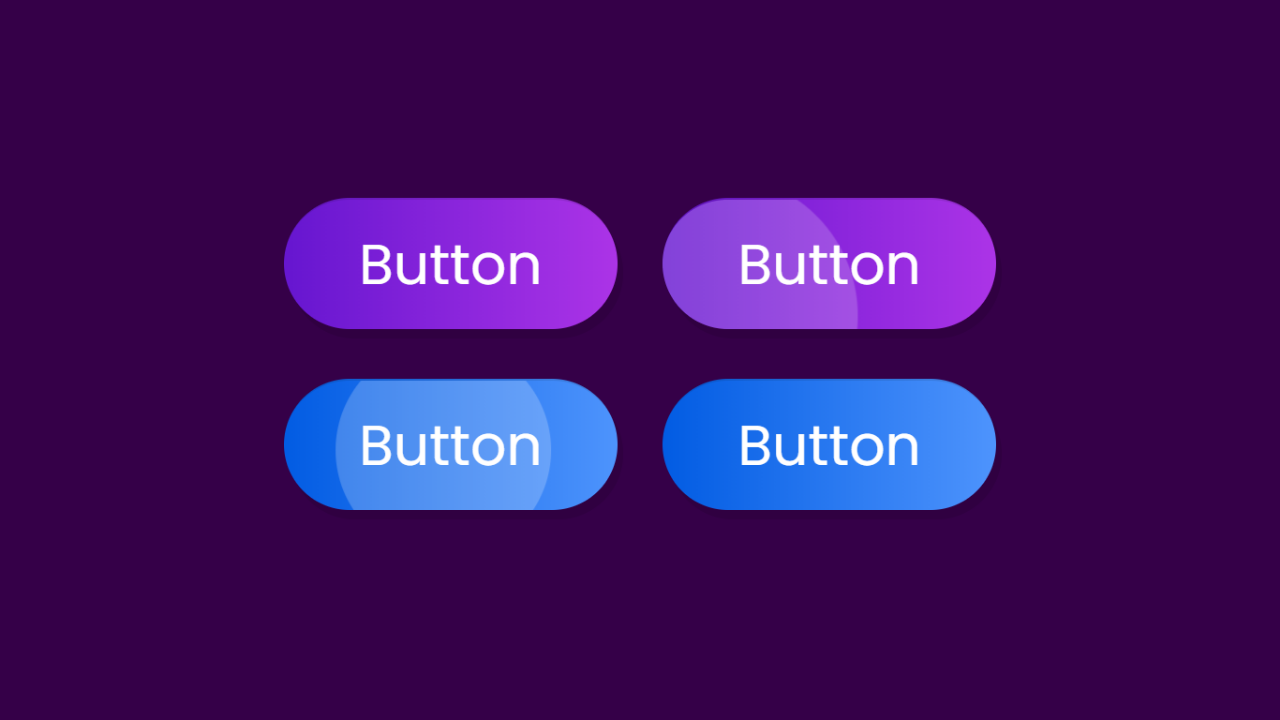
Let’s have a look at the image of [Button Ripple Animation in HTML CSS and JavaScript] that I have provided on the webpage. Two images of the button are in normal form and two buttons are in the animated form and these are the real animation that is going to build.
Without further ado let’s watch the video tutorial of this program [Button Ripple Animation in HTML CSS and JavaScript], then we will get the real demo of this ripple animation on the button and the code that I have used to create this type of animation.
Button Ripple Animation in HTML CSS and JavaScript
I have provided all the source code that I have used to create this program [Button Ripple Animation in HTML CSS and JavaScript], but before jumping for the code let me cover some important points of this ripple effect on the button.
As you have seen on the video tutorial of this program [Button Ripple Animation in HTML CSS and JavaScript]. At first, we saw two-button with gradient color and this gradient color has a big hand to make this button beautiful like candy.
Actually, that ripple is an HTML tag with the class name “Ripple” which I did CSS and gave the animation and when the user clicks on the button I added that tag on the HTML by JavaScript. Have you noticed that where ever I clicked, the ripples start from there? Also to make this I have used some JavaScript code.
This is the simple but tricky animation that we have created. If you are still feeling difficulties to build this animation then you can copy-paste or download all source code files of our program [Button Ripple Animation in HTML CSS and JavaScript] from below.
You Might Like This:
Button Ripple Animation [Source Code]
<!DOCTYPE html>
<!-- Coding By CodingNepal - codingnepalweb.com -->
<html lang="en" dir="ltr">
  <head>
    <meta charset="UTF-8">
    <title> Button Ripple Effect | CodingLab </title>
    <link rel="stylesheet" href="style.css">
   </head>
<body>
  <div class="buttons">
    <a class="button"href="#">Button</a>
    <a class="button two" href="#">Button</a>
  </div>

  <script>
  // Ripple Effect JavaScript Code
  let buttons = document.querySelectorAll(".button");

  for (var i = 0; i < buttons.length; i++) {
    buttons[i].addEventListener("click", (e)=>{
      e.preventDefault(); // preventing form submitting

      let overlay = document.createElement('span'); //creating a tag(span)
      overlay.classList.add("overlay"); //adding a class inside the span
      e.target.appendChild(overlay); //adding overlay tag inside the anchor tag at in HTML

      let xValue = e.clientX - e.target.offsetLeft; //by this we get perfect value where we will click
      let yValue = e.clientY - e.target.offsetTop; //by this we get perfect value where we will click

       overlay.style.left = xValue + "px"; //changing the position of the overlay according to our clicks on the button
       overlay.style.top = yValue + "px"; //changing the position of the overlay according to our clicks on the button
  });
  }
  </script>
</body>
</html>
/* Google Font Link */
@import url('https://fonts.googleapis.com/css2?family=Poppins:wght@200;300;400;500;600;700&display=swap');
*{
  margin: 0;
  padding: 0;
  box-sizing: border-box;
  font-family: "Poppins" , sans-serif;
}
body{
  height: 100vh;
  display: flex;
  align-items: center;
  justify-content: center;
  background: #350048;
}
.buttons .button{
  position: relative;
  display: inline-block;
  color: #fff;
  padding: 12px 38px;
  background: linear-gradient(90deg, #6616d0, #ac34e7);
  border-radius: 45px;
  margin: 10px;
  font-size: 30px;
  font-weight: 400;
  text-decoration: none;
  box-shadow: 3px 5px rgba(0, 0, 0, 0.1);
  border-top: 1px solid rgba(0,0,0,0.1);
  overflow: hidden;
}
.buttons .button.two{
  background: linear-gradient(90deg, #025ce3, #4e94fd);
}
.buttons .button .overlay{
  position: absolute;
  background: #fff;
  top: 0;
  left: 0;
  transform: translate(-50%,-50%);
  border-radius: 50%;
  animation: blink 0.5s linear;
}
@keyframes blink {
  0%{
    height: 0px;
    width: 0px;
    opacity: 0.3;
  }
  100%{
    height: 400px;
    width: 400px;
    opacity: 0;
  }
}
If you face any difficulties while creating your Button Ripple Animation or your code is not working as expected, you can download the source code files for this Button Click Animation for free by clicking on the download button, and you can also view a live demo of this card slider by clicking on the view live button.


great
Awesome
amazing effects
thanks
thanks