Hello friends, welcome to another project on HTML CSS and JavaScript. Today in this project we are going to create a beautiful and useful design and animation. As you know I have built lots of JavaScript Projects which are very useful and practical.
A button with a progress bar means the animation appears after clicking on the button to show the user’s work is loading. Nowadays, this type of concept is getting used rapidly day by day because it takes less space on the webpage and looks very beautiful.
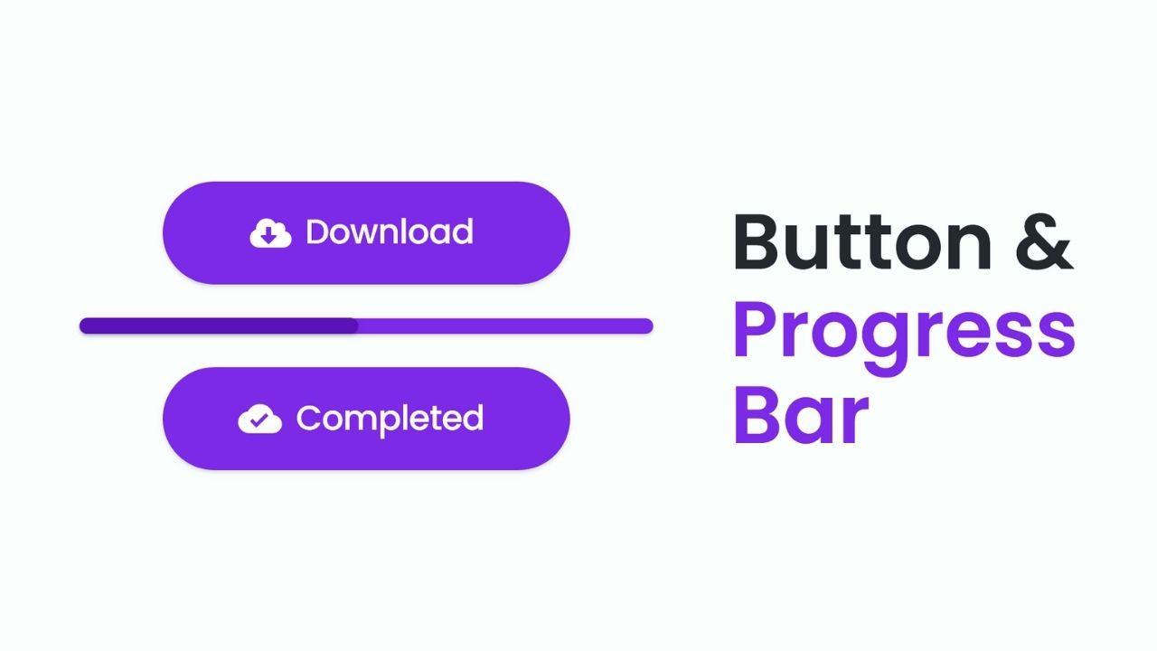
Let’s have a look at the given image of our program [Button with Progress Bar], the first button you are seeing will be the first look at your project and when we click on that button, its height and width will be converted into the second image and stars progressing. When the progressing bar finished progressing then that progress was converted into the button. And those texts and icons also change.
Now lets we will watch the video tutorial of this Butonn and its progressing animation. Also, we will take ideas on how all the HTML CSS, and JavaScript are working behind in the project.
Button with Progress Bar in HTML CSS JavaScript
I have provided all the HTML CSS and JavaScript code that I had have to create this project [Button with Progress Bar using HTML CSS and JavaScript], but before jumping into the source code file, I have pointed out some important points of this video tutorial of the button with progress bar.
As we have seen in the video tutorial this button with the progress bar. At first, we have seen only the button on the screen with text and a download icon. When I clicked on that button it turns into a progress bar and starts animating. At last when the progress bar finished its animation then it turned into a button with different text and icons.
To make the design of the button and progress bar, I have used HTML and CSS code only, and to make the button and progress bar animation, I have used some JavaScript code.
I believe this type of project is easy for you, those friends who are feeling difficulty building this program [Button with Progress Bar using HTML CSS and JavaScript], I have provided all HTML CSS and JavaScript source code files below.
You Might Like This:
Button with Progress Bar [Source Code]
<!DOCTYPE html>
<!-- Coding By CodingNepal - codingnepalweb.com -->
<html lang="en" dir="ltr">
  <head>
    <meta charset="UTF-8">
    <title> Button with Progress Bar | CodingLab </title>
    <link rel="stylesheet" href="style.css">
    <!-- Boxiocns CDN Link -->
    <link href='https://unpkg.com/[email protected]/css/boxicons.min.css' rel='stylesheet'>
   </head>
<body>
  <div class="button">
      <div class="content">
        <i class="bx bx-cloud-download"></i>
        <span class="button-text">Download</span>
      </div>
  </div>
  <script>
    const button = document.querySelector(".button");
    button.addEventListener("click", () =>{
      button.classList.add("active");
      setTimeout(()=>{
        button.classList.remove("active");
        button.querySelector("i").classList.replace("bx-cloud-download", "bx-check-circle")
        button.querySelector("span").innerText = "Completed";
      },6000);
    });
  </script>
</body>
</html>
@import url('https://fonts.googleapis.com/css2?family=Poppins:wght@200;300;400;500;600;700&display=swap');
*{
  margin: 0;
  padding: 0;
  box-sizing: border-box;
  font-family: 'Poppins',sans-serif;
}
.button{
  position: absolute;
  top: 50%;
  left: 50%;
  transform: translate(-50%, -50%);
  height: 95px;
  width: 360px;
  background: #7D2AE8;
  border-radius: 55px;
  cursor: pointer;
  box-shadow: 0 5px 10px rgba(0,0,0,0.2);
  transition: all 0.4s cubic-bezier(0.68, -0.55, 0.265, 1.55);
  overflow: hidden;
}
.button.active{
  height: 20px;
  width: 500px;
}
.button::before{
  content: "";
  position: absolute;
  top: 0;
  left: -100%;
  height: 100%;
  width: 100%;
  background: #5b13b9;
  border-radius: 55px;
  transition: all 6s ease-in-out;
}
.button.active::before{
  animation: layer 6s ease-in-out forwards;
}
@keyframes layer {
  100%{
    left: 0%;
  }
}
.button .content{
  height: 100%;
  width: 100%;
  display: flex;
  align-items: center;
  justify-content: center;
  transition: all 0.2s ease;
  transition-delay: 0.2s;
}
.button.active .content{
  transform: translateY(60px);
}
.button .content i,
.button .content .button-text{
  color: #fff;
  font-size: 40px;
  font-weight: 500;
}
.button .content .button-text{
  font-size: 28px;
  margin-left: 8px;
}
If you face any difficulties while creating your Button with Progress Bar or your code is not working as expected, you can download the source code files for this Button with Progressing Bar for free by clicking on the download button, and you can also view a live demo of this card slider by clicking on the view live button.


can you share get link download google drive like this post?