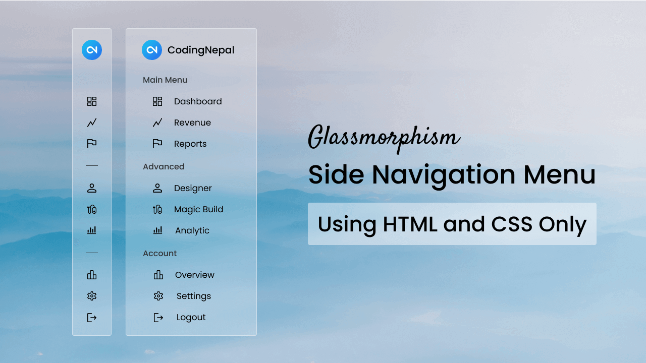
As a beginner web developer, have you ever wondered how to create sidebars like the ones you’ve seen on websites or apps? With just HTML and CSS, you can build your own stylish sidebars with the trendy glassmorphism effect. This not only teaches you how to make popular UI components but also lets you apply the modern glassmorphism style to your designs.
If you’re unfamiliar, glassmorphism is a stylish design trend that creates transparency and frosted glass effects. This effect gives the elements a semi-transparent look, making the background and foreground blend smoothly.
In this blog post, we’ll show you how to create a stylish Glassmorphism Sidebar using only HTML and CSS. Not only will we apply the elegant glassmorphism effect to the sidebar, but we’ll also add an interactive hover animation.
Initially, the sidebar remained collapsed, showing only the icons of each link. But when we hover over the sidebar, it smoothly expands and reveals the respective logo’s link. This animation is done with pure CSS and HTML.
Video Tutorial of Glassmorphism Sidebar in HTML & CSS
Steps To Create Glassmorphism Sidebar in HTML & CSS
To create a stylish Sidebar with a Glassmorphism effect using only HTML and CSS. Follow these simple, step-by-step instructions:
- Create a folder. You can name this folder whatever you want, and inside this folder, create the mentioned files.
- Create an
index.htmlfile. The file name must be index and its extension .html - Create a
style.cssfile. The file name must be style and its extension .css - Download and place the Images folder in your project directory. This folder includes the sidebar logo and hero background image.
To start, add the following HTML codes to your index.html file to create your sidebar layout. These codes include the necessary Google icon links and other HTML elements like aside, div, ul, li, span, and a.
<!DOCTYPE html>
<!-- Coding By CodingNepal - www.codingnepalweb.com -->
<html lang="en">
  <head>
    <meta charset="UTF-8">
    <meta name="viewport" content="width=device-width, initial-scale=1.0">
    <title>Glassmorphism Sidebar HTML and CSS| CodingNepal</title>
    <!-- Linking Google font link for icons -->
    <link rel="stylesheet" href="https://fonts.googleapis.com/css2?family=Material+Symbols+Outlined:opsz,wght,FILL,[email protected],100..700,0..1,-50..200">
    <link rel="stylesheet" href="style.css">
  </head>
  <body>
    <aside class="sidebar">
      <div class="logo">
        <img src="images/logo.jpg" alt="logo">
        <h2>CodingNepal</h2>
      </div>
      <ul class="links">
        <h4>Main Menu</h4>
        <li>
          <span class="material-symbols-outlined">dashboard</span>
          <a href="#">Dashboard</a>
        </li>
        <li>
          <span class="material-symbols-outlined">show_chart</span>
          <a href="#">Revenue</a>
        </li>
        <li>
          <span class="material-symbols-outlined">flag</span>
          <a href="#">Reports</a>
        </li>
        <hr>
        <h4>Advanced</h4>
        <li>
          <span class="material-symbols-outlined">person</span>
          <a href="#">Designer</a>
        </li>
        <li>
          <span class="material-symbols-outlined">group</span>
          <a href="#">Developer </a>
        </li>
        <li>
          <span class="material-symbols-outlined">ambient_screen</span>
          <a href="#">Magic Build</a>
        </li>
        <li>
          <span class="material-symbols-outlined">pacemaker</span>
          <a href="#">Theme Maker</a>
        </li>
        <li>
          <span class="material-symbols-outlined">monitoring</span>
          <a href="#">Analytic</a>
        </li>
        <hr>
        <h4>Account</h4>
        <li>
          <span class="material-symbols-outlined">bar_chart</span>
          <a href="#">Overview</a>
        </li>
        <li>
          <span class="material-symbols-outlined">mail</span>
          <a href="#">Message</a>
        </li>
        <li>
          <span class="material-symbols-outlined">settings</span>
          <a href="#">Settings</a>
        </li>
        <li class="logout-link">
          <span class="material-symbols-outlined">logout</span>
          <a href="#">Logout</a>
        </li>
      </ul>
    </aside>
  </body>
</html>
Next, add the following CSS codes to your style.css file to achieve a stylish and interactive glassmorphism design for our Sidebar. These codes include various styling properties like blur, color, background, background image, and more to create a transparent glass-like effect sidebar with a smooth hover animation.
/* Importing Google font - Poppins */
@import url("https://fonts.googleapis.com/css2?family=Poppins:wght@400;500;600;700&display=swap");

* {
    margin: 0;
    padding: 0;
    box-sizing: border-box;
    font-family: "Poppins", sans-serif;
}

body {
    height: 100vh;
    width: 100%;
    background-image: url("images/hero-bg.jpg");
    background-position: center;
    background-size: cover;
}

.sidebar {
    position: fixed;
    top: 0;
    left: 0;
    width: 110px;
    height: 100%;
    display: flex;
    align-items: center;
    flex-direction: column;
    background: rgba(255, 255, 255, 0.2);
    backdrop-filter: blur(17px);
    --webkit-backdrop-filter: blur(17px);
    border-right: 1px solid rgba(255, 255, 255, 0.7);
    transition: width 0.3s ease;
}

.sidebar:hover {
    width: 260px;
}

.sidebar .logo {
    color: #000;
    display: flex;
    align-items: center;
    padding: 25px 10px 15px;
}

.logo img {
    width: 43px;
    border-radius: 50%;
}

.logo h2 {
    font-size: 1.15rem;
    font-weight: 600;
    margin-left: 15px;
    display: none;
}

.sidebar:hover .logo h2 {
    display: block;
}

.sidebar .links {
    list-style: none;
    margin-top: 20px;
    overflow-y: auto;
    scrollbar-width: none;
    height: calc(100% - 140px);
}

.sidebar .links::-webkit-scrollbar {
    display: none;
}

.links li {
    display: flex;
    border-radius: 4px;
    align-items: center;
}

.links li:hover {
    cursor: pointer;
    background: #fff;
}

.links h4 {
    color: #222;
    font-weight: 500;
    display: none;
    margin-bottom: 10px;
}

.sidebar:hover .links h4 {
    display: block;
}

.links hr {
    margin: 10px 8px;
    border: 1px solid #4c4c4c;
}

.sidebar:hover .links hr {
    border-color: transparent;
}

.links li span {
    padding: 12px 10px;
}

.links li a {
    padding: 10px;
    color: #000;
    display: none;
    font-weight: 500;
    white-space: nowrap;
    text-decoration: none;
}

.sidebar:hover .links li a {
    display: block;
}

.links .logout-link {
    margin-top: 20px;
}
Conclusions and Final Words
Congratulations! You have successfully created a Glassmorphism Sidebar using only HTML and CSS by following these simple steps. This exercise not only enhances your knowledge to create popular UI components but also helps you to apply the trending glassmorphism style to your designs.
Feel free to experiment and customize the code to make your sidebar even more beautiful and functional. To further improve your HTML and CSS skills, why not try recreating other sidebar menu designs available on this website?
If you encounter any problems while creating your Glassmorphism Sidebar, you can download the source code files for this sidebar project for free by clicking the Download button. You can also view a live demo of it by clicking the View Live button.


I would like to thank you for the wonderful effort
Can I take an online course?