Hello friend I hope you are doing fantastic. Today in this blog you will learn to Create a Toggle Button in HTML CSS and JavaScript. I recently created a love shape Toggle Button, which I believe you may like. Today’s toggle button will be simple and valuable.
The toggle button is the type of button that can be used on any page of application of other frontend parts to activate or deactivate its related kinds of stuff. for example, when you need to turn on wifi then we have to click on the toggle button right?. The toggle button can be used on any page of application of other frontend parts to activate or deactivate its related kinds of stuff.
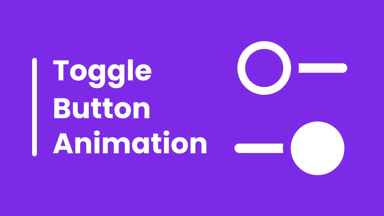
Have a quick look at the given image of our toggle button that I have given on the webpage. As we can see on the image of our toggle button, at first you can see the first toggle button, which is in closed status and the second one is in opened condition. Actually, the toggle button will be only one, and to open or closed we need to click on it. The circle part will only slides.
I would highly recommend you to watch the given video tutorial on our toggle button. By watching the video tutorial you will get the real demo of the toggle button and all the HTML CSS and JavaScript code that I have used to create this toggle button.
Create Toggle Button in HTML CSS & JavaScript | Video Tutorial
I have provided all the HTML CSS and JavaScript code that I have used to create this Toggle Button, before getting into the source code file, I would like to explain the given video tutorial of our project toggle button briefly.
As you have seen in the video tutorial on the toggle button. At first, there was a toggle button in the closed status when I liked that button the circle part slides to the right side with beautiful animation, and again when I clicked on it, the circle part slides to the left side. For the UI design, I used HTML and CSS, for the animation I used CSS cubic bezier, and to make it slide I used some JavaScript code.
Now I believe, you can make this toggle button easily by using HTML CSS, and JavaScript, If you are feeling difficulty creating this toggle button, I have provided all the source code below;
You Might Like This:
- Button Ripple Animation
- Button with Progress Bar
- Hamburger Menu Button
- Button with Loading Animation
Toggle Button [Source Code]
<!DOCTYPE html>
<!-- Coding By CodingNepal - codingnepalweb.com -->
    <html lang="en">
    <head>
        <meta charset="UTF-8">
        <meta http-equiv="X-UA-Compatible" content="IE=edge">
        <meta name="viewport" content="width=device-width, initial-scale=1.0">
       <title>Toggle Button Animation</title>

        <!-- CSS -->
        <link rel="stylesheet" href="css/style.css">
    </head>
    <body>
        <div class="toggle"></div>

        <!-- JavaScript -->
        <script>
            const toggleBtn = document.querySelector(".toggle");

            toggleBtn.addEventListener("click", () => toggleBtn.classList.toggle("active"));
        </script>

    </body>
</html>
*{
  margin: 0;
  padding: 0;
  box-sizing: border-box;
}
body{
  height: 100vh;
  display: flex;
  align-items: center;
  justify-content: center;
  background: #7d2ae8;
}
.toggle{
  position: relative;
  height: 12px;
  width: 125px;
  cursor: pointer;
  border-radius: 25px;
  background-color: #fff;
  box-shadow: 0 5px 10px rgba(0, 0, 0, 0.1);
}
.toggle::before{
  content: "";
  position: absolute;
  left: 0;
  top: 50%;
  transform: translateY(-50%);
  height: 50px;
  width: 50px;
  border-radius: 50%;
  background-color: #7d2ae8;
  border: 10px solid #fff;
  transition: all 0.5s cubic-bezier(0.68, -0.55, 0.265, 1.55);
  box-shadow: 0 5px 10px rgba(0, 0, 0, 0.1);
}
.toggle.active::before{
  left: calc(100% - 70px);
  background-color: #fff;
  border-color: #7d2ae8;
}


