If you are seeking a form that is designed for verifying one-time passwords and want to learn how to create it in HTML CSS & JavaScript then this blog could meet you demands.
In this blog you will learn to How to create OTP Verification Form in HTML CSS & JavaScript. You will learn how to structure the form and input fields using HTML, how to style the form and input fields using CSS, and how to handle the form submission and verify the OTP using JavaScript. In the recent blog I have created Star Rating System I hove that will also help to enhance you coding skills.
An OTP (one-time password) form is a type of form used to verify the identity of a user by requiring them to enter a unique code that is sent to their email or phone number. OTPs are commonly used as a security measure to prevent unauthorized access to sensitive information or accounts.
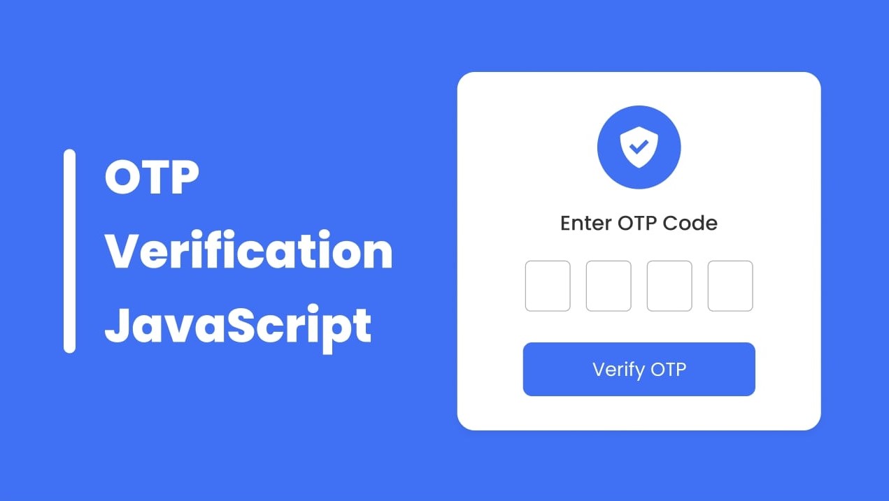
Have a look on the given image of our OTP Verification Form. As you can see in this form we wil have one icon at top, text, five input fields and a button. To watch the demo of this project and create this OTP Form step by step you can watch the given video tutorial.
Video Tutorial | OTP Form in HTML CSS & JavaScript
In the video tutorial on creating an OTP verification form, you may have noticed that the form initially appeared with all input fields and the submit button disabled, except for the first input field, which was already focused. As the user entered numbers into the first field, the focus automatically moved to the next field, and so on until all fields were filled.
Once all fields were completed, the submit button became active and could be clicked to submit the form. This process helps to ensure that the user correctly enters the OTP and allows for a smooth and efficient user experience.
I hope that you are now able to create an OTP verification form using HTML, CSS, and JavaScript. If you are still experiencing any challenges, I have provided the source code that I used to create this form for your reference.
You May Like This:
OTP Verification Form in HTML CSS & JS [Source Code]
- Create a folder. You can name this folder whatever you want, and inside this folder, create the mentioned files.
- Create an
index.htmlfile. The file name must be index and its extension .html - Create a
style.cssfile. The file name must be style and its extension .css - Create a
script.jsfile. The file name must be script and its extension .js
Once you create these files, paste the given codes into the specified files. If you don’t want to do these then scroll down and download the OTP Verification Form in HTML CSS & JavaScript by clicking on the given download button.
First, paste the following codes into your index.html file.
<!DOCTYPE html>
<!-- Coding By CodingNepal - codingnepalweb.com -->
<html lang="en">
  <head>
    <meta charset="UTF-8" />
    <meta http-equiv="X-UA-Compatible" content="IE=edge" />
    <meta name="viewport" content="width=device-width, initial-scale=1.0" />
   <title>OTP Verification Form</title>
    <link rel="stylesheet" href="style.css" />
    <!-- Boxicons CSS -->
    <link href="https://unpkg.com/[email protected]/css/boxicons.min.css" rel="stylesheet" />
   <script src="script.js" defer></script>
  </head>
  <body>
    <div class="container">
      <header>
        <i class="bx bxs-check-shield"></i>
      </header>
      <h4>Enter OTP Code</h4>
      <form action="#">
        <div class="input-field">
          <input type="number" />
          <input type="number" disabled />
          <input type="number" disabled />
          <input type="number" disabled />
        </div>
        <button>Verify OTP</button>
      </form>
    </div>
  </body>
</html>
Second, paste the following codes into your style.css file.
/* Import Google font - Poppins */
@import url("https://fonts.googleapis.com/css2?family=Poppins:wght@200;300;400;500;600;700&display=swap");
* {
  margin: 0;
  padding: 0;
  box-sizing: border-box;
  font-family: "Poppins", sans-serif;
}
body {
  min-height: 100vh;
  display: flex;
  align-items: center;
  justify-content: center;
  background: #4070f4;
}
:where(.container, form, .input-field, header) {
  display: flex;
  flex-direction: column;
  align-items: center;
  justify-content: center;
}
.container {
  background: #fff;
  padding: 30px 65px;
  border-radius: 12px;
  row-gap: 20px;
  box-shadow: 0 5px 10px rgba(0, 0, 0, 0.1);
}
.container header {
  height: 65px;
  width: 65px;
  background: #4070f4;
  color: #fff;
  font-size: 2.5rem;
  border-radius: 50%;
}
.container h4 {
  font-size: 1.25rem;
  color: #333;
  font-weight: 500;
}
form .input-field {
  flex-direction: row;
  column-gap: 10px;
}
.input-field input {
  height: 45px;
  width: 42px;
  border-radius: 6px;
  outline: none;
  font-size: 1.125rem;
  text-align: center;
  border: 1px solid #ddd;
}
.input-field input:focus {
  box-shadow: 0 1px 0 rgba(0, 0, 0, 0.1);
}
.input-field input::-webkit-inner-spin-button,
.input-field input::-webkit-outer-spin-button {
  display: none;
}
form button {
  margin-top: 25px;
  width: 100%;
  color: #fff;
  font-size: 1rem;
  border: none;
  padding: 9px 0;
  cursor: pointer;
  border-radius: 6px;
  pointer-events: none;
  background: #6e93f7;
  transition: all 0.2s ease;
}
form button.active {
  background: #4070f4;
  pointer-events: auto;
}
form button:hover {
  background: #0e4bf1;
}
Third, paste the following codes into your script.js file.
 const inputs = document.querySelectorAll("input"),
  button = document.querySelector("button");

// iterate over all inputs
inputs.forEach((input, index1) => {
  input.addEventListener("keyup", (e) => {
    // This code gets the current input element and stores it in the currentInput variable
    // This code gets the next sibling element of the current input element and stores it in the nextInput variable
    // This code gets the previous sibling element of the current input element and stores it in the prevInput variable
    const currentInput = input,
      nextInput = input.nextElementSibling,
      prevInput = input.previousElementSibling;

    // if the value has more than one character then clear it
    if (currentInput.value.length > 1) {
      currentInput.value = "";
      return;
    }
    // if the next input is disabled and the current value is not empty
    //  enable the next input and focus on it
    if (nextInput && nextInput.hasAttribute("disabled") && currentInput.value !== "") {
      nextInput.removeAttribute("disabled");
      nextInput.focus();
    }

    // if the backspace key is pressed
    if (e.key === "Backspace") {
      // iterate over all inputs again
      inputs.forEach((input, index2) => {
        // if the index1 of the current input is less than or equal to the index2 of the input in the outer loop
        // and the previous element exists, set the disabled attribute on the input and focus on the previous element
        if (index1 <= index2 && prevInput) {
          input.setAttribute("disabled", true);
          input.value = "";
          prevInput.focus();
        }
      });
    }
    //if the fourth input( which index number is 3) is not empty and has not disable attribute then
    //add active class if not then remove the active class.
    if (!inputs[3].disabled && inputs[3].value !== "") {
      button.classList.add("active");
      return;
    }
    button.classList.remove("active");
  });
});

//focus the first input which index is 0 on window load
window.addEventListener("load", () => inputs[0].focus());
If you face any difficulties while creating your OTP Verification Form or your code is not working as expected, you can download the source code files for this OTP Verification Form for free by clicking on the download button, and you can also view a live demo of this card slider by clicking on the view live button.


