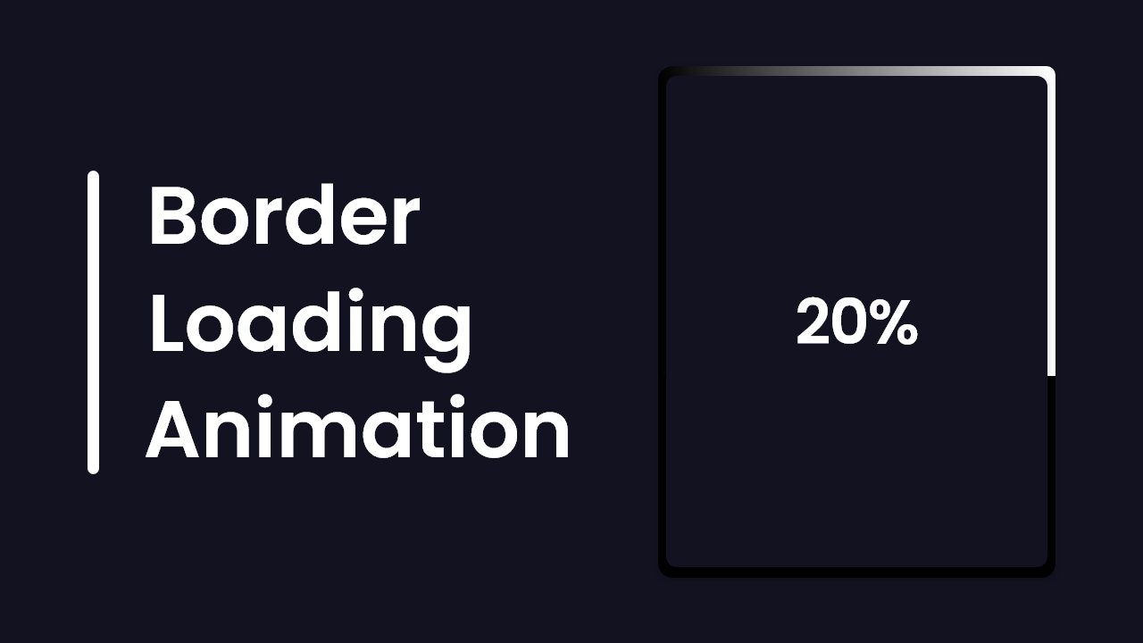
Hello there, as usual, today you will learn to create exciting projects, Card’s Border Loading Animation, and the animated percentage inside it from 0 to 100 in HTML CSS and JavaScript. As you know there are lots of Card Designs that I have already created and they are available on this blog, but today’s project will be different and exciting.
Border Animation means the animation that happens with the border of any stuff like a card and others. Percentage animation means the increase of the number from 0 to 100%. You can see this type of loading animation in different websites and applications while we are exporting something from it.
Take a quick look at the given image of our project [Border Loading Animation with Percentage], at the right side you can see there is a card with a black border about it. At the top right side, there is a white border and inside the card, there is a percentage.
Basically, when the webpage is reloaded, the white border starts to rotate around that card, and along with the border, the percentage starts animating as well from 0 to 100%. When the percentage becomes 100 the border stops animating and the card’s border color changed from black to white.
To watch the real demo of this project [Border Loading Animation with Percentage] how it animates and all the HTML CSS and JavaScript code that I have used to create this animation, I have provided a full video tutorial of this project [Border Loading Animation with Percentage].
Border Loading Animation in HTML CSS JavaScript
I have provided all the HTML CSS & JavaScript code that I used to create this project [Border Loading Animation with Percentage], before getting into the source code file, I would like to explain the given video tutorial briefly.
As you have seen in the video tutorial when the webpage is reloaded the border and percentage number started animating and after that when the percentage number became 100 it stopped to animate and the card border color changed from dark to white. To make that card and border animation and the percentage I used HTML and CSS to animate the percentage number and to make border white after I used some JavaScript code.
I believe now you can make this project [Border Loading Animation with Percentage], easily by using HTML CSS, and JavaScript. If you are feeling difficulty creating this card and its border animation with percentages, I have provided all the source codes below. From there you copy or download all the source code files.
You Could Like This:
Border Loading Animation [Source Codes]
- Create a folder. You can name this folder whatever you want, and inside this folder, create the mentioned files.
- Create an
index.htmlfile. The file name must be index and its extension .html - Create a
style.cssfile. The file name must be style and its extension .css
Once you create these files, paste the given codes into the specified files. If you don’t want to do these then scroll down and download the source codes of this Border Loading Animation by clicking on the given download button.
First, paste the following codes into your index.html file.
<!DOCTYPE html>
<!-- Coding By CodingNepal - codingnepalweb.com -->
<html lang="en">
  <head>
    <meta charset="UTF-8" />
    <meta http-equiv="X-UA-Compatible" content="IE=edge" />
    <meta name="viewport" content="width=device-width, initial-scale=1.0" />
    <title>Border Loading Animaton</title>
    <link rel="stylesheet" href="style.css" />
  </head>
  <body>
    <div class="container active">
      <span class="overlay" id="percent">0%</span>
    </div>

    <script>
      const container = document.querySelector(".container"),
        percent = document.querySelector("#percent");

      let perVal = 0;

      let increament = setInterval(() => {
        perVal++;
        percent.textContent = `${perVal}%`;

        if (perVal == 100) {
          clearInterval(increament);
          container.classList.remove("active");
        }
      }, 100);
    </script>
  </body>
</html>
Second, paste the following codes into your style.css file.
/* Google Fonts - Poppins */
@import url("https://fonts.googleapis.com/css2?family=Poppins:wght@300;400;500;600;700&display=swap");

* {
  margin: 0;
  padding: 0;
  box-sizing: border-box;
  font-family: "Poppins", sans-serif;
}
body {
  height: 100vh;
  background-color: #131221;
}
body,
.container,
.overlay {
  display: flex;
  align-items: center;
  justify-content: center;
}
.container {
  position: relative;
  height: 450px;
  width: 350px;
  border-radius: 16px;
  background-color: #fff;
  overflow: hidden;
}
.container.active {
  background-color: #000;
}
.container::before {
  content: "";
  position: absolute;
  height: 650px;
  width: 650px;
  background-image: conic-gradient(transparent, transparent, transparent, #fff);
}
.container.active:before {
  animation: rotate 4s linear infinite;
}
@keyframes rotate {
  0% {
    transform: rotate(0deg);
  }
  100% {
    transform: rotate(360deg);
  }
}
.container .overlay {
  position: absolute;
  height: 440px;
  width: 340px;
  font-size: 40px;
  font-weight: 500;
  color: #fff;
  border-radius: 12px;
  background-color: #131221;
}
That’s all, now you’ve successfully created a Dynamic Calendar App in HTML CSS & JavaScript. If your code doesn’t work or you’ve faced any problems, please download the source code files from the given download button. It is free and a zip file will be downloaded that contains the project folder with source code files.


