Hello buddy, I hope you are doing well. Today you are going to create a Button with an Animation in HTML CSS & JavaScript. Though there are lots of Buttons I have created. But, today’s button will be more fascinating.
Buttons are the clickable object on the webpage, that redirects us to another page or use to submit our data. The button can have different functionality, some button has saving or downloading file functionality, some has submitted user login id and password, and some button has added to cart option that we can see on the e-commerce. Basically, buttons can have various functions according to the webpage, website, apps, and others.
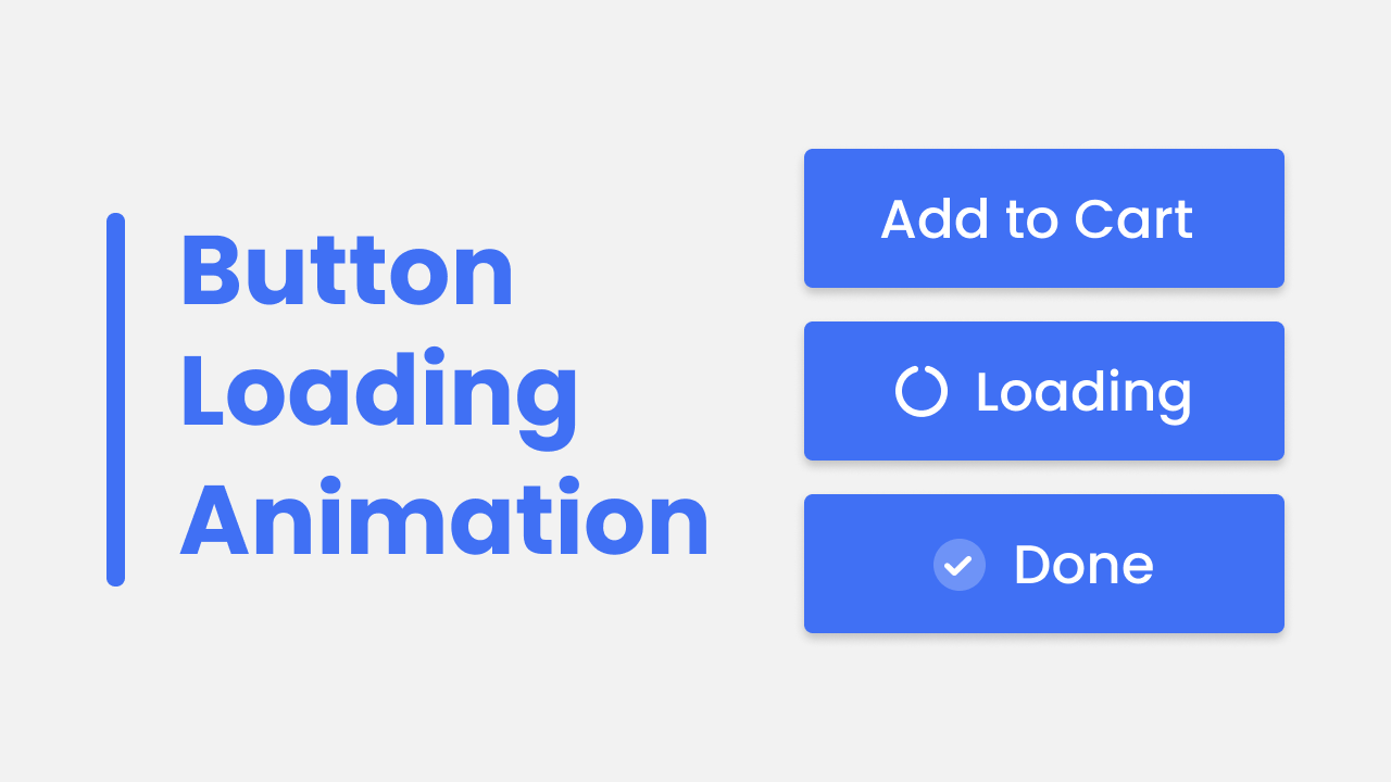
Let’s have a quick look at the given image of our project [Button Animation], as you can see on the image at first button has “add to cart” text and in the second button there is a spinner and “loading” text, and in the last button, there is a check icon and “done” text. Actually, according to this project, there will be the first button and when you click on that button, the spinner and “loading” text appear, and the spinner starts to spin, after a few time the check icon appear with “done text”.
Now the given video tutorial helps us to watch the real demo of our project [Button Animation] and all the HTML CSS and JavaScript that I have used to create this button with an animation.
Button Animation in HTML CSS & JavaScript | Video Tutorial
I will provide all the HTML CSS and JavaScript code that I have used to create this animated button. Before getting into the source code file, I would like to briefly explain the given video tutorial of our project [Button Animation].
As you have seen in the video tutorial of our project [Button Animation]. At first, there was a button with “add to cart” text, when I clicked on that button, a spinner appeared with a “loading” text, and that spinner started to spring at the same time. After a few seconds, a check icon appeared and “loading” text turn into “done” text. The overall animation was quite an awesome right?. To make this button I used HTML and CSS only, the transition was created by CSS cubic-bezier. To change the icon and text I used some JavaScript code.
I hope now you can build this button with animation using HTML CSS and JavaScript. If you are feeling difficulty creating this project, I have provided all the source code below.
You Might Like This:
Button Animation [Source Code]
<!DOCTYPE html>
<!-- Coding By CodingNepal - codingnepalweb.com -->
    <html lang="en">
    <head>
        <meta charset="UTF-8">
        <meta http-equiv="X-UA-Compatible" content="IE=edge">
        <meta name="viewport" content="width=device-width, initial-scale=1.0">
        <title> Button with Loading Animation </title>

        <!-- CSS -->
        <link rel="stylesheet" href="css/style.css">

        <!-- Fontawesome CDN Link -->
        <link rel="stylesheet" href="https://cdnjs.cloudflare.com/ajax/libs/font-awesome/6.1.1/css/all.min.css">

    </head>
    <body>
        <div class="button">
            <i class="fa-solid fa-circle-notch icon spinner"></i>
            <span class="btn-text" user-selcect="none">Add to Cart</span>
        </div>

        <script>
            let btn = document.querySelector(".button"),
                spinIcon = document.querySelector(".spinner"),
                btnText = document.querySelector(".btn-text");

            btn.addEventListener("click", () => {
                btn.style.cursor = "wait";
                btn.classList.add("checked");
                spinIcon.classList.add("spin");
                btnText.textContent = "Loading";

            setTimeout(() => {
                btn.style.pointerEvents = "none";
                spinIcon.classList.replace("spinner", "check");
                spinIcon.classList.replace("fa-circle-notch", "fa-check");
                btnText.textContent = "Done";

            }, 4500) //1s = 1000ms
            });
        </script>
    </body>
</html>
/* Google Fonts - Poppins */
@import url('https://fonts.googleapis.com/css2?family=Poppins:wght@300;400;500;600&display=swap');

*{
    margin: 0;
    padding: 0;
    box-sizing: border-box;
    font-family: 'Poppins', sans-serif;
}
body{
    height: 100vh;
    display: flex;
    align-items: center;
    justify-content: center;
}
.button{
    display: flex;
    align-items: center;
    padding: 20px 36px;
    border-radius: 8px;
    background-color: #4070f4;
    box-shadow: 0 5px 10px rgba(0, 0, 0, 0.2);
    cursor: pointer;
    user-select: none;
}
.button .icon{
    font-size: 28px;
    color: #fff;
    margin-right: 10px;
    display: none;
}
.button.checked .icon{
    display: flex;
}
.icon.spinner.spin{
    animation: spin 1.3s ease-in-out infinite;
}
@keyframes spin {
    100%{
        transform: rotate(360deg);
    }
}
.icon.check{
    display: inline-flex;
    height: 32px;
    width: 32px;
    font-size: 18px;
    border-radius: 50%;
    align-items: center;
    justify-content: center;
    background-color: #6e93f7;
}
.button .btn-text{
    font-size: 32px;
    font-weight: 400px;
    color: #fff;
}


