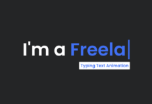
Hey friends, today in this blog you’ll learn how to create a Simple Text Typing Animation using only HTML & CSS or Typewriter Text Animation. Earlier I have shared a blog on Colorful Gradient Text Effect using HTML & CSS and now I’m going to create pure CSS text typing animation.
You may have seen this type of text typing animation on many portfolio sites or other sites. Generally, this animation is created using JavaScript or jQuery library, and the famous jQuery library for text animation is typed.js but now I’ll tell you how you can create this text typing animation using only HTML & CSS.
In this text animation, there are two types of texts that mean one is a static text which has no animation, and the second one has animation and it changes dynamically. I have added four different texts to this animation and it’s shown one by one with a typing animation which looks pretty cool and interesting.
You can watch a demo of this text animation or a full video tutorial which may help you to clear your doubts related to this animation.
Video Tutorial of Text Typing Animation
In the video, you have seen how I created this text animation using only HTML & CSS and I believe if you’re a beginner then you can also understand these codes and can create this type of text animation. I used the CSS @keyframes property to create typing animation of texts and without this property, this animation can’t be completed.
If you like this animation can thinking about using it on your projects then you can download or copy codes from the given boxes and feel free to use these codes on your projects without any limitation. In this video, I didn’t show you how you can erase back to typed text but many viewers have wanted it so I and this animation also and updated the codes.
You might like this:
Pure CSS Text Typing Animation [Source Codes]
First, create an HTML file with the name of index.html and paste the given codes in your HTML file. Remember, you’ve to create a file with .html extension.
<!DOCTYPE html>
<!-- Created By CodingNepal - www.codingnepalweb.com -->
<html lang="en">
<head>
  <meta charset="UTF-8">
  <title>Multiple Texts Typing Animation | CodingNepal</title>
  <link rel="stylesheet" href="style.css">
</head>
<body>
  <div class="wrapper">
    <div class="static-txt">I'm a</div>
    <ul class="dynamic-txts">
      <li><span>YouTuber</span></li>
      <li><span>Designer</span></li>
      <li><span>Developer</span></li>
      <li><span>Freelancer</span></li>
    </ul>
  </div>
</body>
</html>
Second, create a CSS file with the name of style.css and paste the given codes in your CSS file. Remember, you’ve to create a file with .css extension.
@import url('https://fonts.googleapis.com/css2?family=Poppins:wght@200;300;400;500;600;700&display=swap');
*{
  margin: 0;
  padding: 0;
  box-sizing: border-box;
  font-family: 'Poppins', sans-serif;
}
body{
  display: flex;
  align-items: center;
  justify-content: center;
  min-height: 100vh;
  background: #343F4F;
}
.wrapper{
  display: flex;
}
.wrapper .static-txt{
  color: #fff;
  font-size: 60px;
  font-weight: 400;
}
.wrapper .dynamic-txts{
  margin-left: 15px;
  height: 90px;
  line-height: 90px;
  overflow: hidden;
}
.dynamic-txts li{
  list-style: none;
  color: #FC6D6D;
  font-size: 60px;
  font-weight: 500;
  position: relative;
  top: 0;
  animation: slide 12s steps(4) infinite;
}
@keyframes slide {
  100%{
    top: -360px;
  }
}
.dynamic-txts li span{
  position: relative;
  margin: 5px 0;
  line-height: 90px;
}
.dynamic-txts li span::after{
  content: "";
  position: absolute;
  left: 0;
  height: 100%;
  width: 100%;
  background: #343F4F;
  border-left: 2px solid #FC6D6D;
  animation: typing 3s steps(10) infinite;
}
@keyframes typing {
  40%, 60%{
    left: calc(100% + 30px);
  }
  100%{
    left: 0;
  }
}
That’s all, now you’ve successfully created a Text Typing Animation using only HTML & CSS. If your code does not work or you’ve faced any error/problem then please download the source code files from the given download button. It’s free and a .zip file will be downloaded then you’ve to extract it.


Awesome! I enjoyed this tutorial very much. Thanks for the code files.
Brilliant! I enjoyed this very much! Thank you! Is there a way to backspace and then type again as if fixing a typo?
Thanks for the knowledge you have provided!
Great work…Keep it up
Hey I would love to use this for my landing page.
First I want to display my name, make that dissapear and then launch the text typing animation. How would you recomend delaying the text typing animation?
Great Tutorial! Enjoyed it every minute!
Thank you so much for this head start.
I’m starting to work on making it be a little more responsive (as in maybe it should shrink a little when on a smaller screen?).
Any pointers on that would be very welcome!
best website for newbie devloper
Happy to hear that! Keep learning!
Thank you bro
Hi, Love your work, its helping me learn and understand HTML and CSS very well.
Is it possible to have the slider pause after the last entry, Freelance,
and have Freelance have a link or timer of say 5 seconds then open the main page of a website,
I am looking at using this as a landing page, then automatically open a web link
Thank you
David
Very Useful Site
Thank you
hi