Hello Reader, Today in this blog I’m going to design an animated profile card and it will control by one button. As you know I have shared a blog about How to Create Responsive Neumorphism Navigation Menu and now I will design a profile card.
Simply we can understand profile means the identity of something especially a human head or face described or seen in a side view and a card is means a flat, thick piece of paper, used to prove the identification of a particular person. Generally, a Profile card contains an individual person’s name, address, profession, and other casual details.
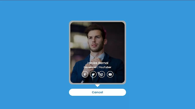
In this Program [Profile Card Design using HTML & CSS ], as you can see in the given picture there is a profile of an individual person with his name, job and also we can see some social media buttons for this person. At the bottom of that card, we can see a button with text. At first, that profile card name, job and, social media button are disabled, and also a button and card distance little far but when we clicked that share button a profile card move downward close to the button with sliding animation also card’s name, job, and social media icons appear with animation and the button text change into cancel.
If you are feeling difficult to understand this program [Profile Card Design] I have to provide a video tutorial below. You can watch the full tutorial, I hope you will get an idea about this profile card.
Video Tutorial of Animated Profile Card using HTML & CSS only
As you have seen on this video tutorial how the button controls the whole profile card and the sliding animation with the hover effect of those social media icons, also you have seen when we click the share button that the button change into cancel form. To control a whole profile card I have used an HTML input checkbox and button with label tag( when button click input is checked and unchecked).
If you know basic HTML & CSS you can easily create this program[Profile Card ] using only HTML & CSS or if you have knowledge of JavaScript you can add other various concepts to this card. Friends you use this profile card for your purpose freely. If you are feeling difficult to create this profile car, I have provided source code files of this program[ProfiCard Design using HTML & CSS].
You Might Like This:
Animated Profile Card [Source Codes]
To copy these given codes of this program [Animated Profile Card Design], you need to create HTML & CSS file on your computer then you can paste these codes or you can easily down all source code files from the given “Download Button”.
<!DOCTYPE html>
<!-- Created By CodingLab - www.codinglabweb.com -->
<html lang="en" dir="ltr">
  <head>
    <meta charset="UTF-8">
   <title> Animated Profie Card | CodingLab </title>
    <link rel="stylesheet" href="style.css">
   <link rel="stylesheet" href="https://cdnjs.cloudflare.com/ajax/libs/font-awesome/5.15.2/css/all.min.css"/>
   </head
<body>
<div class="main-box">
<div class="content">
  <input type="checkbox" id="check">
  <label class="box" for="check">
  <div class="share">SHARE</div>
  <div class="cancel">CANCEL</div>
  </label>
  <div class="image-box">
    <img src="james.jpeg" alt="">
    <div class="about">
    <div class="details">
      <div class="name">James Bernal</div>
      <div class="job">Devoloper | Youtuber</div>
      <div class="icon">
        <a href="#"><i class="fab fa-facebook-f"></i></a>
        <a href="#"><i class="fab fa-twitter"></i></a>
        <a href="#"><i class="fab fa-instagram"></i></a>
        <a href="#"><i class="fab fa-youtube"></i></a>
      </div>
    </div>
    </div>
  </div>
</div>
</div>
</body>
</html>
@import url('https://fonts.googleapis.com/css2?family=Poppins:wght@200;300;400;500;600;700&display=swap');
*{
  margin: 0;
  padding: 0;
  box-sizing: border-box;
  font-family: 'Poppins',sans-serif;
}
body{
  background: #3498db;
}
.main-box{
  position: absolute;
  left: 50%;
  bottom: 8%;
  transform: translateX(-50%);
  width: 400px;
  height: 550px;
  text-align: center;
}
.main-box .content{
  position: relative;
  height: 100%;
  width: 100%;
}
.content .box{
  position: absolute;
  height: 50px;
  width: 100%;
  left: 0;
  bottom: 0;
  border-radius: 25px;
  cursor: pointer;
}
.share, .cancel{
  position: absolute;
  height: 100%;
  width: 100%;
  left: 0;
  top: 0;
  font-size: 20px;
  font-weight: 600;
  color: #2980b9;
  line-height: 50px;
  background: #fff;
  letter-spacing: 1px;
  border-radius: 25px;
  opacity: 0;
  transition: all 0.3s ease;
}
.content .box .share{
  opacity: 1;
}
#check:checked ~ .box .share{
  opacity: 0;
}
#check:checked ~ .box .cancel{
  opacity: 1;
}
.content .image-box{
  position: absolute;
  height: 450px;
  width: 100%;
  bottom: 130px;
  left: 50%;
  transform: translateX(-50%);
  background: #fff;
  padding: 10px;
  border-radius: 25px;
  transition: all 0.4s ease;
}
#check:checked ~ .image-box{
  bottom: 70px;
}
#check{
  display: none;
}
.image-box::before{
  position: absolute;
  content: '';
  bottom: -12px;
  left: 50%;
  transform: translateX(-50%) rotate(45deg);
  height: 30px;
  width: 30px;
  background: #fff;
  z-index: -1;
}
.image-box img{
  height: 100%;
  width: 100%;
  object-fit: cover;
  border-radius: 26px;
}
.image-box .about{
  position: absolute;
  background: rgba(0, 0, 0, 0.5);
  height: 100%;
  width: 100%;
  left: 0;
  top: 0;
  border-radius: 25px;
  padding: 20px;
  text-align: center;
  opacity: 0;
  transition: all 0.3s ease;
}
#check:checked ~ .image-box .about{
  opacity: 1;
}
.about .details{
  position: absolute;
  width: 100%;
  left: 0;
  bottom: 35px;
}
.details .name, .job{
  font-size: 18px;
  font-weight: 500;
  color: #fff;
}
 .details .icon i{
   font-size: 20px;
   color: #fff;
   height: 45px;
   width: 45px;
   line-height: 43px;
   border-radius: 50%;
   border: 2px solid #fff;
   margin: 14px 5px;
   transition: all 0.3s ease;
 }
.details .icon i:hover{
  transform: scale(0.95);
}
If you face any difficulties while creating your Animated Profile Card or your code is not working as expected, you can download the source code files for this Profile Card with Share Button for free by clicking on the download button, and you can also view a live demo of this card slider by clicking on the view live button.


nice