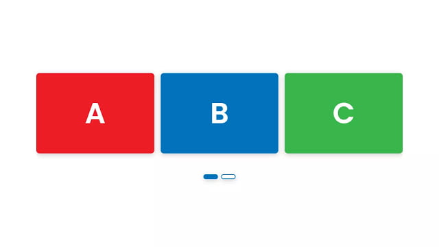
Hello readers, Today in this blog you’ll learn how to create a Responsive Owl-carousel Slider using HTML CSS & jQuery. Earlier I have also shared a blog on how to create an Owl-carousel Cards Slider but this design is not responsive to mobile devices and there weren’t controls to slide cards. So today I’m going to create a Responsive Owl-carousel Slider with control buttons to slide card.
OWL Carousel is a touch-enabled jQuery plugin that permits you to create beautiful responsive carousel sliders. A carousel is a combination of rotating banners, or a slideshow, that describes on the homepage of your store. It lets you display up to five slides consisting of images and text, which can be linked to particular products or pages.
In this program (Responsive Owl-carousel Slider ), on the webpage, there are shown only three cards among five cards with different background-color and these cards slide automatically after every two seconds. There are also control or nav buttons to slide cards manually. This design is fully responsive for any device and in tablets, there are shown two cards with three control buttons and in mobile devices, there is shown one card with five control buttons.
If you’re feeling difficult to understand what I am saying. You can watch a full video tutorial on this program (Responsive Owl-carousel Slider).
Video Tutorial of Responsive Owl-carousel Slider
In the video, you have seen the Responsive Owl-carousel Slider and I hope you have understood the basic codes behind creating this program. These sliders are simple and easy to create because of the Owl-carousel jQuery plugin. We can also create this program with pure JavaScript but in javascript, we need to code more as compare to using a plugin.
If you like this program (Responsive Owl-carousel Slider) and want to get source codes. You can easily get the source codes of this program. To get the source codes you just need to scroll down. You can use this pre-built carousel slider on your HTML pages, projects, and websites.
You might like this:
Responsive Owl-carousel Slider [Source Codes]
To create this program (Responsive Owl-carousel Slider). First, you need to create two Files one HTML File and another one is CSS File. After creating these files just paste the following codes in your file.
First, create an HTML file with the name of index.html and paste the given codes in your HTML file. Remember, you’ve to create a file with .html extension.
<!DOCTYPE html>
<!-- Created By CodingNepal -->
<html lang="en" dir="ltr">
   <head>
      <meta charset="utf-8">
      <title>Responsive Owl-Carousel Slider | CodingNepal</title>
      <link rel="stylesheet" href="style.css">
      <meta name="viewport" content="width=device-width, initial-scale=1.0">
      <script src="https://code.jquery.com/jquery-3.5.1.js"></script>
      <script src="https://cdnjs.cloudflare.com/ajax/libs/OwlCarousel2/2.3.4/owl.carousel.min.js"></script>
      <link rel="stylesheet" href="https://cdnjs.cloudflare.com/ajax/libs/OwlCarousel2/2.3.4/assets/owl.carousel.min.css">
   </head>
   <body>
      <div class="wrapper">
         <div class="carousel owl-carousel">
            <div class="card card-1">
               A
            </div>
            <div class="card card-2">
               B
            </div>
            <div class="card card-3">
               C
            </div>
            <div class="card card-4">
               D
            </div>
            <div class="card card-5">
               E
            </div>
         </div>
      </div>
      <script>
         $(".carousel").owlCarousel({
           margin: 20,
           loop: true,
           autoplay: true,
           autoplayTimeout: 2000,
           autoplayHoverPause: true,
           responsive: {
             0:{
               items:1,
               nav: false
             },
             600:{
               items:2,
               nav: false
             },
             1000:{
               items:3,
               nav: false
             }
           }
         });
      </script>
   </body>
</html>
Second, create a CSS file with the name of style.css and paste the given codes in your CSS file. Remember, you’ve to create a file with .css extension.
@import url('https://fonts.googleapis.com/css?family=Poppins:400,500,600,700&display=swap');
*{
  margin: 0;
  padding: 0;
  box-sizing: border-box;
  font-family: 'Poppins', sans-serif;
}
body{
  min-height: 100vh;
  display: flex;
  align-items: center;
}
.wrapper{
  width: 100%;
}
.carousel{
  max-width: 1200px;
  margin: auto;
  padding: 0 30px;
}
.carousel .card{
  color: #fff;
  text-align: center;
  margin: 20px 0;
  line-height: 250px;
  font-size: 90px;
  font-weight: 600;
  border-radius: 10px;
  box-shadow: 0px 4px 15px rgba(0,0,0,0.2);
}
.carousel .card-1{
  background: #ed1c24;
}
.carousel .card-2{
  background: #0072bc;
}
.carousel .card-3{
  background: #39b54a;
}
.carousel .card-4{
  background: #f26522;
}
.carousel .card-5{
  background: #630460;
}
.owl-dots{
  text-align: center;
  margin-top: 40px;
}
.owl-dot{
  height: 15px;
  width: 45px;
  margin: 0 5px;
  outline: none;
  border-radius: 14px;
  border: 2px solid #0072bc!important;
  box-shadow: 0px 4px 15px rgba(0,0,0,0.2);
  transition: all 0.3s ease;
}
.owl-dot.active,
.owl-dot:hover{
  background: #0072bc!important;
}
That’s all, now you’ve successfully created a Responsive Owl-carousel Slider using HTML CSS & jQuery. If your code doesn’t work or you’ve faced any error/problem then please comment down or contact us from the contact page.


Thanks, man, looks fantastic!
Can you help me get it to work with 12 images?
I got it to work!
I want to add 12 images to the slider. I did 5 and it works fine but with 12 it breaks. Can you help with that?
im trying to use it to disply reviews n the embed and i cant get it working, just lists them vertically 🙁
Working
Sir I want two make only left and right buttons in the slider, because when i use it in phone, it shows as many slider button as number of cards.
It is not responsive for me, what can be the issue?
It’s responsive. Please check your codes.
its working ! thanks
You’re welcome.
Wich size have to set for pictures ?
I forgot the size of the image. Please download code files from the given download button and you’ll get images also.
how to edit it
You're welcome!
Working Good Job… Thank you
Check you jQuery code and make sure you're online
Did not work. No vertical flex of boxes.
Make sure you're connected to the Internet.
Not working