Hello readers, Today in this blog you’ll learn how to create a Button Ripple Effect using HTML CSS & JavaScript. Earlier I have shared many blogs on Gradient Glowing Effect on Button, 3D Flip Button, and Colorful Glowing Effect on Button. But now I’m going to create a Ripple Effect on the Button.
The Ripple effect provides an immediate visual confirmation at the point of contact when the users interact with UI elements. And a button is any graphic or text box that lets your visitors interact with your website. Interaction is commonly an action that you want your visitors to take.
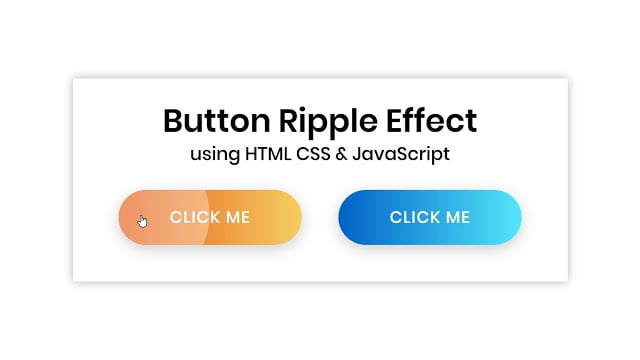
In this program (Button Ripple Effect), at first, on the webpage, there are two gradient buttons with different background-color. Generally, gradient means a mix of two or more colors. And when you click on the particular button there is shown a ripple effect and it expands smoothly as you can see in the image. This ripple effect is dynamic that means this ripple starts expanding from the point where you clicked.
If you’re feeling difficult to understand what I am saying. You can watch a full video tutorial on this program (Button Ripple Effect in HTML & CSS).
Video Tutorial of Button Ripple Effect in JavaScript
As you have seen the ripple effect in the video. And I hope you have understood the basic codes behind creating this ripple effect. You also knew this ripple effect is a dynamic effect that means the position of this effect is not fixed. This type of effect is in trend nowadays. Many websites are using this ripple effect on their UI elements like buttons, links, and many more.
To make this ripple effect dynamic, JavaScript plays a significant role. Without JavaScript, we can’t make this effect dynamic. If you’re a beginner and you know HTML & CSS only, you can also create a simple ripple effect, but that effect won’t be dynamic.
You might like this:
Button Ripple Effect in JavaScript [Source Codes]
To create this program (Button Ripple Effect). First, you need to create two Files one HTML File and another one is CSS File. After creating these files just paste the following codes in your file.
First, create an HTML file with the name of index.html and paste the given codes in your HTML file. Remember, you’ve to create a file with .html extension.
<!DOCTYPE html>
<!-- Created By CodingNepal -->
<html lang="en" dir="ltr">
   <head>
      <meta charset="utf-8">
      <title>Button Ripple Effect | CodingNepal</title>
      <link rel="stylesheet" href="style.css">
   </head>
   <body>
      <div class="wrapper">
         <div class="text">
            Button Ripple Effect
         </div>
         <p>
            using HTML CSS & JavaScript
         </p>
         <div class="btns">
            <a href="#">Click me</a>
            <a href="#">Click me</a>
         </div>
      </div>
      <script>
         const buttons = document.querySelectorAll("a");
         buttons.forEach((button) => {
           button.onclick = function(e){
             let x = e.clientX - e.target.offsetLeft;
             let y = e.clientY - e.target.offsetTop;
             let ripple = document.createElement("span");
             ripple.style.left = `${x}px`;
             ripple.style.top = `${y}px`;
             this.appendChild(ripple);
             setTimeout(function(){
               ripple.remove();
             }, 600); // 1second = 1000ms
           }
         });

      </script>
   </body>
</html>
Second, create a CSS file with the name of style.css and paste the given codes in your CSS file. Remember, you’ve to create a file with .css extension.
@import url('https://fonts.googleapis.com/css?family=Poppins:400,500,600,700&display=swap');
*{
  margin: 0;
  padding: 0;
  outline: none;
  box-sizing: border-box;
  font-family: 'Poppins', sans-serif;
}
html,body{
  display: grid;
  height: 100%;
  place-items: center;
  text-align: center;
}
.wrapper{
  background: #fff;
  padding: 20px 30px;
  box-shadow: 0px 0px 10px rgba(0,0,0,0.25);
}
.wrapper .text{
  font-size: 35px;
  font-weight: 600;
}
.wrapper p{
  font-size: 20px;
  font-weight: 500;
  line-height: 20px;
}
.wrapper .btns{
  display: flex;
  margin: 30px 0 20px 0;
}
.btns a{
  position: relative;
  margin: 0 20px;
  height: 60px;
  width: 200px;
  display: block;
  line-height: 60px;
  border-radius: 30px;
  text-decoration: none;
  color: #fff;
  font-size: 18px;
  font-weight: 500;
  text-transform: uppercase;
  letter-spacing: 1px;
  overflow: hidden;
  box-shadow: 0 4px 15px rgba(0,0,0,0.2);
}
.btns a:first-child{
  background: linear-gradient(-90deg, #f5ce62, #e85a19);
}
.btns a:last-child{
  background: linear-gradient(90deg, #0162c8, #55e7fc);
}
.btns a > span{
  position: absolute;
  background: #fff;
  transform: translate(-50%, -50%);
  border-radius: 50%;
  pointer-events: none;
  animation: ripples 0.6s linear infinite;
}
@keyframes ripples {
  0% {
    width: 0px;
    height: 0px;
    opacity: 0.5;
  }
  100% {
    width: 500px;
    height: 500px;
    opacity: 0;
  }
}
That’s all, now you’ve successfully created a Button Ripple Effect in HTML CSS & JavaScript. If your code doesn’t work or you’ve faced any error/problem then please comment down or contact us from the contact page.


Nice it Really Helped Me A Lot Got Away With Lots Stress Searhing Everywhere how to make a ripple effect button
Keep Your Work Going!
I love your work of arts.
Love from Bhutan.
Keep loving <3
you super man in coding its very helpfull for us thank you so much ….
your my inspiration
You’re most welcome
Can you give a tutorial on how you created your blog
Sorry, now I don’t upload videos related to blogging.
You're welcome 🙂
yooossss
tank you
You're welcome 🙂
Thank's big fan from india
Just copy the codes and paste where you want buttons.
How i can implement these buttons in my blogpost?