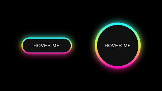
Hello readers, Today in this blog you’ll learn how to create a Colorful Glowing Effect on Hover using only HTML & CSS. Previously I have shared a Social Media Widget with Cool Hover Animation using only HTML and CSS, now it’s time to create Colorful Glowing Effects on Hover.
As you can in the image, there are two objects with Colorful Glowing Effects. There is a one-button with hover me a text and one loader-circle with the same hover me text. Assuming Those two objects are buttons.
At first, those buttons are in the initial stage where there are no glow effects on them. But when you hover on it, it will be started to glowing in the background. If you’re feeling difficulty understanding what I am saying. You can watch a full video tutorial on this program (Colorful Glowing Effect on Hover).
Video Tutorial of Colorful Glowing Effect in HTML & CSS
I hope you liked this Glowing Effect and understood the basic codes and concepts. As you have seen in the video, I used HTML & CSS only to create this animation. If you are a beginner and have basic knowledge of HTML & CSS, you can also create this type of animation.
If you like this program (Colorful Glowing Effect on Hover) and want to get source codes. You can easily get the source codes of this program. To get the source codes you just need to scroll down.>
You might like this:
Colorful CSS Glowing Effect [Source Codes]
To create this program (Colorful Glowing Effect on Hover). First, you need to create two Files one HTML File and another one is CSS File. After creating these files just paste the following codes in your file.
First, create an HTML file with the name of index.html and paste the given codes in your HTML file. Remember, you’ve to create a file with .html extension.
<!DOCTYPE html>
<!-- Created By CodingNepal -->
<html lang="en" dir="ltr">
   <head>
      <meta charset="utf-8">
      <title>Gradient Color Effect | CodingNepal</title>
      <link rel="stylesheet" href="style.css">
      <meta name="viewport" content="width=device-width, initial-scale=1.0">
   </head>
   <body>
      <div class="center">
         <div class="outer button">
            <button>Hover Me</button>
            <span></span>
            <span></span>
         </div>
         <div class="outer circle">
            <button>Hover Me</button>
            <span></span>
            <span></span>
         </div>
      </div>
   </body>
</html>
Second, create a CSS file with the name of style.css and paste the given codes in your CSS file. Remember, you’ve to create a file with .css extension.
*{
  margin: 0;
  padding: 0;
  box-sizing: border-box;
}
html,body{
  display: grid;
  height: 100%;
  place-items: center;
  background: #000;
}
.center{
  display: flex;
  text-align: center;
  align-items: center;
  justify-content: center;
}
.outer{
  position: relative;
  margin: 0 50px;
  background: #111;
}
.button{
  height: 70px;
  width: 220px;
  border-radius: 50px;
}
.circle{
  height: 200px;
  width: 200px;
  border-radius: 50%;
}
.outer button, .outer span{
  position: absolute;
  top: 50%;
  left: 50%;
  transform: translate(-50%, -50%);
}
.outer button{
  background: #111;
  color: #f2f2f2;
  outline: none;
  border: none;
  font-size: 20px;
  z-index: 9;
  letter-spacing: 1px;
  text-transform: uppercase;
  cursor: pointer;
}
.button button{
  height: 60px;
  width: 210px;
  border-radius: 50px;
}
.circle button{
  height: 180px;
  width: 180px;
  border-radius: 50%;
}
.outer span{
  height: 100%;
  width: 100%;
  background: inherit;
}
.button span{
  border-radius: 50px;
}
.circle span{
  border-radius: 50%;
}
.outer:hover span:nth-child(1){
  filter: blur(7px);
}
.outer:hover span:nth-child(2){
  filter: blur(14px);
}
.outer:hover{
  background: linear-gradient(#14ffe9, #ffeb3b, #ff00e0);
  animation: rotate 1.5s linear infinite;
}
@keyframes rotate {
  0%{
    filter: hue-rotate(0deg);
  }
  100%{
    filter: hue-rotate(360deg);
  }
}
@media (max-width: 640px){
  .center{
    flex-wrap: wrap;
    flex-direction: column;
  }
  .outer{
    margin: 50px 0;
  }
}
That’s all, now you’ve successfully created a Colorful Glowing Effect on Hover using HTML & CSS. If your code does not work or you’ve faced any errors/problems, please comment down or contact us from the contact page.


Cool! 🙂
Thanks bro
Thank you
Great! Going to try it on my phone!
Thank you
Atom bro
nice
what's app?? bro
Where bro?
Which font you use bro
Thank you…Stay tuned with us!
U are the best love all videos
Add anchor tag for this.
How send it to a link?
Please contact on me Instagram.
Thank you.
How can I put this on my Blogger?how pls help bro
oh wow this so great
Thanks bro..keep visiting.
Welcome bro..keep visiting.
super
work
bro
Thank you for share code..