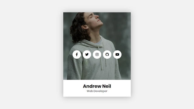
Hello readers, Today in this blog you’ll learn how to create an Animated Profile Card using only HTML & CSS. Previously I have shared a Responsive Navbar using CSS Flexbox, now it’s time to create a Profile Card Design with Hover Animation in HTML & CSS.
Cards are surfaces that display contents and actions on a particular topic. They should be easy to scan for appropriate and actionable information. Components, like text and images, should be placed on them.
As you can see in the image, this is a Profile Card using HTML & CSS. This is a simple CSS card. In this card, there is a cool hover animation on the card. That means at first there is only an image but when you hover on that image, the image will slide up, and then the bottom texts and center social buttons are visible.
If you’re feeling difficult to understand what I am saying. You can watch a full video tutorial on this program (Animated Profile Card Design).
Video Tutorial of Animated Profile Card Design in HTML CSS
If you are a beginner and have some basic knowledge of HTML & CSS then you can make this card fully responsive and can use this card in your project according to your requirements.
If you want to get the source code of this program (Animated Profile Card Design). You can easily get the source codes of this program. To get the source codes you just need to scroll down.
Animated Profile Card Design in HTML CSS [Source Codes]
To create this program (Animated Profile Card Design). First, you need to create two Files one HTML File and another one is CSS File. After creating these files just paste the following codes in your file. First, create an HTML file with the name of index.html and paste the given codes in your HTML file. Remember, you’ve to create a file with .html extension.
<!DOCTYPE html>
<!-- Created By CodingNepal -->
<head>
   <meta charset="utf-8">
   <title>Animated Profile Card | CodingNepal</title>
   <link rel="stylesheet" href="style.css">
   <link rel="stylesheet" href="https://cdnjs.cloudflare.com/ajax/libs/font-awesome/5.15.3/css/all.min.css"/>
</head>
<body>
   <div class="container">
      <div class="image">
         <img src="https://images.unsplash.com/photo-1492288991661-058aa541ff43?ixlib=rb-1.2.1&ixid=eyJhcHBfaWQiOjEyMDd9&auto=format&fit=crop&w=634&q=80">
      </div>
      <div class="content">
         <div class="info">
            <h2>
               Andrew Neil
            </h2>
            <span>Web Developer</span>
         </div>
      </div>
      <ul>
         <li><a href="#"><span class="fab fa-facebook-f"></span></a></li>
         <li><a href="#"><span class="fab fa-twitter"></span></a></li>
         <li><a href="#"><span class="fab fa-instagram"></span></a></li>
         <li><a href="#"><span class="fab fa-github"></span></a></li>
         <li><a href="#"><span class="fab fa-youtube"></span></a></li>
      </ul>
   </div>
</body>
</html>
Second, create a CSS file with the name of style.css and paste the given codes in your CSS file. Remember, you’ve to create a file with .css extension.
@import url('https://fonts.googleapis.com/css?family=Poppins:400,500,600,700&display=swap');
*{
  margin: 0;
  padding: 0;
  font-family: 'Poppins', sans-serif;
}
html,body{
  display: grid;
  height: 100%;
  place-items: center;
  text-align: center;
  background: #f2f2f2;
}
.container{
  position: relative;
  height: 500px;
  width: 400px;
  overflow: hidden;
  background: #fff;
  box-shadow: 0px 1px 5px 0px rgba(0,0,0,0.3);
  transition: 0.3s ease-out;
}
.container:hover{
  box-shadow: 0px 1px 35px 0px rgba(0,0,0,0.3);
}
.container .image{
  background: #000;
  position: absolute;
  top: 0;
  left: 0;
  height: 100%;
  width: 100%;
  z-index: 2;
  transition: transform 0.3s ease-out;
}
.container:hover .image{
  transform: translateY(-100px);
}
.image img{
  height: 100%;
  width: 100%;
  object-fit: cover;
  transition: opacity 0.3s ease-out;
}
.container:hover .image img{
  opacity: 0.7;
}
.container:hover .image{
 transform: translateY(-100px);
}
.container ul{
  display: flex;
  position: absolute;
  top: 50%;
  left: 50%;
  transform: translate(-50%, -50%);
  z-index: 3;
  list-style: none;
}
ul li{
  margin: 0 5px;
}
ul li a{
  display: block;
  height: 50px;
  width: 50px;
  color: #000;
  line-height: 50px;
  font-size: 20px;
  border-radius: 50%;
  opacity: 0;
  transform: translateY(200px);
  background: #fff;
  transition: transform 0.3s ease-out, opacity 0.3s ease-out;
}
.container:hover > ul > li > a{
  opacity: 1;
  transform: translateY(0);
}
.container:hover > ul > li:nth-child(2) a{
  transition-delay: 0.1s;
}
.container:hover > ul > li:nth-child(3) a{
  transition-delay: 0.2s;
}
.container:hover > ul > li:nth-child(4) a{
  transition-delay: 0.3s;
}
.container:hover > ul > li:nth-child(5) a{
  transition-delay: 0.4s;
}
.container .content{
  position: relative;
  width: 100%;
  height: 100%;
  background: #fff;
}
.info{
  position: absolute;
  bottom: 20px;
  text-align: center;
  width: 100%;
  color: #000;
  line-height: 26px;
}
.info h2{
  font-size: 27px;
  margin: 3px 0;
}
.info span{
  color: #1a1a1a;
}
That’s all, now you’ve successfully created Animated Profile Card Design in HTML & CSS. If your code doesn’t work or you’ve faced any error/problem then please comment down or contact us from the contact page.


Seems good 🙂
It was to good.
We make more videos on Web development