Hey friends, today in this blog, you’ll learn how to create a Fully Responsive Footer Section using only HTML & CSS. In the earlier blog, I have shared how to create a Responsive Dropdown Menu Bar using HTML & CSS and now it’s time to create a Responsive Footer.
You may have seen a footer on every website that you’ve visited because the footer on any website is now compulsory. Footer is always set on the bottom of the main page or last of the page. The latest version of HTML5 has introduced a separate tag for the footer and that is <footer>.
A few years ago, the footer is only used to giving copyright information but nowadays the footer is in trend and all websites have a big footer section with more information and social media accounts or icons.
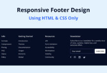
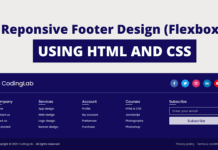
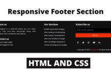
In our footer, as you can see in the preview image, there are some categories of footer with some social media icons, short description, location info, and a contact form. This footer is fully responsive for all devices including mobile phones. On the pc, these footer categories are aligned horizontally but when you open it on small devices like mobile phones, each category of footer aligned vertically and it’ll automatically adjust its height and width according to the device height and width.
Video Tutorial of Responsive Footer Section
In the video, you’ve seen the responsive footer section and how it shows on mobile devices. I hope your all doubts and problems are solved after watching this video tutorial on the footer design. I think you’ve understood the basic codes of this footer design. To create this footer I used only HTML & CSS so if you’re a beginner then you can also easily understand the codes and can create this type of footer design.
You can use this responsive footer section code on your website or project after a few changes according to your requirements and you can also redesign this footer and take this to the next level. If you like this footer and want to get source codes then you can easily copy the codes from the given copy boxes or you can also download source files of this footer design. I believe this responsive footer code can help beginners to know CSS in depth.
You might like this:
Responsive Footer Section HTML & CSS [Source Codes]
To create this program [Responsive Footer Section]. First, you need to create two Files one HTML File and another one is CSS File. After creating these files just paste the following codes into your file. You can also download the source code files of this responsive footer design from the below download button.
First, create an HTML file with the name of index.html and paste the given codes in your HTML file. Remember, you’ve to create a file with .html extension.
<!DOCTYPE html>
<!-- Created By CodingNepal - www.codingnepalweb.com -->
<html lang="en" dir="ltr">
  <head>
    <meta charset="utf-8">
    <title>Responsive Footer Section | CodingNepal</title>
    <link rel="stylesheet" href="style.css">
    <link rel="stylesheet" href="https://cdnjs.cloudflare.com/ajax/libs/font-awesome/5.15.3/css/all.min.css"/>
    <meta name="viewport" content="width=device-width, initial-scale=1.0">
  </head>
  <body>
    <div class="content1">
      <div class="text">Fully Responsive Footer Section</div>
      <div class="p">HTML and CSS (Flexbox)</div>
    </div>
    <footer>
      <div class="main-content">
        <div class="left box">
          <h2>About us</h2>
          <div class="content">
            <p>CodinNepal is a YouTube channel where you can learn web designing, web development, ui/ux designing, html css tutorial, hover animation and effects, javascript and jquery tutorial and related so on.</p>
            <div class="social">
              <a href="https://facebook.com/coding.np"><span class="fab fa-facebook-f"></span></a>
              <a href="#"><span class="fab fa-twitter"></span></a>
              <a href="https://instagram.com/coding.np"><span class="fab fa-instagram"></span></a>
              <a href="https://youtube.com/c/codingnepal"><span class="fab fa-youtube"></span></a>
            </div>
          </div>
        </div>

        <div class="center box">
          <h2>Address</h2>
          <div class="content">
            <div class="place">
              <span class="fas fa-map-marker-alt"></span>
              <span class="text">Birendranagar, Surkhet</span>
            </div>
            <div class="phone">
              <span class="fas fa-phone-alt"></span>
              <span class="text">+089-765432100</span>
            </div>
            <div class="email">
              <span class="fas fa-envelope"></span>
              <span class="text">[email protected]</span>
            </div>
          </div>
        </div>

        <div class="right box">
          <h2>Contact us</h2>
          <div class="content">
            <form action="#">
              <div class="email">
                <div class="text">Email *</div>
                <input type="email" required>
              </div>
              <div class="msg">
                <div class="text">Message *</div>
                <textarea rows="2" cols="25" required></textarea>
              </div>
              <div class="btn">
                <button type="submit">Send</button>
              </div>
            </form>
          </div>
        </div>
      </div>
      <div class="bottom">
        <center>
          <span class="credit">Created By <a href="https://www.codingnepalweb.com">CodingNepal</a> | </span>
          <span class="far fa-copyright"></span><span> 2020 All rights reserved.</span>
        </center>
      </div>
    </footer>
  </body>
</html>
Second, create a CSS file with the name of style.css and paste the given codes in your CSS file. Remember, you’ve to create a file with .css extension.
@import url('https://fonts.googleapis.com/css?family=Poppins:400,500,600,700&display=swap');
*{
  margin: 0;
  padding: 0;
  color: #d9d9d9;
  box-sizing: border-box;
  font-family: 'Poppins', sans-serif;
}
.content1{
  position: relative;
  margin: 130px auto;
  text-align: center;
  padding: 0 20px;
}
.content1 .text{
  font-size: 2.5rem;
  font-weight: 600;
  color: #202020;
}
.content1 .p{
  font-size: 2.1875rem;
  font-weight: 600;
  color: #202020;
}
footer{
  position: fixed;
  bottom: 0px;
  width: 100%;
  background: #111;
}
.main-content{
  display: flex;
}
.main-content .box{
  flex-basis: 50%;
  padding: 10px 20px;
}
.box h2{
  font-size: 1.125rem;
  font-weight: 600;
  text-transform: uppercase;
}
.box .content{
  margin: 20px 0 0 0;
  position: relative;
}
.box .content:before{
  position: absolute;
  content: '';
  top: -10px;
  height: 2px;
  width: 100%;
  background: #1a1a1a;
}
.box .content:after{
  position: absolute;
  content: '';
  height: 2px;
  width: 15%;
  background: #f12020;
  top: -10px;
}
.left .content p{
  text-align: justify;
}
.left .content .social{
  margin: 20px 0 0 0;
}
.left .content .social a{
  padding: 0 2px;
}
.left .content .social a span{
  height: 40px;
  width: 40px;
  background: #1a1a1a;
  line-height: 40px;
  text-align: center;
  font-size: 18px;
  border-radius: 5px;
  transition: 0.3s;
}
.left .content .social a span:hover{
  background: #f12020;
}
.center .content .fas{
  font-size: 1.4375rem;
  background: #1a1a1a;
  height: 45px;
  width: 45px;
  line-height: 45px;
  text-align: center;
  border-radius: 50%;
  transition: 0.3s;
  cursor: pointer;
}
.center .content .fas:hover{
  background: #f12020;
}
.center .content .text{
  font-size: 1.0625rem;
  font-weight: 500;
  padding-left: 10px;
}
.center .content .phone{
  margin: 15px 0;
}
.right form .text{
  font-size: 1.0625rem;
  margin-bottom: 2px;
  color: #656565;
}
.right form .msg{
  margin-top: 10px;
}
.right form input, .right form textarea{
  width: 100%;
  font-size: 1.0625rem;
  background: #151515;
  padding-left: 10px;
  border: 1px solid #222222;
}
.right form input:focus,
.right form textarea:focus{
  outline-color: #3498db;
}
.right form input{
  height: 35px;
}
.right form .btn{
  margin-top: 10px;
}
.right form .btn button{
  height: 40px;
  width: 100%;
  border: none;
  outline: none;
  background: #f12020;
  font-size: 1.0625rem;
  font-weight: 500;
  cursor: pointer;
  transition: .3s;
}
.right form .btn button:hover{
  background: #000;
}
.bottom center{
  padding: 5px;
  font-size: 0.9375rem;
  background: #151515;
}
.bottom center span{
  color: #656565;
}
.bottom center a{
  color: #f12020;
  text-decoration: none;
}
.bottom center a:hover{
  text-decoration: underline;
}
@media screen and (max-width: 900px) {
  footer{
    position: relative;
    bottom: 0px;
  }
  .main-content{
    flex-wrap: wrap;
    flex-direction: column;
  }
  .main-content .box{
    margin: 5px 0;
  }
}
That’s all, now you’ve successfully created a Responsive Footer Section Design with HTML & CSS. If your code does not work or you’ve faced any error/problem then please download the source code files from the given download button. It’s free and a .zip file will be downloaded then you’ve to extract it.


You are really helping us to learn, source code make us compare and learn easily. Thank you
just A big thanks to you
it’s wonderful to make so much tutorials which are well explained so beautiful and free OMG!!
Thanks From SENEGAL (sadio Mane’s country) thanks again
You’re most welcome!
Hello, first thank for your code. But I have some problem, why icon facebook,instagram,email can’t view in my chrome.
There is a script line inside the head tag of html file like this – script src=”https://……….5399.js right..? Just replace this line with the line no.8 link tag which is in the html code box of the above-given source codes.
i already did, but sometimes icon appears sometimes it doesn’t appear.
ok thanks I have replaced it, but sometimes logo appears sometimes it doesn’t
Good afternoon, my friend. I really like your work. Thanks for your lessons. A big request to you if you can teach in your lessons how to register an online store.
you do wonderful code. I just subscribed to your youtube channel.
i want to know if i can reuse your codes for my projects ???
hello
Yes you can
sir i can apply your navbar and footer my website?????
Blue means?
..?
Sure you can use it.
Nahi koi problem nahi hogi
I have read it and I think it allows me to use the codes for personal Websites not sell them, does that also allows me to use it for my school project and it maybe will be published as my school official website
B.T.W I will use other stuff like PHP I will just use your codes just to get my grades and then I will change the navbar and footer
sir ager me aapke code apni website me use karu to koi problem to nhi hogi
Yes but please read our terms and condition.
Love ya bro
post desing please html and css
Can I use your codes without copyright claims?
hey how do i make the other ones blue instead of just the home one like how do i get that to the you are curently on
No you don't have to put files in your blogger template, just paste the following codes at last of your html codes. But remember, you have to paste css codes in html file using style tag inside head tag of html file.
Hey bro, i don't know where to put this html and css file in Blogger Template can you tell me step wise please.
Contact me on Instagram, there maybe I can help you.
I am trying to add your footer on my website can i use it and whenever i do so all the code above get disturb . I was using tailblocks and tailwind css
Check our php videos or blogs
How we can get submission in our email by submit button
Pls suggest easy way…..!!
Please download source files
I did the step by step in the video and the footer is not distributed horizontally xd
Please check out our php form
It's a developer option of chrome. Press ctrl+shift+i to open it on chrome.
how to make the contact us work
how do you resize your page, without having to shrink the chrome window ?
Using inspect element, ctr+shift+i
Open your server and start apache then open your browser and type localhost/foldername/filename Remember that folder or file must be inside htdocs folder of XAMPP. Watch our PHP videos for further info.
can you please tell me php for this one only
how i run PHP file
Read this blog – https://www.codingnepalweb.com/2020/09/how-to-send-email-with-php-from-localhost.html
how would i link php email sending to this?
In the footer section you can put this footer codes.
we don't know where to put these files in wordpress?please reply